Designing a website for your law firm to boost your online presence and catch more clients is crucial. The design of your website should be customized to cater to your client’s requirements, focusing on building a professional and user-friendly interface.
According to this study, almost half of visitors consider a website’s design important for a seamless browsing experience and credibility. Without these things, it is challenging for potential customers to trust your law firm. Your website reflects your brand, enhancing its voice with great design, functionality, and user experience.
Fortunately, you can build an excellent website that attracts new clients and converts qualified leads using simple web design tips for law firms. Let’s get started.
Top 10 Law Firm Website Design Tips
1. Create Clear CTAs
The objective of your law firm website is to convert leads, which can be achieved by having clear CTAs. Including call-to-action (CTAs) on each website page is essential as it helps visitors understand what step is next.
Effective CTAs must be clear and visible with buttons and place them where visitors naturally take action, for example, book a free consultation or read more. Integrate them throughout the website using persuasive language and prominent links and buttons. You can add CTAs to your homepage or service pages at the end of your blog post.
Potential customers visiting your site can be in multiple stages of the law firm marketing funnel, and each CTA can be tailored to match their needs better. Consider two things while making your CTA clear – language and location. Clients should find it easy no matter which pages they are browsing. Avoid using long sentences and ambiguous actions users should take further.

2. Watch Your Site Load Speed
Mobile browsing demands fast loading times. Slow load rates impact viewing, rankings, conversion, and bounce rates. Google prioritizes page speed for mobile search rankings. Keep your lead attention with 1-2 second load times.
Ensuring your website loads quickly on desktop and mobile devices is extremely important. Various law firm web design elements, such as the size and quantity of images and videos used, can significantly affect your site’s loading times. Avoid using too many images and videos. Stick to 1-2 videos per page. You can test your site’s speed using tools like Google’s PageSpeed Insights.
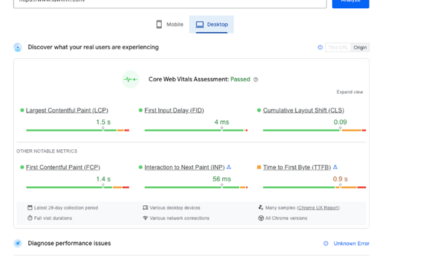
You can also conduct a technical SEO audit to identify opportunities to fix or eliminate to speed up your website pages. You can use WebCEO to see how your law firm’s site performs on search engines and possible errors and get actionable recommendations for improving it.
3. Show Reviews and Social Proof
According to this survey, 89% of people search for information about law firm reputation, while 68% prefer reading reviews. So, law firm websites need to establish trust and credibility through social proof and reviews.
Ensure to incorporate various forms of social proof on your site, such as ratings, recommendations from external sites, media recognition, and association memberships. Testimonials and social proof show potential clients that your firm is trustworthy and effortlessly protects their interests.
Video testimonials are an excellent way for current and former clients to share their positive experiences with your law firm and tell potential customers about the benefits if they start dealing with you.
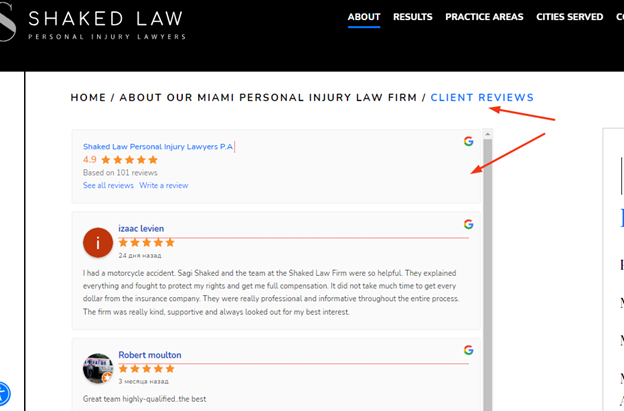
Ideally, you create a separate page with reviews and video testimonials. For example, this law firm puts all their clients’ reviews in one place with ratings that better show off your law practice and make it appear more trustworthy.
4. Use Original Visual Content
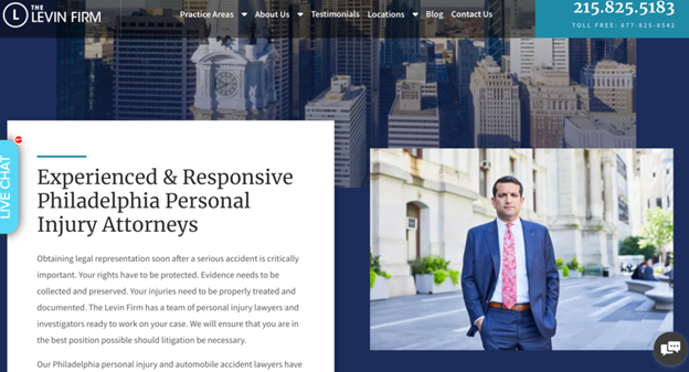
A visually appealing website can catch and retain users. Including high-quality professional photos can build trust and credibility with potential clients. It’s essential to include photos and videos of your lawyers, team, office, and location. You can also add visual content about relevant events or other vital things highlighting your reputation.
It’s essential to use only original and unique images. Avoid using stock images and videos, as people can quickly recognize some stock photos because they have been used so frequently. Moreover, they can seem insincere and irrelevant to your law firm’s site design. Consider hiring a professional photographer to capture authentic moments and build trust.
5. Provide Accessibility Features
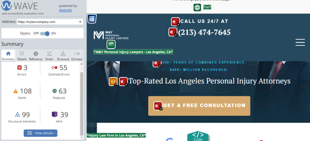
According to the statistics, website accessibility can improve user experience, widen your audience, and decrease legal risks. It’s essential to focus on accessibility in web design for law firms, like lack of captions, poor color contrast, etc. You can follow the Web Content Accessibility Guidelines to accommodate your site disabilities.
Today, many websites do their best to add all text for images to allow people with visual or sensory processing disorders. Using strong color contrast in text is another way to enhance visual accessibility. You can use the WAVE Web Accessibility tool to check whether your website is accessible.
6. Create a Client-Oriented Website Navigation
A well-organized website navigation can significantly enhance user experience on your website and send positive signals to search engines. It’s essential to have a website with easily defined categories and clear labeling for each section. One of the best practices for designing a law firm website is to use your logo as a link to the main page in the upper corner.
Ensure your website menu is easily accessible and structured based on the significance of each section. An anchor menu allows visitors to navigate to multiple parts of the site quickly. Keep the number of primary navigation links to about 7.
Include all the vital navigation links in the footer to improve user experience. People want to find contact information, social media icons, and other relevant links there. Add the search bar in the navigation bar or header to let users find what they want.

7. Build a Mobile Responsive Website
Today, a majority of people access websites through their mobile devices. Law firms should consider this while designing their websites to satisfy clients. The concept of mobile-first design entails creating a responsive website compatible with multiple screen sizes and can scale to larger screens. It should function equally well on any device, regardless of size or orientation.
Keep the website design for law firms simple to maximize user experience. You can use large and easy-to-read fonts, compress and minimize the number of images, and declutter the navigation menu. Reduce the number of page elements or make menus smaller to improve the page loading speed. With Google’s Mobile-Friendly Test, figure out whether your website is mobile-friendly.
8. Specify Your Practice Areas
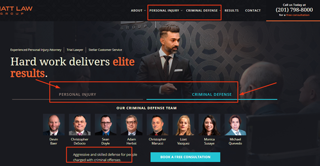
People who visit your website usually need a lawyer to help them with their legal issues. That’s why showcasing your practice areas on your homepage is crucial. Ensure to include clear links to pages describing each area in your navigation bar.
Remember, a potential client will form an impression of your website in just 50 milliseconds. Therefore, you want them to quickly and easily see that you offer the specific legal services they need. You can add the top two or three practice areas, like criminal defense and premises liability, highlighted with CTA buttons on the homepage. Include a summary of each area by clicking these CTAs and the option to learn more.
9. Keep Your Homepage Simple and Organized
Building trust relies on first impressions. Most people tend to scan a website rather than read it thoroughly. Therefore, it is crucial to design it with a clear and concise headline and simplicity. No one likes cluttered and confused homepages that make visitors leave a website.
Law firm website design should cater to decreasing attention spans by dividing content and making it more appealing. Here are some tips to consider:
- Make a headline that focuses on your client’s pain points or questions. Use it to clarify your services and who your target audience is. This way, your client will clearly understand the next step.
- Add a clear and concise CTA that prompts users to take the following desired action.
- Place the most crucial information at the top of your webpage so visitors do not have to scroll down to find it.
- Use white space to divide text and images.
- Convey your message using high-quality media like photographs or infographics.

10. Incorporate Engaging and Interactive Elements
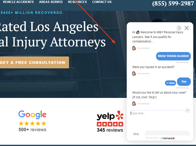
Law firms should incorporate interactive and engaging elements into their website designs to enhance user engagement and experience. Regarding these elements, law firm websites should benefit from chatbots to improve customer support. This great addition can help your law firm’s website answer clients’ queries and guide them toward contacting you. It can offer 24/7 support and access to educational resources.
Another way to engage your visitors is to create videos. You can easily explain the most complex legal problems and show your expertise and knowledge. Moreover, that will add a personal touch to your website and easily connect with potential clients.
Using micro-animations is an excellent way to increase visual experience, show essential information, and build brand identity. Find key areas you want to make the most impact and integrate micro-animations. Ensure that too many can distract visitor’s attention from the main parts of your law firm website.
Conclusion
If you want to revamp your existing website or build a new one for your new practice area, you can follow the above-mentioned website design best practices for law firms to get it right.
An optimized website for law firms works tirelessly to generate leads and convert them into customers. This site will be your best marketing tool. Take some time and get the most out of these tips.
- 10 Smart Website Design Tips for Law Firms - October 2, 2023
![]() Give feedback about this article
Give feedback about this article
Were sorry to hear about that, give us a chance to improve.


