fbpx
Home » Features » Blog » Case Studies » Heatmap Analysis

Heatmap Analysis

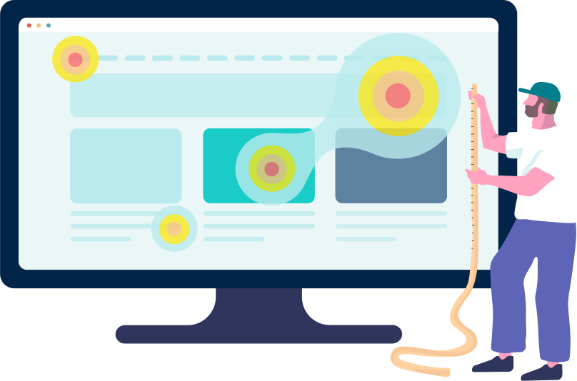
See behavior patterns and find hotspots of user engagement with easy-to-understand click heatmaps.

Visualize user interaction for instant insights

Discover user engagement zones for effective design

Easy test set-up, no coding experience required

The user testing platform trusted by

Uncover UX Insights with Loop11's Heatmap Tool

Here’s how Loop11’s heatmap analysis can elevate your user testing experience for optimized website performance:

Click Heatmaps

Identify your website’s hottest interaction areas and popular click zones. Loop11’s heatmap report allows you to track user interactions task by task, revealing everywhere visitors click on the page – from links and images to text and dead space.

Heatmaps & Clickstreams Integration

Elevate your insights by combining click heatmaps with Loop11’s Clickstream Analytics. Trace the user’s journey, unveil paths, and identify drop-off points. Optimize the user journey and experience by understanding interaction flow and click patterns.

Desktop, Mobile & Tablet Heatmaps

Understand how users engage across devices. Loop11 provides desktop, mobile, and tablet heatmaps, enabling tailored optimization strategies that enhance the overall user experience.

Heat Up Your UX Strategy with Loop11

Whether you’re refining a website design, strategically placing content, or aiming to improve user experience, Loop11’s usability testing tool provides the insights you need.

Discover the Benefits of Heatmap Analysis

UX heatmaps empower you to see exactly where your visitors click, what captures their attention, and how to tailor your website for an unbeatable online experience. Explore the advantages of Heatmap analysis:

Instant Visual Feedback

Gain an instant visual summary of user interaction across your site. Vibrant ‘hot’ colors like reds and oranges highlight areas with the most activity, while cooler blues and purples identify less-visited zones.

Improved Content Placement

Identify your website’s ‘hot spots’ and strategically position crucial content or call-to-action buttons where user attention is highest. Maximize visibility and engagement by placing elements where they matter most.

Optimized Page Layout

Analyze the distribution of clicks and interactions across different page elements. Make informed decisions about layout adjustments to create a seamless and enjoyable browsing experience for your users.

Higher Conversion Rates

Simplify and direct user attention to key elements, such as sign-up forms, by understanding potential distractions. Optimize the path to conversion, increasing the likelihood of users completing desired actions.

Enhance User Experience

Detect potential user frustration by recognizing cooler colors in vital navigation links or buttons. Use this visual cue to address confusing or hard-to-find elements, ensuring a smoother user journey.

Reduced Bounce Rate

Spot ‘cold’ areas on your landing page, indicating lower user interaction or attention span. Reassess and refine those zones to keep visitors engaged longer, ultimately reducing bounce rates.

Our Clients Say It Best

“Loop11 has been a wonderful asset for us. We can see real world kids and real world parents in real world environments, and how the app performs. And we can make adjustments based off of that.”

R.-Kali-Woodward-FUNetix.png
R. Kali Woodward

FUNetix Founder

“Using Loop11 allows us to deliver quantitative data so the client can see where the painpoints of their users are and where to tackle the usability issues in their platform.”

Sarai-Prado-Sperientia.png
Sarai Prado

Lead UX Researcher and Lab Lead,
Sperientia: [Studio + Lab]®

“We have the ability to test prototypes, and test our website live to understand the issues in the current journey. That’s one of the strengths of Loop11.”

amelie_kiefer
Amélie Kiefer

Product Designer,
Vodafone Ireland

Discover More Features of Our Online User Testing Platform

Explore our features that allow you to easily manage your testing projects and obtain valuable feedback from your users.

Online Usability Testing

Discover more

AI Insights

Discover more

Unmoderated Usability Testing

Discover more

Prototype Testing

Discover more

Moderated Usability Testing

Discover more

Information Architecture (IA) Testing

Discover more

UX Benchmarking

Discover more

A/B Testing

Discover more

True Intent Studies

Discover more

Mobile & Tablet UX Testing

Discover more

User Session Recording & Replay

Discover more

Search Engine Findability

Discover more

Clickstream Analytics

Discover more

The Power of Heatmaps in Website Analysis

After a round of usability testing, where you’ve observed users directly, the data from heatmaps can act as a reinforcing agent, indicating if the observed behavior is a one-off or a recurring pattern among the broader audience.

When heatmaps are mixed with other UX tools, the insights are more profound, holistic, and actionable – propelling websites toward unmatched user-centric excellence.

What is a Heatmap?

In the digital realm, a heatmap isn’t about temperature but rather the intensity of activity. Think of it as a visual GPS for your website’s user journey.

At its core, a heatmap is a data visualization tool that represents information using a spectrum of colors. Brighter or ‘hotter’ areas indicate higher concentrations of user interactions or activities, while cooler colors represent fewer interactions. The objective? To quickly grasp where users most frequently click, move, or scroll on your site.

There are several types of heatmaps used in web analytics:

  • Click Heatmaps: These visualize where users most frequently click on a page. It’s like a spotlight on user intent, highlighting popular links, buttons, or unexpected click areas.

  • Scroll Heatmaps: Have you ever wondered how much your content visitors see? Scroll heatmaps reveal how far users scroll down a page, showing if crucial content is being missed because it’s too far down.

  • Move Heatmaps: This type gives insights into mouse movement. While not a definitive guide to eye movement, mouse paths can still hint at areas of interest or elements that capture attention.

Using heatmaps, businesses, and web designers can make informed decisions on website redesigns, content placement, and more. In the digital age, where user experience is king, understanding your audience’s silent, visual feedback is key to success. Remember, a heatmap isn’t just about colors; it’s about decoding the language of your users without them saying a word.

Why are Heatmaps Important for Website Optimization?

Imagine seeing a bird’s-eye view of your website, enlightened by user interactions. This is the essence of a heatmap. These vibrant visuals don’t just add color; they provide deep insights, enabling businesses to craft great online experiences.

  1. Deciphering User Behavior Patterns: According to a recent study by the Nielsen Norman Group, users typically leave a web page in 10-20 seconds, but pages with a clear value proposition can hold their attention for much longer. Heatmaps help pinpoint areas that retain interest and those that are frequently overlooked. Businesses can better understand how users digest content and navigate the site by assessing the’ hot’ and’ cold’ zones.

  2. Data-Driven Insights for Business: A study from Forrester reveals that a well-designed user interface could raise a website’s conversion rate by up to 200%. By leveraging heatmaps, businesses can identify what’s working and what’s not. This allows for strategic changes that can significantly boost conversion rates and overall ROI.

  3. Empathy Through Visualization: User experience is deeply tied to empathy. Heatmaps allow businesses to visually ‘feel’ their users’ journey. By seeing through the users’ lens, companies can foster a more intuitive and user-centric website design.

  4. Refining Content Strategy: In a world dominated by content marketing, understanding content engagement is vital. According to a report by the Content Marketing Institute, the most successful B2B marketers spend 50% (or more) of their marketing budget on content marketing. With such significant investment, using heatmaps to analyze which content pieces resonate and which don’t can be a game-changer.

Heatmaps light the way to making websites better. In today’s online world, they help businesses build websites that draw people in, keep them interested, and encourage them to take action.

Which Elements of a Website can be Analyzed using Heatmaps?

Users often silently communicate their feedback when they interact with a website. Heatmaps are a messenger for these unspoken words, turning actions into insights.

For instance, imagine a landing page for a new smartphone. The page has captivating features like a cutting-edge camera, extended battery life, and innovative design. Here’s how heatmaps play detective: Click heatmaps might show that despite the camera being the highlighted feature, users are more frequently clicking on details about battery life. This suggests that for your audience, battery longevity trumps camera quality.

Heatmaps are powerful analytical tools that visually represent user behavior on a website with color-coded systems to indicate areas of high and low activity, enabling webmasters and UX designers to understand how users interact with different site elements.

Here’s a breakdown of which elements can be thoroughly analyzed using heatmaps:

  • Homepage Interaction: The homepage is the primary entry point for many visitors. Heatmaps can show which sections or elements attract the most attention and which are frequently bypassed.

  • Sidebar Usage: Sidebars often contain important links, advertisements, or call-to-action buttons. Heatmaps help determine whether these components capture user attention or are largely ignored.

  • Content Engagement: By using scroll heatmaps, one can ascertain how far users scroll down on content-heavy pages. This gives insight into which parts of the content keep users engaged and where they typically drop off.

  • Interactive Elements: Click heatmaps are especially useful for understanding how often users interact with buttons, links, and other clickable elements. This can help in assessing the effectiveness of these interactive components.

  • Menus and Forms: Drop-down menus and forms are critical for navigation and user input. Heatmaps can indicate if users are accessing these elements and if any part of the menu or form is causing confusion or hindrance.

  • Cursor Movement: Move heatmaps track where users hover their cursors. This can shed light on areas that might be causing uncertainty or drawing interest, even if they aren’t necessarily clicked.

With these data, website owners and designers can make smart decisions to enhance the overall user experience.

What are Click Heatmaps, and How are They Different from Scroll and Move Heatmaps?

In the digital maze of website optimization, heatmaps are the guiding stars. Like constellations in the night sky, each type – click, scroll, and move – shines with unique insights, helping webmasters and UX designers chart a course to improve user engagement. Let’s dive deeper into understanding the distinct stories they tell.

I. Click Heatmaps: Touchpoints of Curiosity

Every time a user clicks on your website, they make a statement. They’re expressing interest, seeking information, or attempting to navigate.

How do click heatmaps visualize user interaction? Click heatmaps capture these moments of interaction, representing them as vibrant splashes of color. The hotter the color (like red or yellow), the higher the concentration of clicks, painting a vivid picture of where users are most engaged. Conversely, cooler colors (like blue or green) show areas less traveled by the click. It’s like a visual applause meter, revealing the most applauded parts of your website.

II. Scroll Heatmaps: The Journey Down the Page

While clicks signal active interaction, scrolling is a subtler indication of interest and engagement.

What can we learn from analyzing scroll heatmap data? Scroll heatmaps track the user’s journey as they traverse down a page. Brighter colors indicate sections where a majority linger, while dimmer shades show where users tend to skip or move past quickly. If a page has a sharp transition from hot to cold colors, it might indicate a ‘drop-off’ point where users aren’t venturing further. This could be due to content layout, a perceived end of valuable content, or other design elements.

III. Move Heatmaps: Tracing the Digital Dance

As users glide their cursors across the screen, they often reveal intent, hesitation, or focus, even if they don’t click.

What can we learn from analyzing move heatmap data? Move heatmaps capture this dance of the cursor, showcasing areas where users hover, pause, or frequently return. These can be zones of interest, potential confusion, or consideration. For example, if users consistently hover over a particular section but don’t click, it might hint at something capturing their attention but not compelling enough to elicit a click.

While all three heatmap types capture user behavior, they each offer a unique lens into user engagement. Click heatmaps spotlight active interaction, scroll maps reveal content engagement depth, and move maps expose cursor intrigue. Together, they form a powerful triad, enabling a holistic understanding of user interactions and preferences on a website.

How to Interpret Heatmap Colors and Patterns?

There are (3) three ways to translate heatmaps, namely:

The Spectrum of Engagement:

Heatmaps use a color gradient, typically from cool to warm, representing varying degrees of user interaction.

  • Reds and Yellows: These fiery tones indicate hotspots of intense activity. On a click heatmap, it could mean a button frequently clicked, or on a move heatmap, an area where cursors often hover. Think of these areas as the buzzing town squares of your digital city.
  • Blues and Greens: These cooler shades signify less interaction. They’re the quieter alleyways, still essential but less frequented by the digital populace. Maybe a sidebar is often overlooked or a section few users scroll to.

Interpreting Patterns:

Beyond colors, the arrangement and spread of these hues on your heatmap can offer deeper insights.

  • Reds and Yellows: These fiery tones indicate hotspots of intense activity. On a click heatmap, it could mean a button frequently clicked, or on a move heatmap, an area where cursors often hover. Think of these areas as the buzzing town squares of your digital city.
  • Blues and Greens: These cooler shades signify less interaction. They’re the quieter alleyways, still essential but less frequented by the digital populace. Maybe a sidebar is often overlooked or a section few users scroll to.

Beyond Just Colors:

Patterns also extend to the frequency and dispersion of clicks or moves.

  • Scattered Dots: If you observe a scattering of individual dots, it suggests exploration. Users might be trying to find something or exploring multiple areas of interest.
  • Linear Trails: Especially on move heatmaps, linear trails of warm colors might indicate users are following a specific path, like reading a block of text or tracking a visual element.

Decoding heatmap is a blend of art and science. While the colors and patterns provide quantitative data, interpreting them requires intuition, understanding your website’s goals, and sometimes detective work. But as you get the hang of it, these vibrant visualizations become a compass, guiding you toward a more optimized and user-friendly digital experience.

What are the Best Practices for Collecting Accurate Heatmap Data?

To ensure your heatmap tells an accurate and timely tale of user interaction, it’s crucial to adhere to best practices during data collection. Here are surefire ways to guarantee your heatmap’s accuracy:

1. Gather Ample Data:

It’s essential to have a sizable data set to get an accurate representation. Collecting heatmap data over a short period or from a limited user base can skew results. Ensure you’re covering various user behaviors by considering:

  • Timeframes: Monitor user interactions over weeks or months to factor in anomalies or seasonal trends.
  • User Diversity: Ensure data collection spans different user segments, devices, and geographic locations for a holistic view.

2. Factor in Responsive Design:

With users accessing websites from myriad devices – from smartphones to tablets to desktops – it’s essential to collect and analyze data for different screen resolutions and orientations.

3. Regularly Refresh Data:

The digital landscape is ever-evolving, with website content, design, and user preferences frequently changing. To keep your insights relevant:

  • Update Intervals: Refresh heatmap data every few months or after significant website updates.
  • Post-Campaign Analysis: After running specific marketing or advertising campaigns, it’s a good idea to collect fresh data to gauge any changes in user behavior.

4. Avoid Overlapping Elements:

Ensure that pop-ups, modals, or floating elements don’t obstruct primary website elements. Overlapping can skew click data, leading to misleading insights.

5. Combine with Other Analytics:

Heatmaps offer visual insights, but combining them with traditional analytics can give depth to your findings. For instance, a high click area on a heatmap supported by high conversion rates in your analytics tool can validate the effectiveness of that element.

6. Filter Out Irrelevant Clicks:

Sometimes, users might click out of habit, frustration, or error. To ensure data integrity, utilize filtering tools to sift out unintentional or irrelevant clicks.

7. Educate Your Team:

Accurate interpretation of heatmap data is as crucial as collecting it. Ensure your team is well-versed in reading and analyzing heatmaps. Regular workshops or training sessions can keep everyone updated.

By sticking to these best practices, you capture the essence of user behavior and do so with precision, ensuring that the insights you draw are actionable.

What are the Drawbacks of Using Only Heatmaps for Analyzing User Experience?

Heatmaps are a popular tool in UX analysis because they visually represent where users interact on a webpage. However, relying only on heatmaps has its limitations.

While heatmaps show where users click or hover, they don’t explain why users behave in a certain way. For example, if an area on a website has few interactions, it needs to be clarified whether the content isn’t appealing, if there’s a design issue, or some other reason. Therefore, understanding the context behind the heatmap data is essential.

To get a comprehensive view of user behavior, it’s recommended to use heatmaps alongside other UX tools and methods, such as user surveys or session recordings. This approach ensures a more informed and accurate analysis, leading to better website improvements and user experience decisions.

Heatmaps 2.0: Gazing into the Crystal Ball of Future Web Analysis

Digital landscapes and the tools we use to interpret them are ever-evolving. Heatmaps, once a basic visualization of user clicks, are now gearing up to be the linchpin in website analysis of the future. As we advance further into the age of AI (artificial intelligence), it’s clear that heatmaps won’t just be about colors; they’re set to transform into sophisticated, smart tools, reshaping our understanding of user behavior.

Websites waited for users to interact a few years ago and then used heatmap data to retrospectively tweak their content. Fast-forward to now: We’re entering an era of AI-driven predictive analysis. This isn’t about mere reactions but about proactively adapting.

Groundbreaking innovations are on the horizon, where heatmaps and AI will anticipate user actions, allowing for real-time site modifications. Soon, more businesses will incorporate AI-powered heatmaps to preemptively adjust web content based on projected user behavior.

But the innovation train continues beyond there. With the surging interest in virtual reality (VR) and augmented reality (AR) experiences, heatmaps are also set to break the 2D mold. Imagine analyzing user interactions in a 3D virtual store or an AR-enhanced educational site. We will look at heatmaps that delve deep into three-dimensional, immersive environments.

In short, the future of heatmaps promises a merge of prediction, real-time adaptability, and spatial understanding. As the line between the digital and physical worlds blurs, heatmaps are poised to be our compass, navigating and decoding the intricate web of user behavior. The question isn’t just about where users are clicking but where they’re heading next.

Ready to Navigate the Heatwave with Loop11 Heatmap Analysis?

Discover the hotspots in user interaction with Loop11’s heatmap tool and ride the wave of improved engagement and conversions.