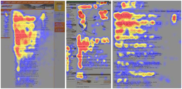
Let’s explore how heatmaps provide marketers with invaluable data that helps understand how users behave and navigate.
Heatmaps are a great way of understanding what visitors actually do on your website. They can provide insights into where they click, how far they scroll, what content they actually spend time looking at and what they outright choose to ignore.
This form of insight can be easy to ignore in the world of marketing. After all, you’ve developed a clear idea of what you want your website to look like and how it will greet new arrivals, why bother delving further into where people are looking when they navigate onto your page? However, it can really pay to focus more on how heatmaps can optimize the traffic you attract and turn visitors into conversions.
We are used to seeing heatmaps with various use cases on a regular basis like in meteorology, sport, and various forms of analytics. But let’s take a deeper look at how it can help directly in the world of marketing:
The Various Forms of Heatmap
So, how can heatmaps help the development and growth of our websites? Typically, users took to heatmaps for insight into the following questions:
- Are people seeing the most important content on this page?
- Do visitors notice the calls to action?
- How do people interact with the non-clickable parts of this website?
- Are visitors becoming distracted instead of focusing on important information?
- How well are visitors from different devices interacting with the site?
The above questions follow marketers throughout the development of a website, and heatmaps are one of the very few pragmatic options that can offer comprehensive insights into each one. There are many different types of heatmaps that can aid web development, including:
Click heatmaps that help to analyze the parts of a webpage that attract the most clicks and study where the least clicks occur.
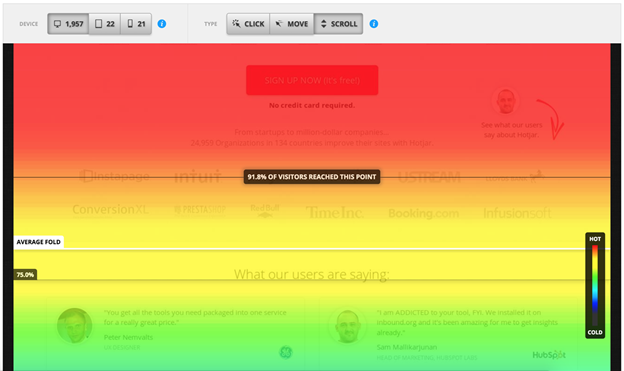
Scroll heatmaps which use a dark-to-light colour scheme to indicate how far down a page a visitor scrolls. In the case of these heatmaps, the darker sections indicate where users have spent the most time, whilst lighter colours show the content that’s largely missed.
(Image: Hotjar)
In the example above, we can see that the number of users who typically scroll below the fold falls dramatically the further down the webpage they go. With as many as 91.8% of visitors in this case reaching just above the average fold, just 75% make it further down to the recommendations section of the page.
Traffic segmentation heatmaps are another useful tool in helping website owners to categorize data into customer segments based on their demographics like age, location, occupation and plenty more.
Move heatmaps track mouse cursor movements on specific pages, clarifying the levels of focus, or lack thereof, that users are exhibiting.
Mobile and desktop heatmaps help to offer a little bit of understanding regarding how users interact with your site based on the device they’re browsing on. Mobile browsers and desktop browsers can provide wholly different views of a site, so it’s worth checking both out.
Although it can be a tedious process to use heatmaps to see how users interact with all of your pages, it’s certainly worth running heatmap tests on the pages that are most important to the performance of your business. Whether that’s the homepage, landing pages, blog page, conversion pages, or simply any parts of your website that appear to be underperforming for traffic, heatmaps can lead the way to growth driven by valuable insights.
With this in mind, let’s take a look at four key reasons why we should pay extra special attention to heatmaps and how they can help web performance:
1. Avoiding Losing Money to Banner Blindness
(Image: Neil Patel)
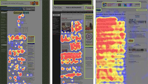
Banner blindness refers to when visitors either consciously or unconsciously ignore a pivotal part of your webpage because it appears to be similar to advertising. Given the prevalence of banners across the world wide web, it can be common now for traffic to largely ignore anything online that appears to be an advertisement.
Heatmaps can help to spot whether your on-site content is creating banner blindness by displaying where users are looking on your pages. If your pages are promising to offer a quick solution to a question or query, it’s likely that your visitor will look directly to the content for their answer without looking away.
Depending on your circumstance, you can adapt your pages to better incorporate your website’s most important information into the page in a more immersive and impactful way. Try to avoid segmenting parts of your site to avoid forcing attention away from the bigger picture.
Banner blindness can also contribute to websites losing money because visitors are ignoring advertisements. With this in mind, it could be worth looking at new ways to incorporate ads into your site, rather than through generic banners – this can be done by exploring what spaces your visitors are spending more time observing and where they’re ignoring.
2. Accommodate Your Pages to Suit Browsing Patterns
If you believe that all of your visitors to your blog pages sit still and read every word you’ve written then, sadly, you’re highly likely to be mistaken. You could be the most riveting author in the world, and you’ll still get plenty of visitors who switch off whilst reading your content.

(Image: Instapage)
Don’t be disheartened at how people struggle to read all the way through your content, we’re naturally impatient and are used to scanning for valuable information rather than sitting and digesting every word on our screens.
Heatmaps can often show that text-heavy pages typically create F-shaped viewing patterns from visitors. This occurs as users cling to the opening two paragraphs of your content before scanning their way further down the page.
By tapping into heatmap software, you can view how visitors interpret your content and modify your page accordingly. If you see F-shaped trends emerging, it’s vital to use the coverage that the F generates to your advantage. This means that your opening two paragraphs are crucial – make sure you’re engaging, informative and consistent throughout. As the F shape progresses down, make sure your subheadings, bullet points, and paragraph openings are on point to keep readers enticed into reading more.
(Image: NNGroup)
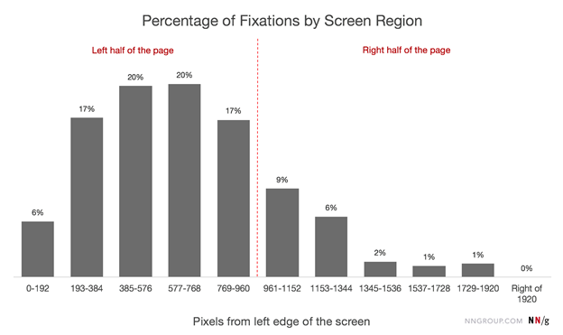
Interestingly, due to the way most languages read from left to right, we’ve become accustomed to finding ourselves fixated on the left-hand side of our screens. This can also be used to your advantage if your heatmaps are showing an F-pattern – and creating narrow, left-leaning paragraphs could be a solution to experiment with and re-test.
3. Spot Leaks in Your Funnel
Website heatmaps aren’t just useful tools for spotting the best and worst performing elements on your site, but they can also be used to help you to understand where visitors are falling out of your sales funnel and abandoning their purchases – and, most importantly, provide insight on why this is happening.
There could be some elements that your visitors dislike, or it could also be possible that other elements are forming a distraction from more important aspects of your pages. On the whole, it’s important to examine how visitors are using your sales funnel, and where disconnects may be emerging.
Heatmaps can help to keep your visitors engaged and focused in this respect, by showing you what content can be removed without it impacting the effectiveness of the page – thus efficiently eliminating clutter from your site.
4. Powering up Your Analytical Insights
Heatmaps can be used to power up the wealth of insights that you can find from analytical engines. They can enable you to quickly and clearly spot trends in page views, visitor numbers, bounce rates and various other information in a far more accessible manner.
This visual insight can help to prevent marketers from getting bogged down in the raw data offered by the likes of Google Analytics or seeing the impact of a percentage point difference rather than larger trends and activity surrounding specific data.
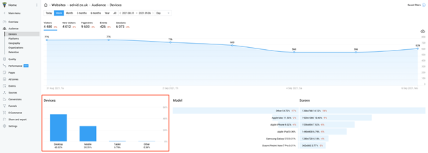
Using heat mapping in tandem with analytics platforms like Google Analytics or Finteza, as exemplified above, can help to illustrate the data you’re accessing. For instance, we can not only gain greater insight into the most popular time of day that visitors are arriving, but we can also see what device they’re most likely to use – enabling us to adapt our pages to see what kinds of views specific device users see when navigating through our pages.
This gives website owners and marketers alike a strong starting point to understand why certain patterns are emerging among analytical insights and how they can adapt their pages to make the most of them.
Heatmaps can play an invaluable role in illuminating how our websites are used. By following the paths of our visitors, we can see what parts of our pages are gaining more attention than others and which calls to action are benefiting from the most exposure.
This gives us a great opportunity to optimize our pages for the better, and to keep more visitors on our sites for longer – effectively helping to turn interest into conversions.
- E-A-T 2.0: Mastering Expertise, Authoritativeness, and Trustworthiness for UX Success - October 24, 2023
- Voice-Driven Commerce: How To Design A Conversational Website for Effortless Online Shopping - September 12, 2023
- Could Neglecting Sound Design Be Ruining Your UX Success? - September 13, 2022
![]() Give feedback about this article
Give feedback about this article
Were sorry to hear about that, give us a chance to improve.
Error: Contact form not found.

