It’s a challenge for any startup to get off the ground these days. The competition is tough and you need to consider a number of factors to stand out and make your project cut through the industry noise. And one of the crucial factors that are often overseen is ever-expanding customer expectation. That means understanding and adapting to user behaviors. Most startups are to pay attention and commit resources to design and UX (user experience) to reach and engage with potential buyers.
Benefits of Adopting UX Best Practices
Being a startup with a tight budget, it’s obvious that you need to be sure why UX is worth investments. So, let’s start with the key benefits of adopting UX best practices when designing and developing any product:
- Boost customer loyalty and acquisition.
The more user-friendly and aesthetically pleasing your solution is, the easier you build trust with people. A strong user experience helps you attract users, convert them into customers, and retain users more effectively.
- Maximize revenue generation opportunities.
Having certain data about users and their needs makes it much easier to plan the user journey, identify and optimize all potential opportunities to convert users into buyers, which leads to revenue growth.
- Optimize not only resources, but development time and costs as well.
By integrating UX design into the development process, you can predict and address most of the usability issues and anticipate the users’ needs before the production. That saves considerable resources, money, and time, ultimately ensuring that the design is both flexible and scalable.
- Provide you with engagement metrics.
Insights from user engagement give you an understanding of what your customers find valuable and what makes them convert. Based on the engagement insights you gathered, you can provide the solution that converts consistently and retains customers better.
- Reduce troubleshooting and result in decreasing associated costs.
It’s better to predict UX errors than fix them. Thus, ensuring that the UX is done effectively and efficiently from the very beginning will help alleviate potential troubles in the future like fixing or deleting features that are unnecessary or inaccessible.
5 UX Rules Tech Startups Should Consider To Succeed
There are tons of UX trends and rules that can impact your design strategy. Yet, we did the work for you and picked out the 5 most important rules for tech startups to keep in mind. Let’s elaborate on them.
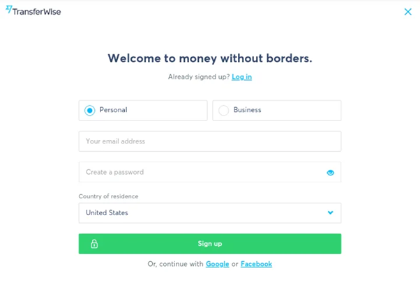
Simplify Your Sign-up Form
It’s crucial to minimize friction during the Sign-Up process. So, it’s highly important to understand how much and what information about the users is needed to get them up and running the first time they use the app/software.
Here are our 6 tips on how to make an effective Sign-Up form that converts:
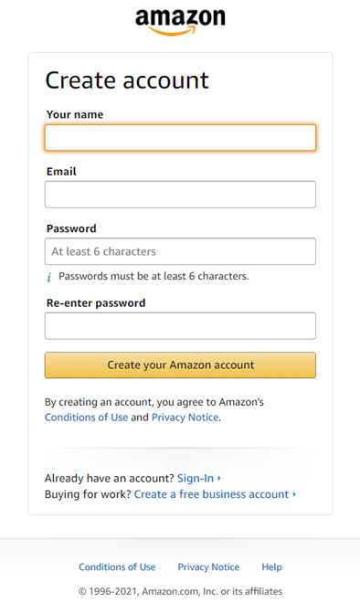
- Make it short or at least break it into steps.
Require only as much user details and information as you need to create a profile and make a great first experience. So, if email/login and password are enough then wait and ask the question or gather further details later when the customer starts to use your product. Don’t forget to explain why you ask for this or that personal data.
In case your project is complex and a lot of personal data is needed, then it’s better to break the registration into manageable steps and add a progress bar.
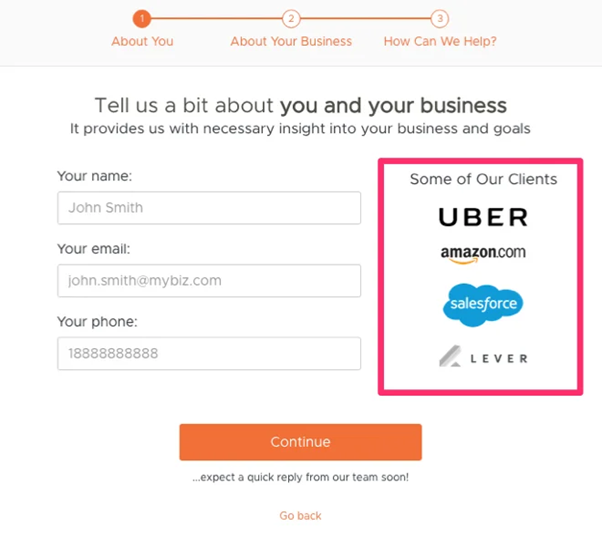
2. Increase the dimensions of your form fields.
It’s a fact that not all users use the tab button to move from field to field. Mouse or touch screens are popular alternatives. Ensure that all the fields are well visible and large enough so that the customers can easily fill in their details.
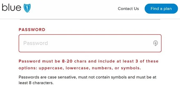
- Don’t use complex fields and provide clear instructions.
Help your users avoid mistakes and explain what kind of information is needed in a certain field.
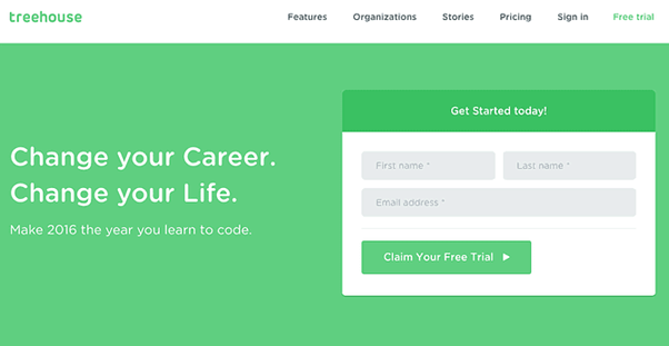
4. Make CTA (call to action) clear and simple.
Make sure that your CTA button has a clear value proposition, draws attention, and drives users to take a particular action. It’s better to change plain “Sign Up” or “Register” to “Start your free demo/trial” to clarify to the users what they would get when they sign up.
- Enable social media sign-up.
By implementing such an option, you’ll not only simplify and hasten the registration process but get access to the customer details in one touch.
Build Engaging Customer Onboarding Experience
What is customer onboarding? It’s a process of demonstrating your product/service to the customers and bringing them up to speed on how it works. It’s important for startups and not only startups to make a positive and engaging onboarding experience because it can save a business up to 10% of revenue to churn every year. Here are a few tips on how to build a positive customer onboarding experience.
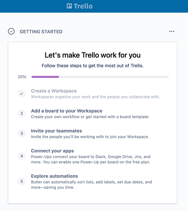
- Define your product’s critical actions points to be explained to the customers to ease their journey.
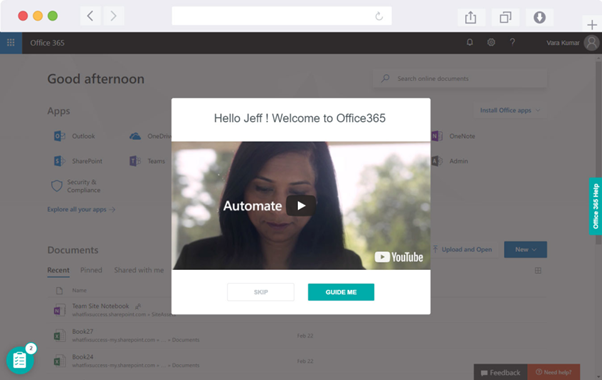
- Prepare a new customer welcome series to greet, educate, and guide them through the product and its features. You can create and embed in-product tours and welcoming videos of someone in your company to create a more personal feel.
- Design your onboarding flow:
- Choose the most suitable onboarding model for your project (self-serve, low-touch, high-touch);
- Determine onboarding elements to build and deploy inside the product (in-app tutorials, product tours, checklists, modal video guides, progress bars, walkthroughs, live assistance tools, chatbots, etc.)
- Find pain points of your customers and help solve them and complete a task.
4. Create the non-product onboarding elements:
- FAQ page/Knowledge base;
- Video lessons/guides;
- Tutorials;
- Help/troubleshooting documentation.
5. Provide customer support no matter how comprehensive onboarding is:
- Help desk software;
- Social media customer support;
- Dedicated support email;
- Chatbots/AI-based assistants.
Create User-Friendly Dashboards
Commonly, a dashboard is a screen in the software or application that displays information that provides the user with a global overview, access to the most important and relevant data, features, controls, etc. Such dashboards are crucial to think over when you are going to develop software with analytics features, management software, and so on.
Here are tips for designing a user-friendly dashboard:
- Provide documentation on how to use the dashboard. Such documentation is to include:
- Metric definitions;
- Contents page with descriptions;
- Instructions on how to navigate along with generic ‘how to’ guides.
- Have clear navigation options so that users can move between pages with ease.
- Select the right type of dashboard for your project. Depending on your project and business activity, choose the type of dashboard: strategic, operational, analytical, or tactical. Build responsive dashboards that will fit all types of screens.
- Provide context for all the data shown. Always try to provide maximum information, even if some of them seem obvious to you.
- Use the right type of chart and their visualization. Line, bar, or pie charts are used for different purposes. Analyze the type of data you are going to represent to select the right variant of charts for your project.
- Choose the layout carefully. The next step is the placement of charts on a dashboard. Try to make your dashboard visually organized and structured. Remember to group the charts by theme with the comparable metrics placed next to each other.
- Prioritize simplicity. Focus on simplicity is one of the best practices for dashboard design. Try to use a few options for charts and other elements so that you don’t overwhelm users and that they see a simple data story with the main points highlighted.
- Choose a few colors and stick to them. When it comes to color, it’s better to choose and stay true to the company identity (colors, logo, fonts).
- Make the dashboard customizable so that users can choose the options they need, see what matters to them, and get only the relevant information.
Keep Information Structured And Easy-To-Navigate
It’s not enough to pack pictures, optimize load time, use clear language, use white space, and keep away from pointless information passage. While prototyping a UX, every design component and element, including pictures, visuals, fonts, colors, content, CTAs, section, catch, and so on are to be considered and reviewed.
Review each element and information added, and if it brings no value for your customers then it’s better to refuse or change it. Don’t make your customers seek needed information or struggle to complete the task. Help your users — think over the structure of your product and keep it simple and intuitive, considering the preferences of your customers.
Improve Your Product With Ongoing Reviews And Iterations
It’s impossible to create a fully completed UX design. It’s a continuous and iterative process. So as soon as you get through all the stages, you need to go back to the very beginning and start it again. Keep gathering information about your users, measuring UX, conducting ongoing reviews of the product, and implementing changes to meet the customers’ demands. Thus, never stop iterating to improve your product and meet the changing customers’ needs and wishes. That’s the only way to stay competitive and retain your customers.
Final Thoughts
Each startup and project is created for users. It’s critical to consider this fact when developing a product. Here are a few benefits to get with an effective UX design:
- Boosted conversions;
- Lower support cost;
- Improved SEO;
- Increased brand loyalty.
Adopting and mastering the 5 UX rules described in the article, tech startups increase their chances to succeed and differentiate from the competition by avoiding a lot of usability issues and meeting the ever-expanding customer expectation.
- 5 UX Rules Tech Startups Need To Master - September 14, 2021
![]() Give feedback about this article
Give feedback about this article
Were sorry to hear about that, give us a chance to improve.
Error: Contact form not found.


