Investing in UI and UX is a crucial aspect of the design process for a high-performing website. But, while focusing on technical performance, on-site user behavior, and browsing experience yields tremendously positive results, it’s not always enough to capture your audience’s attention and encourage them to interact with your brand.
That’s why your brand’s online presentation — your site, social media feeds, and all marketing messages — must contain a dose of creative storytelling. This will help you engage prospects and drive them to explore and consider your solutions. More importantly, you’ll create a seamless brand interaction, transforming a mere monetary transaction into a journey toward helping your potential customers solve their pain points.
Naturally, there are various ways you can rely on narratives to enhance your site’s potential. Here are nine ways to use storytelling to improve your UI/UX design.
How Does Storytelling Benefit UI/UX Design?
The potential of storytelling lies in the fact that people have a natural affinity toward constructing narratives. For humans, telling and recording tales is not just an act of creativity. It’s an irreplaceable (though often flawed) method of capturing our reality.
From the very first cave drawings to ancient Mesopotamian clay tablets containing the Epic of Gilgamesh to Aesop’s Fables and Homer’s Iliad and Odyssey, people have relied on storytelling to communicate, record their experiences, and express their thoughts and feelings. As the medium of the written word evolved into poems, novels, cinematography, and even video gaming, it took on additional roles in people’s lives, cementing the role of narratives as an irreplaceable part of our existence.
As for the role of storytelling in marketing — or the website design process, for that matter — it’s a natural continuation of this human affinity toward fiction.
It works because people respond to stories much better than to dry information. It’s effective due to the ability of a story to build emotional connections between the narrator and the consumer. Furthermore, it can enhance UI and UX design by infusing run-of-the-mill information with profound meaning.
According to scientific research, storytelling can:
- improve the effectiveness of transmitting information, especially when discussing complex ideas and solutions
- build emotional connections between your audience and your brand
- make your audience retain the information you present, especially considering that stories are 22 times more memorable than facts alone
- reinforce your organization’s voice and personality with specific on-brand interactions
- physically affects our brains and bodies and even triggers certain behaviours
How to Use Storytelling to Improve UI/UX Design
Even though storytelling can be an exceptional way to improve UI and UX design, it’s not always something that comes intuitively during the design process.
Instead, successfully incorporating narratives in your website’s structure and content relies on strategically scouring for opportunities to enhance your audience’s browsing experience by adding a new dimension to existing elements.
Here are a few ideas for making it work for your brand.
Establish Your Brand’s Visual Identity to Set User Expectations
In literature, writers use descriptions to immerse readers into their narratives. They set their scenes with words, creating versions of reality that are (almost) more appealing than the real world.
In web design, designers achieve the same effect with color, typography, and visuals.
By employing the right design tactics — like color psychology, emotionally charged visuals, typography, and branding elements — you can draw web visitors into your brand’s world.
Moreover, you can set their expectations regarding the content they’re about to see on your website. And you can ensure they remember your brand by creating a story that transforms your business’ identity into an unforgettable narrative.
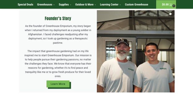
For example, check out Greenhouse Emporium, which heavily relies on shades of green for its visual identity. That makes sense, as it’s a business that focuses on gardening. But what’s genius about this brand’s approach is that it also chose green due to its ability to evoke feelings of peace and security. And that makes total sense once web visitors read the founder’s story, telling how the owner first got into gardening as a therapeutic pastime.
Source: greenhouseemporium.com
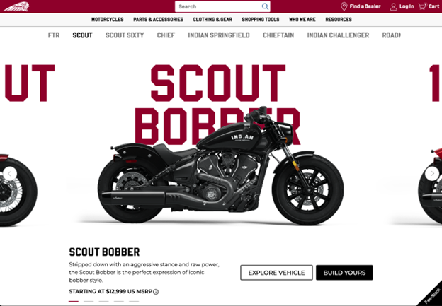
Or, if you check out Indian Motorcycle, you’ll see how hard this business works to evoke a feeling of adventure with its story-driven branding elements. The site’s UI uses a dark shade of red that encompasses the brand’s rebellious spirit. The typography, visuals, copy, and CTAs all align with the idea of rugged power, which is attractive (and pretty unforgettable) for consumers searching for the next exciting chapter of their lives.
Source: indianmotorcycle.com
Engage First-Time Web Visitors with a Story-Driven Hero Section
Positioning high-impact UX elements — like USPs and CTAs — in the first screenful of your hero section is an exceptional way to draw attention to your offer’s unique value.
However, while many consumers employ a practical approach to evaluating potential solutions to their pain points, many make purchase decisions based on their emotions, instincts, or aspirations.
In fact, GWI discovered that 39% of people are aspirational consumers, making purchase decisions based on their hopes and dreams for the future.
With this in mind, an excellent way to employ storytelling in your UX design is to show your prospects the outcomes they could secure by investing in your solutions or services.
For example, if you want to encourage awareness-stage consumers to enter the sales funnel, why not address a frustration or pain point they’re experiencing?
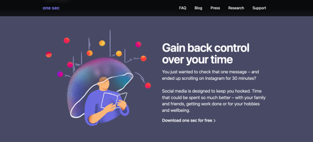
OneSec does this by supporting its value propositions with micro-stories. Each of these premises helps define a common user frustration. More importantly, they position OneSec’s solution’s benefits as ultra-relevant to the brand’s audience. After all, we have all found ourselves mindlessly scrolling for much longer than intended. So, by creating a relatable narrative highlighting people’s need for a solution, OneSec ensures that its value propositions come off as hyper-relevant to anyone trying to cut down on their screen time.
Source: one-sec.app
Alternatively, you can show your prospects an aspirational outcome through visual storytelling or your copy. This UX design strategy can inspire them to consider their pain points. It can motivate them to take action. Finally, it can draw them into the sales cycle by encouraging them to begin their journey of resolving their pain points.
Pinch utilizes its hero section to grab web visitors’ attention with an invitation to enjoy “clinically-approved med spa treatments from the comfort of [their homes].” Then, it presents web visitors with aspirational visuals throughout the site to set their expectations regarding what such an experience can look like for them.

Source: bookpinch.com
Transform Navigation Menus into Logical and Compelling Journeys
Navigation menus are crucial in UI and UX design. But while their primary functions include organizing and categorizing content, ensuring usability and accessibility, and supporting conversions, it’s essential to remember that the primary role of a navigation menu includes supporting user goals.
Ultimately, your site’s navigation isn’t just a tool that lets web visitors jump from page to page. Much more than that, it’s an invitation for your prospects to move on to the next stop on their buying journey.
So, what better way to inspire your target audience to move down the sales funnel than to present your navigation as a narrative-driven journey that compels your audience to take action?
For example, Birdeye understands that trading isn’t simply a financial activity. But, for many, it’s an experience and opportunity to reach their monetary goals. It is precisely for this reason that the brand enhances its navigation menu with bite-sized instances of storytelling. Instead of telling web visitors to trade, it invites them to “find gems.” Moreover, instead of promising earnings, it creates a competitive environment where users can “zoom in on every wallet” to see how other platform users are doing on their investing adventures.

Source: birdeye.so
Add Context to CTAs with Narrative Microcopy
CTA buttons are some of the most important UI elements for driving conversions. Yet, over the years, they’ve become rather uniform, with most simply asking web visitors to take action.
Now, while this approach works — especially when you avoid the pitfalls of poor UX design — you can still enhance site performance by using narrative-driven microcopy to support your calls to action. By showing web visitors how their actions affect them (or those involved), you can effectively inspire them to convert while putting them in the position of a story’s hero.
For instance, check out Save the Children. This charity has an amazing Donate Now CTA section, and it’s not just interactive. By using storytelling, the element shows web visitors precisely what a specific amount of money can provide to those in need. That’s a fantastic way to put even the smallest of sums into a bigger context.
Gamify the Shopping Experience with Micro-Quests
Integrating game mechanics into your website’s UX design is an exceptional way to boost on-page engagement and conversions. So, if you’re looking for ways to elevate the browsing experience for your web visitors, investing in gamification could be the perfect strategy for your brand.
Ultimately, gamification doesn’t only rely on storytelling to create a quest-like setting for your web visitors. It also allows your prospects to take on the main character’s role, which is super effective at encouraging user action.
When implemented in a way that turns user actions (like adding an item to a cart) into trigger points of a narrative, gamification can make your website more attractive. It can ensure that prospects notice the key benefits of shopping with your brand. Finally, it can even make brand interactions more memorable. That’s particularly important, seeing that consumers tend to buy from familiar brands.
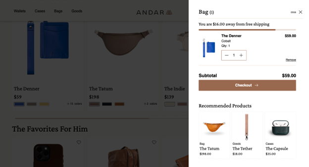
For example, one easy way to gamify the shopping process with micro-quests is to do something similar to Andar. This brand has several UI features in its Bag aiming to maximize average order value. If you look at the top of the element, you’ll see a “You are $16 away from free shipping” message. This message acts as a challenge to web visitors and an incentive for them to browse the products featured in the cross-selling section below.
Source: andar.com
Transform Social Proof Elements with Journey Stories
Despite being essential for attracting and converting your target audience, branded content isn’t always enough to nudge your prospects to move from the evaluation to the purchase stage of the sales funnel.
So, if you’re looking for tactics to elevate your site’s performance, you must incorporate social proof in your design.
After all, 99.5% of people conduct product research before investing in a solution. And if you look at data on resources consumers consider credible, you’ll find that they find user-generated content to be far more trustworthy than branded claims and resources.
But, social proof — especially in its traditional forms like ratings and reviews — can be monotonous and dull. So, if you want to make it pop, why not enhance it with a storytelling element that will paint an authentic picture of what your products and services deliver in real life?
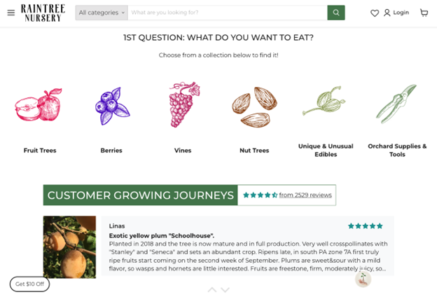
For instance, Raintree Nursery has a super-engaging Customer Growing Journeys UX element on its website. Here, the brand shares user-submitted narratives describing the specific outcomes and challenges customers have experienced since buying from the business.
Source: raintreenursery.com
Show the ‘Why’ Behind Your Brand’s Existence
When looking for opportunities to improve your UI/UX design, you must understand what consumers — and your specific target audience — want from brands.
Research shows that there are multiple factors buyers consider before buying. However, one trend that’s been growing is people’s wish to support authentic brands whose mission and values align with their own.
With this in mind, it’s a good idea to use your website to establish the causes your business supports. By adding story-driven UX elements, you can build strong emotional connections with your prospects, thus maximizing their chances of using your products and services.
Check out how CapitalPad does it. In a section that outlines the founder’s experience with small businesses, the brand shares the “why” behind its existence. It firmly establishes CapitalPad’s mission and aspirations, which perfectly align with the goals of its target audience.

Source: capitalpad.com
Animate UI Elements to Make Interactions Engaging, Intuitive, and Memorable
Finally, as you explore ways to use storytelling to improve your UI and UX design, remember that, sometimes, the best way to add a narrative dimension to your website is to make it fun for visitors to use.
By adding animations to your UI elements, you can make them a part of an engaging and memorable experience. And, you can build excitement among your prospects, helping them feel enthusiastic about using your solutions.
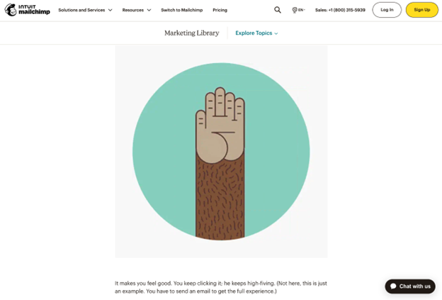
Mailchimp’s animated “Send” button is perhaps one of the best examples of integrating storytelling within the UI design process. Clicking the element brings up a GIF of the brand’s mascot inviting users for a high-five. The result? An entertaining and memorable animation, a sense of accomplishment for the user, and an elevated brand perception that have turned out to be one of the drivers of Mailchimp’s impressive growth journey.
Source: mailchimp.com
Guide Web Visitors through the Product-Discovery Process by Asking Them to Share Their Stories
While one way to use storytelling in your UX design is to construct the narrative yourself, there’s another, more effective way to engage your target audience and inspire them to move through the sales funnel.
Instead of presenting web visitors with a ready-made story and trying to compel them to become immersed, why not build a narrative around their needs and experiences? This is relatively easy to do with interactive elements such as quizzes.
This type of interactivity is also known to boost website engagement rates by over 52%. The benefit can be especially important when trying to capture awareness-stage leads in fast-growing competitive industries like fitness, beauty, and health.
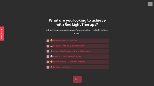
For example, check out Infraredi. This brand invites prospects to take a quiz to help with product discovery. But, by adding a narrative element to the questions – asking prospects to share their aspirations and specific needs — it manages to present future buyers with highly personalized results. The tailor-made product recommendations will help make them feel more confident in their purchases.
Source: infraredi.com
In Closing
Incorporating storytelling in your UI/UX design is always a great idea. And with the nine strategies discussed above, you’re guaranteed to see positive results.
Whether you decide to implement one or all of the tactics from this article, remember that it’s crucial for you to perform in-depth user testing. Ultimately, you can guess what types of narratives will evoke positive emotions among your target audience. But without data to back up your predictions, you can’t be sure.
So, ensure you approach the process with an open mind and a willingness to make necessary changes. And always remember that the point of narrative-driven design isn’t necessarily to boost conversions. Instead, it’s to create strong bonds with your audience that have the potential of transforming into purchases down the road.
- The UX of Trust: Why Design Can Make or Break Brand Credibility - November 24, 2025
- 6 Ways User Experience Shapes Customer Decisions Across Industries - October 13, 2025
- UX for Niche Markets: How to Design User Experiences for Specialized Industries - July 29, 2025
![]() Give feedback about this article
Give feedback about this article
Were sorry to hear about that, give us a chance to improve.
Error: Contact form not found.


