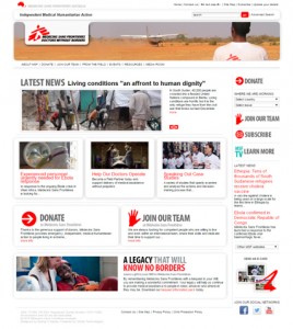
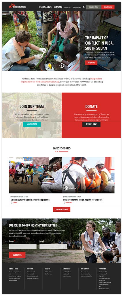
Médecins Sans Frontières (MSF) is one of the world’s leading independent organisations for medical humanitarian aid. Every year nearly two hundred Australians and New Zealanders are sent to and supported in the field by Médecins Sans Frontières Australia.
MSF ran a Loop11 study on https://www.msf.org.au/ to collate visitor feedback and form benchmarks on their existing website to guide development of a new website. Their test was comprised of 7 tasks and 20 questions.
Sean from MSF describes; “Our approach was to gather evidence from a number of sources (internal survey, Google Analytics, and usability testing) that would help identify problem areas that would need to be addressed in our future website, and also opportunities for improved engagement with our key target audiences. Our hope was that by fixing any usability issues, and improving our information architecture and content strategy, we could achieve our objectives of recruitment, fundraising, awareness-raising and advocacy more effectively.”

MSF didn’t want to assume anything going in to the usability test, but they did have feedback from an internal survey which showed staff thought there were usability issues surrounding the navigation menu, and that some content was difficult to find due to the information architecture (IA). Armed with that information they wanted to measure whether that was actually the case with real-world users and looked around at various online tools that were available. Deciding upon Loop11 as the best fit they designed a test that would cover a variety of areas of the website, requiring users to delve into different sections of the site to find the correct pages.
“The tasks where we asked users to find specific pages on our website were the most beneficial aspects of the testing we did with Loop11. It not only helped to identify problem areas, but also gave us a benchmark that we could then use to compare whether those specific tasks became easier or harder to complete on the new website.”
The initial testing confirmed the problems with their navigation which inturn focused their efforts on simplifying the navigation for the new website.

Once the new design was ready, it went live and MSF ran an identical Loop11 study on the new website. They recruited their participants via social media as well as using an on-site pop-up which invited every fourth visitor to participate in the study.
The resulting data from the second round of testing, on the new website, showed that great strides had been made utilizing the learnings from the initial test. The overall success rates from the 7 tasks rose from 61% in the first test to a near perfect 91% in the second test.
Other significant results found in the second test were:
- Across all tasks in the first test 25% of respondents believed they had successfully completed a task, when they had actually failed. This dropped to 5% in the second test on the new website.
- The first test recorded an average of 3.4 page views per task which increased slightly to 3.5 page views per task in the second test. However, the average time to complete the tasks dropped from 94.4 seconds per task to 48.1 seconds per task. This halving of task times show that it’s not all about minimizing page count, but rather it’s about maximizing your IA and ensuring your on page content is clear and well written.
- 14.3% of users gave up and abandoned tasks in the first test which improved to only 3.7% of users abandoning tasks on the new website. Much in line with the above point, this shows that the improved IA didn’t leave users feeling confused or helpless in their search for content.
Sean adds; “Aside from the quantitative measures, the Loop11 test also allowed our users to provide qualitative feedback on what frustrated them most about the old website. The results in the second test showed that there was a clear improvement in the overall sentiment of comments on the ease-of-use of the new website, which was encouraging.”
When participants were asked whether they felt a task was easy to complete only 57% answered either easy or very easy in the first test, which was boosted to 73% in the second test.
The experience MSF had demonstrated a blue print to how companies can discover usability problem and achieve certainty in direction when addressing problems with an existing design. Then, having implemented this information into the new design or product, how they can obtain significant and accurate data to measure the efficacy of their changes.
- Introducing Loop11’s Tester Panel - March 24, 2020
- Our Response to the Coronavirus - March 17, 2020
- Release Notes: 5 Second & First Click Tests, Image Testing& More… - October 17, 2018
![]() Give feedback about this article
Give feedback about this article
Were sorry to hear about that, give us a chance to improve.
Error: Contact form not found.


