While XML sitemaps are slowly becoming standard for website development, UX sitemaps are relatively new. However, a UX sitemap is essential for UX designers and marketing experts because it allows them to understand users better, improve their experience on the site, and bring companies closer to their business goals. It’s a crucial element to implement, whether you’re coding a site from scratch or using landing page builders.
So, what is a UX sitemap, and how to create it? Read this article to find the answers.
What Is a UX Sitemap?
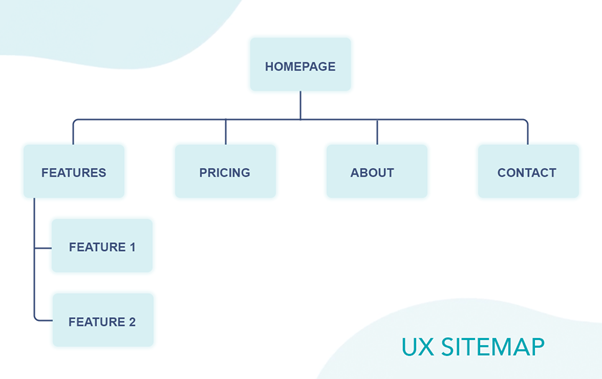
A UX (User Experience) sitemap is a diagram of the various pages included in your website or app. Its primary purpose is to visualize the relationship between the given pages (URLs) or site elements. The UX sitemap plays a vital role in developing websites. It helps you improve website navigation and prevents you from missing out on the critical parts of your website’s architecture, delivering a better user experience. It also allows web owners to understand how users use and navigate their websites. For UX designers, a UX sitemap is an important planning tool needed mainly in the early stages of the UX design process.
A UX sitemap is sometimes called a content outline or information architecture (IA).

Image 01: UX Sitemap example
How does a UX sitemap differ from an XML Sitemap?
The term “sitemap” is mainly associated with the XML sitemap in the marketing industry. It’s a file in XML format which contains a list of pages that make up the website. The file provides information for search bots like Google (and also Yahoo, Bing, and other search engines) about the site structure and gives instructions about which pages need to be scanned by robots. In addition, there may be information such as the date of the page’s last modification and the priority of a given subpage for a search engine in the XML sitemap.
Generating a sitemap as a file in XML format is supposed to facilitate the processing of the website by search engine robots and proper indexing of the website content.
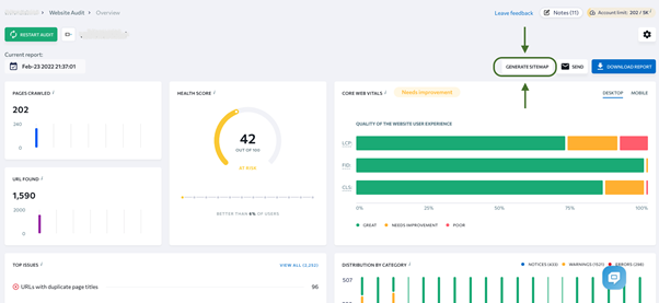
You can check the XML sitemap of your website using tools such as technical site audit by SE Ranking that checks your website structure and all its pages. Moreover, if you don’t have such a file on your website, you can use this tool to generate it automatically.

So how does an XML sitemap differ from a UX site map? Below you will find four key differences:
| UX Sitemap | XML Sitemap | |
| Main purpose | visualizing the relationship between the individual pages of one webpage | allowing search engine robots to scan web pages more effectively |
| File format | can be generated as an image file | XML |
| Target | UX designers | search engine crawlers |
| Contents | all pages, including login in/non-public pages | pages that search engines should index |
| Importance | spots errors that users might be facing improves user experience improves website navigation | shows the website structure to search engines to point out which pages are essential and should be indexed.saves search engines crawlers’ budget |
5 tips for creating an effective UX Sitemap
Creating a UX sitemap is especially recommended for site owners with complex websites with multiple subpages. It will help improve your site’s navigation, enhance the user experience, detect errors, and create instructions for the team working on the site design and development.
So when is the best time to create a UX sitemap? Well, it’s best to make it early on in the UX design process, right after the discovery phase. However, it’s still worth doing if you already have a website, especially if you plan to expand it further. But in that case, you should conduct a site audit before designing a new UX sitemap.
Do you want to learn how to create such a UX sitemap? Here are 5 key steps you need to follow to get the best results.
1. Start with good preparation
As with any business process, creating a sitemap needs a good plan and preparation. You first need to determine what information you want to provide to the users and what role your website’s strategy should play. For example, if you run an online store, the main purpose of your site will probably be to sell your products. If you write a blog, the purpose of the site might be subscription sign-ups or there might simply be a large number of readers. If you run a small business website, the goal might be to make it easier for your potential customers to find key information about your company, encourage them to do business with you, and generate leads.
Depending on your site’s purpose, you should arrange information and navigate the user through the site to achieve the desired result.
It helps if you choose the people responsible for creating the UX sitemap design during the planning process. It’s a good moment to talk about your ideas, visions, and perspectives and find a preliminary solution to satisfy all stakeholders.
2. Create a sitemap-navigation
In the next step, create a draft of your site navigation. Start with the homepage, and then identify the pages that the user will go to directly from it. These should be in the second category. For example, the second category pages are usually “About Us,” “Contact,” “Features,” or “Services,” etc. If, for example, you offer a tool with multiple features and each has a separate sub-page, that’s already a third category page (see Image 01).
Remember that your navigation should be as accurate as possible and include all pages, even such as “Privacy Policy” or “Terms.”
It’s also worth considering your plans for further development of the site and including the pages you plan to implement. It will make it easier for you to design and plan where to place the website’s new elements in the future.
At this stage, it’s worth using a UX tool such as Loop11 that offers a usability analysis of your website with users performing real tasks. It will allow you to understand user behavior better and how and why they use the website.
3. List parent and child pages
Remember to focus on convenience and a positive user experience when creating your navigation. Your site needs to be clear and easy to use and navigate. Ensure that the users can find what they are looking for and that they’re in a place that brings them closer to the goal that you set in the previous step.
How to do it? Create a list of parent and child pages that will be easy to navigate from the user’s perspective. Consider how to organize the page architecture to make it as natural as possible. Focus on adding clear labels in the form of page titles and make sure there’s a logical correlation between the main page and the second-level, third-level, etc., pages. All related content should be easy to find on lower-level pages linked from the higher-level page. Enable users to easily return to start pages. The higher-level pages should contain sub-navigation or links to related content.
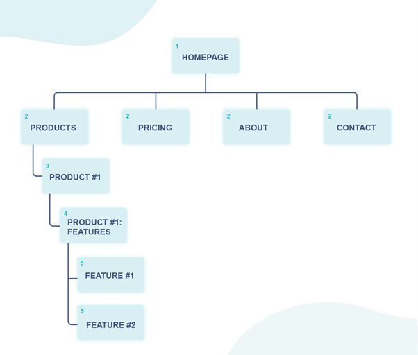
How do you organize content on your site? The lower down in the diagram a page is, the more detailed information it should contain. Imagine you’re an online tool vendor, and you’ve just decided to create a page that describes a specific feature of one of your products. What should the navigation look like? Look at the order at the bottom:
1. Homepage
2. Products
3. Product #1
4. Product #1 – Features
5. Specific Feature of Product #1

Image 02: Parent and child pages
Additionally, it’s a good idea to plan your URL structure at this stage. For example, if you want to include a category in a URL, it can look like www.company.com/products/selected-product. But don’t make URLs too long and complex.
In this step, you can also add annotations about the details of the development of each section. For example, you can add information about the purpose of each page and what kind of content will be placed there (for example, videos, attachments, contact forms, maps, etc.). If you have any additional instructions, it’s worth adding them: the more information that helps you visualize how your site works, the better.
These elements are essential, and planning for them will streamline future development and allow you to create a site that is perfectly suited to your users’ needs.
4. Test a few various scenarios
As with all important business decisions, when it comes to your site’s navigation, you should run a series of tests to make sure you’ve chosen the best solution. Prepare different scenarios to help your team visualize and select the best site structure for your users.
To do this, it’s a good idea to create various user personas and project their journey through your site. Don’t be afraid to experiment with different ways of grouping content to figure out which path will meet your users’ needs and get you closer to your goal in step 1. Sometimes every little detail can make a huge difference.
Remember that every person is different and may behave and move differently on a website. It would be best if you explored every possible way and double-checked any details, even ones that may not seem obvious to you.
Creating different scenarios is very important in planning your entire site design, as it helps you create a structure that will provide the best experience for your site users.
5. Share the site map with your team
As mentioned above, every user is different, and everyone may think differently. Therefore, when designing your site’s sitemap, you should show the result of your work to your colleagues in the company. They may be marketers, web designers, content writers, development team, etc.
It would be a good idea to include people from different company departments in this process. You need to know different perspectives to collate and discuss with each other. It’s also a good idea to include people who don’t work with the site every day, as they may have a fresh perspective and be the voice of your potential users. Don’t forget about the leadership team. They should get a clear picture of what you’re going to make.
Conclusion
Creating a UX sitemap is not tricky, but it does take a lot of time and effort to prepare it well and provide the best user experience possible. Without a doubt, it’s an essential element for the whole business which can bring a lot of long-term benefits to your company.
- Can a Website Sitemap Create Better UX? UX Sitemap Guidelines - April 11, 2022
![]() Give feedback about this article
Give feedback about this article
Were sorry to hear about that, give us a chance to improve.


