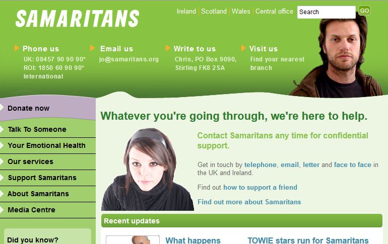
Samaritans is a charity in the UK and Ireland specialising in confidential emotional support. It offers its invaluable service 24 hours a day for people who are experiencing feelings of emotional distress, despair or suicidal thoughts, using trained volunteers to respond and lend help to phone calls, emails and letters.
Relying entirely on donations and volunteer help, Samaritans’ website is the crucial portal through which the charity operates. To improve the charity’s on-line portal, Samaritans sought the services of user-centred digital communications’ specialists, SiftGroups, with a view to redesigning its website.
THE PROBLEM
It was unknown whether the established Samaritans’ website was meeting the needs of current donors, volunteers and those needing emotional assistance.
THE BRIEF
SiftGroups ran a project to explore the usability of Samaritans’ established website with a view to informing how to shape its approach to the forthcoming website redesign.
THE ACTION
SiftGroups conducted an online usability appraisal of the current Samaritans website with 149 participants, providing an overall snapshot of how well core strategic tasks were performed by the site’s main audience types. The key areas SiftGroups assessed included vitally important and fundamental site tasks for the charity:
- Getting Help
- Making Donations and
- Becoming a Volunteer.
The study was distributed to both “warm” and “cold” users that came from Samaritans’ wider internal email database. Help tasks and questions were devised linking participants to the actual site to better determine user satisfaction, validate task completion and enable SiftGroup’s to form a strategic recommendation for the navigation of the new site design.

THE ANALYSIS AND RESULTS
Upon completion of the evaluation, the real-time reporting capability allowed SiftGroups to track and evaluate the task completion rates and monitor the navigation path of participants. The results showed that only half of the participants successfully completed the tasks, identifying in more detail those areas requiring addressing for the site remodeling.
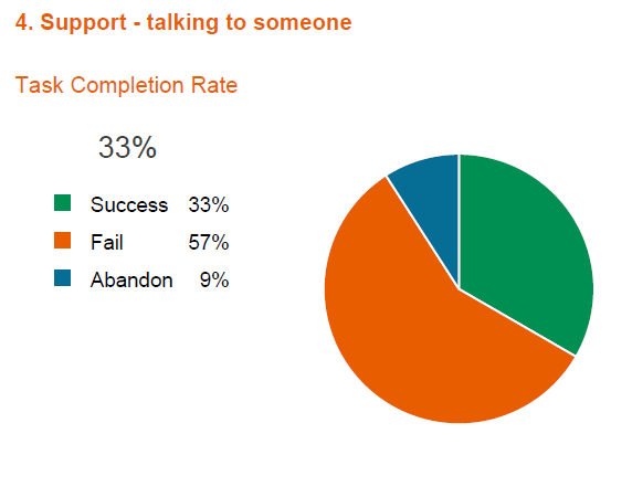
In particular, the results showed a significant issue with the current site navigation when it came to those in need of finding ways of talking to friends they’re worried about with 66% of participants either failing or abandoning the task of “talking to someone” altogether.

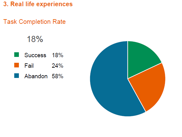
The results also revealed the need to improve the retrieval of the all important real life case studies, which encourage those thinking of seeking help as well as volunteers and donors:
As a result of the study, SiftGroups was able to provide a strategic recommendation for an improved usability experience using hard statistics to back up new navigation models.
LOOKING TO DO SOME SIMILAR, EFFECTIVE USABILITY TESTING?
With its proven track record, Loop11 will help you get the most out of your website. Providing the ultimate online usability testing experience, Loop11 will reveal some startling home truths about your website usability generating quantifiable results and delivering real time performance without the cost of lab-based testing sessions. It’s fast, affordable, simple to use and easy to get started straight away from the comfort of your own office. Sign-up now or discover another Loop11 success story here.
![]() Give feedback about this article
Give feedback about this article
Were sorry to hear about that, give us a chance to improve.


