In an era of overstimulation and addictive technologies, we are in dire need of intention over attention. Unfortunately, because users now have a shorter attention span, many designers are focused on builds that utilize even more addictive features to persuade users to stop and click. But this just adds to the addictive process whereby users are simply taking mindless actions and aren’t necessarily connecting with the design or the brand.
If there is a lack of connection, then there is no real value for the user, and if there is no value, then there is no reason for the user to return. In other words, this type of design does not truly enhance the user experience nor will it help with retention.
Instead, designers must start creating builds with more purpose and intention, which requires taking on a more psychological perspective. You must understand what users truly want and how they think to engage them without being exploitative.
It’s about getting users to take an action with thought as opposed to taking an action simply because they were persuaded to do so with flashy design. When the design is intentional, the actions the user takes will be more intentional, and they will genuinely connect better with the content.
Bypassing the “Lizard Brain” with Intentional UX
Our brains have essentially undergone a sort of remodeling in the past several years due to over-exposure to digital technologies and addictive interfaces. This has led to people being less intentional and more anesthetized. We are numb.
Our senses are bombarded with an overload of information but we can only actually process a small amount of what we are being fed. This leads to our “lizard brain” or limbic system taking over, which results in more actions being taken based on instinct as opposed to rational making.
For this reason, UX designers need to start using brain science to combat this issue and influence the user experience more intentionally. Exploitative, unintentional design will only continue to trigger the lizard brain, but intentional design will create awareness and thoughtful action.
Some designers have already started addressing this issue by using the acclaimed Hook Model, which is a framework for UX design that connects designer solutions with user problems. However, some believe that we now need a pre-action phase before running through the phases of the Hook Model.
This pre-action phase is meant to create a layer of friction before a user even proceeds with their action, thereby creating a more intentional space that promotes mindful decision-making. An example of this could include content customization, where users are given the choice to shape the content they see, which gives them the power as opposed to content simply being forced on them.
Another example of this is opt-out empowerment, where the user is provided with the choice to opt out of receiving certain information, such as giving a user the choice to opt out of personalized ads.
There are numerous other examples, but the idea to take away is that this pre-phase in UX design should be about engaging users in a way that gives them more power and control. This then forces them in a way to be more conscious of the actions they are taking. You want to reinforce more purposeful choices, not take choices away.
Creating a Navigational Flow with Visual Hierarchy
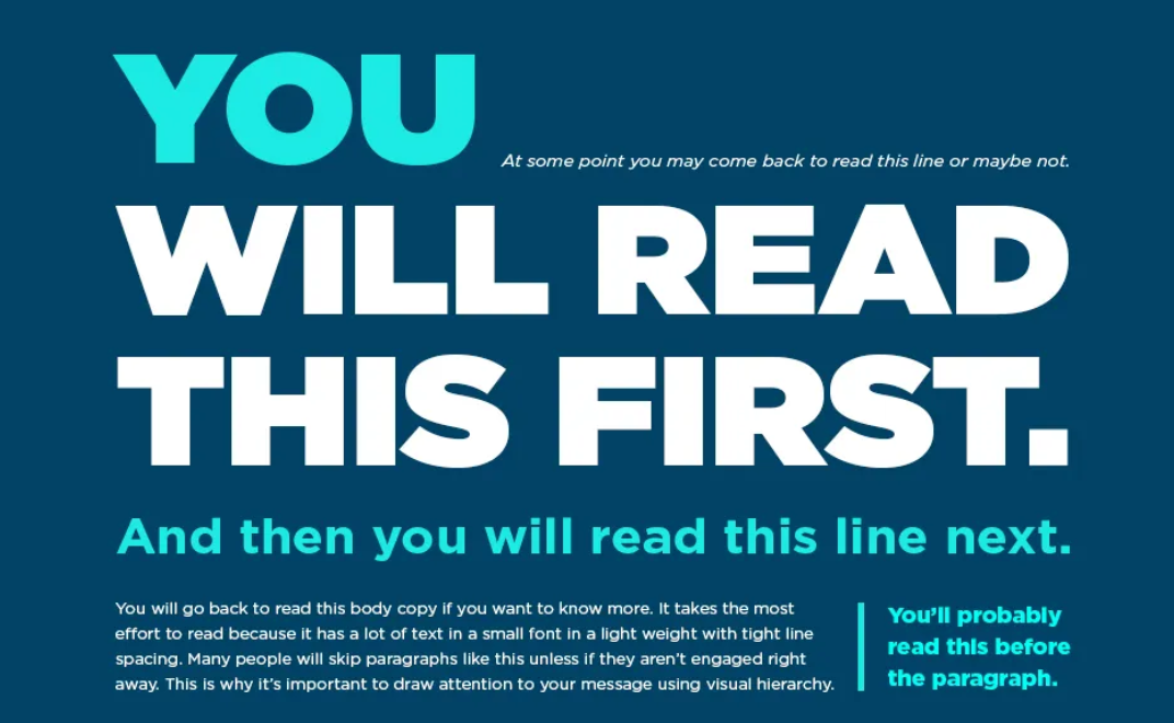
Another important step in creating more intentional UX design is being mindful of how a page is laid out. Instead of a user landing on a page and mindlessly scrolling from top to bottom, it’s important to create a clear visual hierarchy that encourages them to stop and do things in a more specific order. Again, this enables the user to be more thoughtful when navigating a page as opposed to mindlessly blowing past everything without paying attention.
This can be achieved by using a 1 to 3 scale when defining a visual hierarchy for elements on a page, with 1 being the most important, and 3 being the least. To create this scale, you must first determine what the UX and brand objective is.
For example, if the user’s objective is to learn more about a service to determine whether or not it fits their budget and the brand’s objective is to encourage searches for a specific product, then the brand logo should not be the element that is most important on the page. Instead, some sort of messaging that aligns with the UX and brand objective should take precedence.
Again, this means each page must be created with more intention with a visual hierarchy that is specific to the brand’s AND the user’s objective. If you only focus on the brand’s objective, for example, this is when you start creating content that doesn’t hold much value to the user.
Tapping into Emotions with Color Psychology
Another important element that can help designers tap into the psychology of the user experience is color theory. Color can have a significant impact on our perception and how we experience something.
Even medical experts and psychologists believe that color can play an important role in how we feel. For example, blue is often associated with understanding, tranquility, and peace. Yellow is associated with joy. Green with growth, renewal, and harmony. Red with passion and energy. And violet is associated with imagination and spirituality.
So when designing for users, it’s important to be thoughtful about color choice. Colors should not simply be chosen because they fit the brand scheme or simply because they are attractive. Those are certainly still things that should be considered, but it’s also helpful to consider colors that will add to the experience by making users feel a certain way.
Additional Considerations When Designing for User Experience
We’ve talked about what you should do as a UX designer to enhance the user experience and tap into cognition, but it’s important to touch on things that should be avoided as well. For example, it’s crucial that designers be wary of cognitive bias when working on a build.
Cognitive biases can easily creep in based on your past experiences and perceptions, but user design should be free of bias. If you unintentionally (or intentionally) include your biases in your designs, it can influence the decisions users make, and not in a good way. So it’s important to be aware of your biases and how they could negatively influence user decision-making.
Another crucial thing to be mindful of are designs and builds that mirror scams. Cybercrimes are increasing rapidly with more users being active in the digital space. As a UX designer, this not only means ensuring your builds incorporate some form of cybersecurity, but it’s also important to avoid creating builds that might put users off because they seem “scammy” or suspicious.
There are a number of common business scams and tactics that cybercriminals use today, such as malware, social engineering, and phishing. So it’s important to ensure that the actions you are encouraging users to take do not put them at risk or make them feel they are being put at risk of having their sensitive data stolen or used against them in some way.
In Summary
With so much mindless scrolling happening on the internet today, UX designers must start being more intentional with their builds. Influencing a user to take an action is one thing, but influencing a user to take an action that puts them in control and makes them more aware of what they are doing is better. We want users to start taking more thoughtful actions as it will not only lead to better experiences but will also build better relationships, ensuring higher retention rates.
- User Experience in Rural Agriculture: Balancing Tradition and Innovation - June 4, 2024
- Nurturing UX-Centric Culture in Your Tech Startup - May 7, 2024
- Exploring the Connections Between Sustainability and UX Design - March 19, 2024
![]() Give feedback about this article
Give feedback about this article
Were sorry to hear about that, give us a chance to improve.


