The website is the face of the brand, and the company’s digital storefront in the online world. It holds immense value for a variety of strategic goals—from brand-building to customer education, and of course, revenue growth.
As a UX designer, you have numerous goals throughout the website creation process depending on the different goals that each section has. Different parts of the website will have different focuses, but all of those funnel into a single purpose, which is to sell.
When the time comes for a user to place an order, you as a UX designer, need to ensure that they have everything they need to make the right decision.
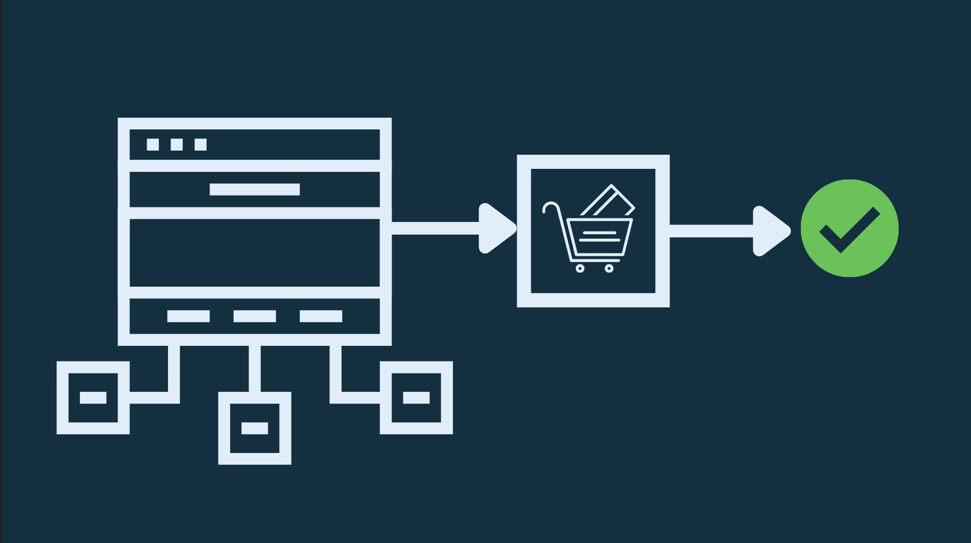
With that in mind, let’s talk about payment flows and the things you need to consider when designing this process so it is as smooth and efficient for the customer as possible.
Develop multiple payment options
First and foremost, people need to have choices. Don’t offer too many, but provide enough choices so they can feel free to buy products, services, and add-ons on their own terms.
This will require you to emphasize payment flexibility throughout the checkout process, even before the user has put anything in the virtual basket. The products or services pages you design need to stress the payment benefits for the user and give them options.
You can choose to include the one-off payment option, which might be accompanied by one for a recurring payment that offers a discount. All recurring payments should be integrated with invoicing software that grants the company ready access to customer information and accountants to have a clear overview of accounts receivables and payables.
For subscription-based products, you can design monthly and annual plans, with a nice toggle to switch between the two. Weave payment options into the design by implementing graphics corresponding to the payment methods and plans you accept.
Capture data without deterring users
The problem with modern online shopping and ecommerce in general is that users simply don’t have the time or the willpower to create accounts or fill out forms. People want a swift, no-fuss checkout process that allows them to get the job done quickly. This means that every prompt and field along the way is a deterrent to that goal.
Don’t get on their nerves. Instead, keep the process lean and straightforward. This is one of the rules of selling on Shopify and other hyper-competitive ecommerce marketplaces, where merchants have a limited window of opportunity to close the sale.
You can also give people the option to create an account after the purchase, and it’s always a good idea to lead it in with a value proposition. Tell them why they should make an account, and what benefits it brings.
On the other hand, make it mandatory for them to give you their email during checkout, allowing you to contact them with shipping updates and sales opportunities.
Dabble with generative AI
Generative AI has been all the rage in recent years, and many companies are integrating it in some form into their websites in order to enhance UX. Yes, generative AI is a modern fad and a trend, but these plugins and integrations make it easier for the user to engage with the site.
Some of the best generative AI examples are from customer service AI, which companies use to provide real-time guidance to customers. Conversational AI can be trained to answer simple questions about payments, specific products, return policies, and much more.
This is a convenient feature that customers will appreciate having because not everyone wants to engage with a human agent. What’s more, generative and conversational AIs allow you to alleviate some of the pressure on your human staff.
Offer support throughout the process
UX designers need to keep in mind that during this critical stage, the customers need guidance more than anything else. This is especially true for high-value purchases and subscriptions for services and software with higher price tags.
People will have questions, so one of the ways to communicate value and make them feel secure in their decision to buy is to prompt them to get in touch. Ensure an enhanced user experience by weaving multiple communication channels into the process.
Allow people to one-click reach the support staff either by phone, DMs, or even to jump into a standard contact form, but without interrupting their process. Coupled with some generative AI, it should be everything they need to make the right decision.
Upsell and cross-sell where it’s appropriate
The payment flow on a website should never be blatantly interrupted, but that doesn’t mean that you can’t supplement it with valuable prompts and promotions.
Upselling and cross-selling are viable options to offer, and good UX designers need to work with marketers and sales experts to craft these prompts throughout the checkout process. Learn what the unique value propositions (UVPs) are and put them into user-friendly designs.
This is where guidance again comes into play, and why proper communication systems are invaluable tools that allow you to communicate the value of your offer quickly. For example, you can implement a simple yet stylish one-click call system on every page throughout the process to prompt users to get in touch if they have any questions.
Make sure that all quality and safety assurances are present, with visuals emphasizing secure payments, fast shipping and support, and more.
Over to you
The payment flow of a website can, without a doubt, make or break the sale, which can put a lot of pressure on UX designers. That said, there are some key measures you can take during the design process to ensure a positive user experience for the vast majority of your customers.
On the other hand, always keep in mind that this is an iterative process. You can integrate these features to maximize your chances of converting as many users as possible, but always remember that it will take some trial and error to design your perfect payment flow.
- 5 Steps for Great Ecommerce UX Throughout the Funnel - January 16, 2024
- Designing Intuitive Payment Flows for Enhanced User Experience - October 31, 2023
- Gamification in UX Design: Enhancing User Experience and Engagement - September 26, 2023
![]() Give feedback about this article
Give feedback about this article
Were sorry to hear about that, give us a chance to improve.


