Once you have learned how to improve your website for conversions, your next job is to ensure that all of the people who make it to your shopping cart actually complete their purchase. Your online shopping cart can make or break the deal – here’s how to improve user experience so yours seals the deal as many times as possible.
Set up analytics to find problems early on.
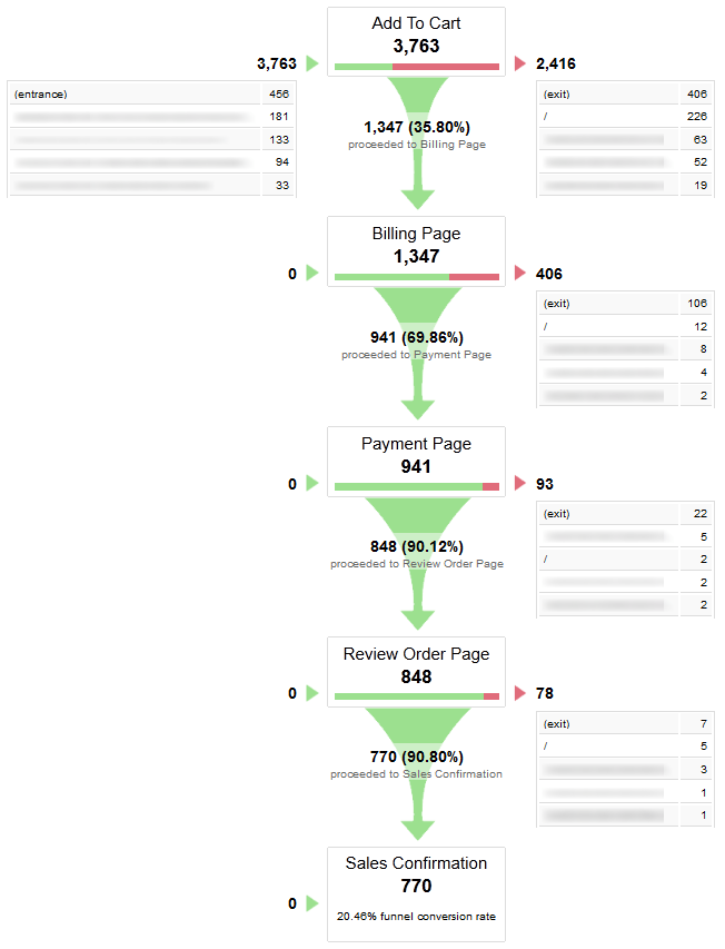
It’s never too early to set up analytics to find user experience problems early on, especially when it comes to shopping carts. Once you have set up Google Analytics, you can create goals using a sales funnel. This will track visitors throughout their shopping cart experience and produce the following report.

Now you can quickly see where people exit the shopping cart the most. This is a key piece of information when you are looking to find problems with user experience. In the above case, people are exiting after adding a product to the cart which suggests that this screen has some kind of user experience issue.
Avoid common user experience faux pas.
Think about your own experiences with shopping carts – the things that have frustrated you the most when making an online purchase. You will want to make sure your shopping cart does not drive your customers away because it does the following.
- • Makes people go through a complex registration process or forcing them to login. There’s nothing worse than wanting to make a quick purchase, not remembering whether you have an account, then filling out a new registration just to find that you already do have an account that needs to be completely updated. Allow for guest checkout instead to let first time customers buy without any hassles or repeat customers buy without having to remember details. Include an option to register for faster convenience for those how are interested.
- • Logs out of sessions too quickly and doesn’t remember where the user was during the process when logging back in. While security is important, if someone gets logged out and has to start all over with their purchase, they may get frustrated and give up.
- • Does not allow customers to confirm items in the shopping cart or change quantities throughout the purchase.
- • Signs customers up for a mailing list without their permission. While this may not affect the first purchase, it could affect the customer’s likelihood to return for future purchases.
Test your shopping cart on multiple platforms.
Maybe the issue with your shopping cart only happens on a particular browser or platform such as a mobile device. Be sure to test your shopping cart from start to finish from a variety of platforms including PC desktops plus all associated browsers (Internet Explorer, Firefox, Chrome, and Safari), Mac desktops plus all associated browsers, a tablet (such as the iPad), and smartphones including the Android and iPhone.
Run usability tests on your shopping cart.
If you can’t find usability issues on your own, try running usability tests on your shopping cart with a test audience. Sometimes it takes someone not as familiar with your shopping cart to find the problems.
Boost the customer’s confidence in your brand throughout the process.
Sometimes it’s not a functionality issue that hurts your shopping cart’s user experience, but rather a confidence issue. Customers need to be reassured throughout the online shopping process that they are going to receive exactly what they want where they want it.

Help assure your customer by including the following throughout the shopping cart.
- • Proof that your site is secure and trustworthy. This can include displaying badges to indicate a money back guarantee, an easy return process, a strong rating with the Better Business Burea, and a high customer satisfaction rating with sites like Bizrate.
- • A phone number or live chat that people can use during the checkout process.
- • A quick summary of the items ordered so they do not have to back out of the checkout process to confirm their selections.
- • A reminder that they can review their order once more before their credit card is charged.
- • An order confirmation screen that includes items to be ordered, shipping and billing addresses chosen, and the last four digts of their credit card or payment method.
What are some other things you would suggest on how to improve user experience with a shopping cart? Please share in the comments!
![]() Give feedback about this article
Give feedback about this article
Were sorry to hear about that, give us a chance to improve.


