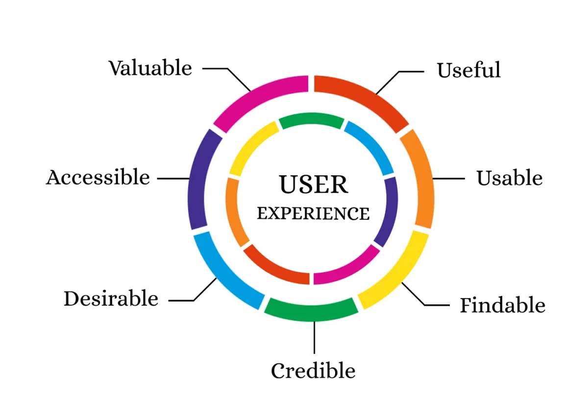
Employing design to improve the user experience on your website is a surefire way to guarantee the results you’re after. UX design can help you wow your target audience and play a significant role in converting new customers.
However, to maximize the ROI on your marketing (and web design) strategies, you need to think further ahead than making a sale. In other words, to ensure the longevity and profitability of your business, you’ll want to work toward nurturing loyal returning customers.
The marvelous thing about investing in UX to boost customer retention is that it’s an effective way to encourage buyers to return to your site. But there’s one more thing you need to consider.
According to experts, customer acquisition costs up to five to seven times more than customer retention. So, if you want your design and marketing efforts to yield results while contributing to customer lifetime value and loyalty, focus on retention-boosting UX tactics. Read on to learn how you can do it.
Get the Basics Right
If there’s one thing you must do to improve the browsing experience on your website, it’s to focus on the basic principles of good UX design.
Essentially, web users have zero tolerance for poor UX. Between 30% and 41% of people will stop interacting with pages that load too slowly or don’t display well on their screens. And 88% of web users won’t return to a site after having a bad experience.
So, as you explore ways to provide web visitors with a stellar browsing experience (and encourage them to become return customers of your brand), pay attention to the following elements of UX design.
Technical Web Performance
Speed and mobile responsiveness are crucial for winning over loyal customers. Why? Because today’s consumers need convenient access to product information regardless of the device they’re using to research their purchases.
According to Statista, the current share of global traffic coming from mobile devices is 54.67%. But even more importantly, 78% of consumers visit a retailer’s site while shopping in-store, showing how important it is to create a seamless online presence that works for on-the-go browsing.
Additionally, pay attention to site speed to guarantee your prospects have a positive experience browsing your offer. Google’s research discovered that a mere 3-second page speed decrease boosts the chances of a bounce by 32%. So, try your best to avoid this faux pas to leave a positive first impression on your audience and encourage them to continue interacting with your website and brand.
Minimal Learning Curve
Web users love a beautiful site. Aesthetic appeal plays a huge role in leaving a positive impression on first-time visitors, which is why brands invest so much in web design and visuals — especially in competitive markets.
However, though people love interacting with pretty sites, they also want them to be predictable and easy to use.
So, when investing in UX design to impress web visitors and encourage them to continue buying from your brand in the future, pay attention to how prototypical the browsing experience is.
Ensure you present key, conversion-inspiring content in the right place and moment during the buyer’s journey. And do your best to create a website structure that makes sense to your target audience.
Want to see a great example of a prototypical yet aesthetically pleasing ecommerce site? Check out the Chisos homepage. It features a classic structure and layout (with a top navigation bar, a hero image showing off the brand’s primary product, a unique value proposition, a traditional CTA button, and a contact option). However, despite its predictability, the site looks visually stunning, works seamlessly, and makes it easy for online buyers to find what they need and purchase.
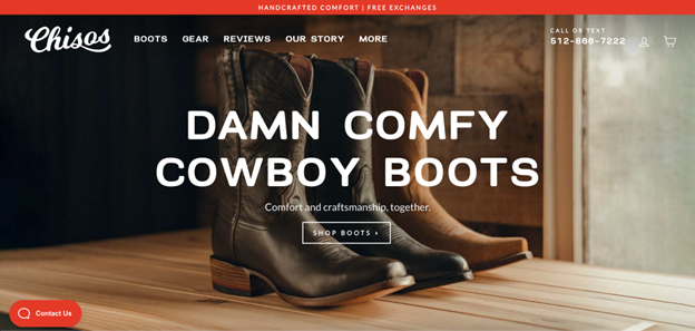
Source: chisos.com
Streamline the Checkout Experience
Do you know why people don’t go through with their purchases? Approximately 1 in 4 times, it’s due to the website having a complicated checkout process.
So, as you research the elementary ways to employ UX design to convert users whom you can nurture into return customers, explore tactics to make it convenient for web visitors to buy from your brand.
Whether that means not requiring shoppers to create an account to check out or allowing for express checkout options like the ones on the Melbourne Watch Company site is up to you. What matters is that the usability benefits your customers and makes it compelling to shop with your brand in the future.
Provide Exemplary Post-Purchase Support
Finally, as you work on the basic elements of a noteworthy user experience, remember that customer support is essential to today’s buyers.
A recent Forbes survey discovered that:
- 76% of people will go out of their way to do business with a company that provides better customer service.
- 86% of consumers will switch brands if it means receiving higher-quality support.
- Customer service is more important than price to 46% of buyers.
With this in mind, explore ways to utilize UX design to make post-purchase resources readily available and customer service easy to receive.
If you check out the School Notification System page on the DialMyCalls, you’ll see several UX elements dedicated to helping new and returning web visitors.
The site features a chat element in the bottom right corner of the page with a dedicated Help tab. Additionally, the design includes a clickable phone number in the top right corner of the page. Moreover, one of the primary CTAs invites new prospects to Request Information, understanding that many B2B buyers go through an extensive sales cycle before deciding to invest in a solution.
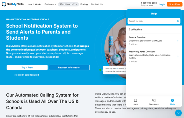
Source: dialmycalls.com
Highlight Lead-Capture Elements
Research shows that 84% of people have made impulse purchases while shopping online or in-store.
However, remember that most buyers go through a much more complex (and research-fuelled) shopping journey when evaluating solutions to their pain points.
The typical buyer’s journey requires approximately eight touchpoints to take them from the awareness to the purchase stage of the sales funnel. And when it comes to expensive purchases, the sales process can take even longer.
For this reason, your brand needs to explore ways to capture first-time web visitors as leads. Then, you can use email marketing or retargeting techniques to nurture subscribers/followers into customers.
For example, if you look at the Midcalf Length Grip Socks page on Gain the Edge, you’ll see that the bottom of the page features a compelling lead-capture element. This brand aims to convert subscribers by offering the chance to win free items — a tried and tested lead-generation strategy.
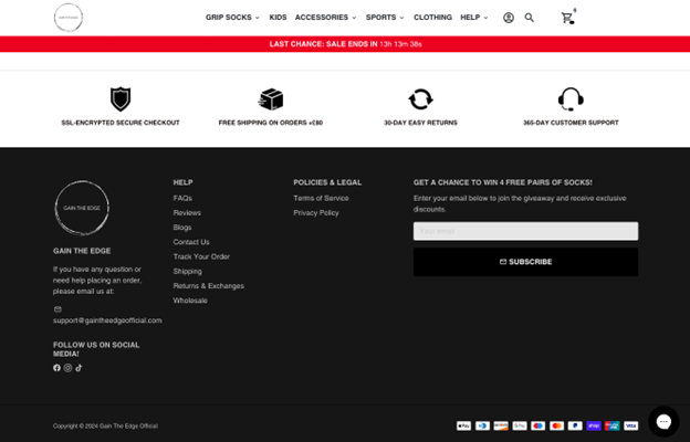
Source: gaintheedgeofficial.com
Of course, if you want to maximize your chances of capturing new leads and gaining the opportunity to nurture them into loyal customers, consider ways of making your lead-generation elements even more prominent.
For instance, check out the Isabelle Grace homepage. It features a spin-to-win pop-up, which aims to capture new leads with an interactive element, adding a gamification dimension to the web-browsing experience and making signing up for a newsletter more compelling to first-time web visitors.
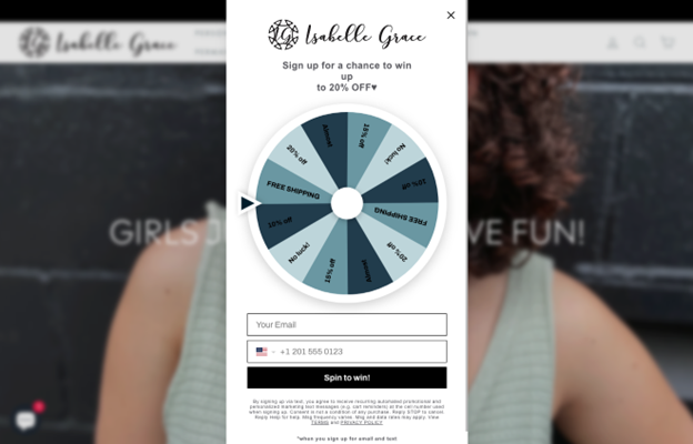
Source: isabellegracejewelry.com
Utilize CLV-Boosting UX Elements
Many strategies for using UX to turn more web visitors into returning customers focus on leaving a positive first (and second, and third) impression on web visitors.
However, sometimes, the best way to maximize customer retention is to employ UX elements that directly improve customer lifetime value.
Encourage Product Subscriptions
One of the easiest ways to retain customers — especially in ecommerce — is to present your target audience with the opportunity to subscribe to the consumable items in your offer.
While physical subscriptions haven’t been that popular before, they’ve seen a significant uptick in consumer interest over the past few years.
From a customer point-of-view, this increase in interest is due to factors like convenience and cost-effectiveness.
But, when aiming to maximize repeat purchases, remember that encouraging product subscriptions also benefits your brand. That’s not just because these plans prompt web visitors to spend more with your business. They also automate the repurchase process, giving your brand a more stable cash flow that doesn’t require a big marketing spend to re-engage existing customers.
To see an example of a brand doing product subscriptions splendidly, check out the Hydrate product page on Transparent Labs. Here, the subscription option is set as the default purchase method, and a 10% discount is advertised to make it more appealing. Moreover, understanding that most consumers have different needs, Transparent Labs allows them to select their preferred delivery frequency, further contributing to a pleasant and personalized shopping experience.
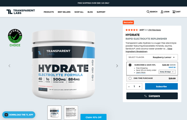
Source: transparentlabs.com
Create a Customer Loyalty Program
Another great incentive for turning your prospects into long-time customers is to develop and market a beneficial loyalty program.
According to Statista, 7 out of 10 Americans consider these programs crucial for securing their commitment to a brand. So, creating a reward program that honors return customers can be an exceptional way to maximize repeat purchases.
When developing this sort of scheme, you have to understand that consumers expect some significant perks in return for their loyalty.
Generally, discounts, cashback, and exclusive gifts make for excellent incentives for joining. However, you can also play around with more elaborate perks, like the exclusive club rides, trips, and free coffee that Rafa Cycling offers to its Club members.
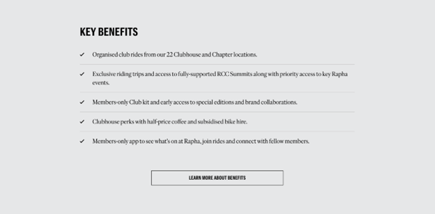
Source: rafa.cc
Personalize the Browsing Experience for Return Customers
Finally, as you explore ways to use UX to encourage customer loyalty, don’t forget that today’s consumers appreciate — and expect — personalization.
Research from McKinsey discovered that as many as 71% of people want brands to offer personalization, and 76% become disappointed when that doesn’t happen.
So, to encourage people to buy more from your brand, play around with methods to personalize the browsing experience for people who have shopped with you before.
For example, you could present visitors with their last-viewed items. You might make product suggestions based on past purchases. Or, you could even create personalized special offers based on a customer’s past shopping behavior. Take a look at the example from Aliexpress below.
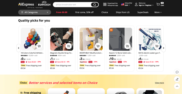
Source: aliexpress.com
Don’t Lose Your Customers’ Trust With Pushy Sales Tactics
So far, we’ve covered UX design techniques to inspire customer loyalty. But, as you explore ways to boost customer retention, you must understand that keeping your audience returning to your brand often depends on avoiding the things that harm the overall customer experience.
With this in mind, it’s essential to maintain your target audience’s trust by always keeping their best interest at heart.
In addition to not employing pushy sales tactics to encourage people to continue shopping with your business, consider other ways to make your website user-centric.
For example, if you offer a subscription, allow customers to skip a delivery or cancel their plan. That way, you’ll minimize their chances of having a negative brand experience and prevent them from perceiving your brand as an organization that is only focused on selling.
Check out the Native’s Subscriptions page. Here, the brand emphasizes that users can cancel anytime or change their fragrances and delivery dates to align with their changing needs and preferences.
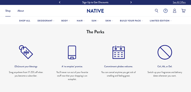
Source: nativecos.com
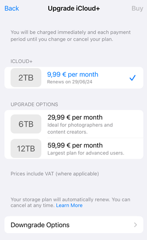
Or, for another example of customer-first UX, look at how easy Apple makes it for users to downgrade their iCloud plans. Ultimately, the brand knows that making the process difficult harms the customer experience and deters people from purchasing its products/services in the future. So, to avoid that mistake, the brand makes it super-easy to downgrade to a lower tier, knowing that a happy customer is much more likely to invest in an Apple device down the road than one who feels dissatisfied with the company’s subscription policies.
Source: Screenshot provided by the author
Employ UX Design to Ensure Customers Notice and Purchase New Products
Finally, as you explore ways to employ UX to turn more visitors into loyal clients, remember to use your site’s layout to promote new products and special offers that may interest your existing customers.
For example, when launching new products and features, promote them in a noticeable spot on your homepage to ensure return web visitors see them right away. For a more streamlined web browsing experience, do something similar to Buffer and employ notification bars to inform customers about new product capabilities.
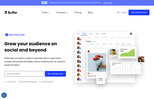
Source: buffer.com
Moreover, explore ways to add a dose of interactivity to your website to ensure your customers notice relevant offers.
The Tailored Athlete does this splendidly, and not just on its athletic fit pants collections page, but in the Search bar as well. Check out how it displays “Sale” tags to encourage customers to check out these products.
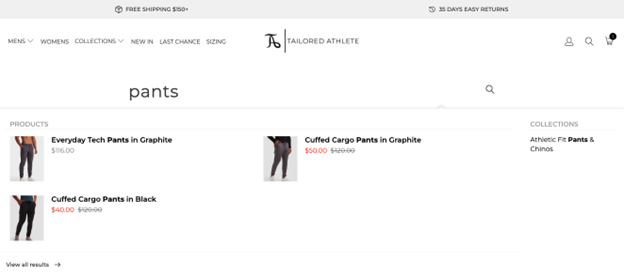
Source: tailoredathlete.com
In Closing
Creating a customer-centric user experience that encourages customer loyalty doesn’t have to be complicated.
On the contrary, it can be pretty straightforward. All you have to do is prioritize meeting your target audience’s needs and take the time to nurture prospects into return buyers instead of aggressively pushing them toward a conversion the moment they land on your site.
- 5 Ways to Leverage Emotional UX Design and Forge Strong Brand Connections - April 14, 2025
- 4 Ways to Use the Power of UX to Gain a Competitive Edge in 2025 - January 21, 2025
- 8 UX Mistakes That Will Hurt Your Conversions and What to Do Instead - November 5, 2024
![]() Give feedback about this article
Give feedback about this article
Were sorry to hear about that, give us a chance to improve.
