How often have you downloaded and deleted an app before even using it? You are not alone; statistics show that app user retention rate can be as low as 3.3% after 30 days of installation.
There are many factors to consider when developing a mobile app for your business. Selecting the right platform and technology is one of them, and this includes the onboarding UX. New users need help navigating through the app or website, and this experience determines whether they will delete the app or go ahead and use it and purchase it.
This guide will give you an ultimate guide to designing the user experience. If you want to learn more, then read on.
What Exactly is User Onboarding UX?
User onboarding UX refers to the process that begins once a new user interacts with your app or website. It can be as simple as a welcome message or as complex as tutorials on how to use the product. Still, the interaction goes a long way in determining customer retention and acquisition.
A good user onboarding UX also ensures that the user has seamless and error-free interaction with the product. Thus, building trust and confidence will ultimately be profitable for your business.
Why Is It Important?
Mobile app developers go through many challenges during development, and their ultimate goal is to ensure that the app is of benefit to the user. No matter how good or beneficial the app is, first impressions determine whether the app will be maintained or deleted by the user.
A user has probably taken their time to research the app, and downloading it indicates that they have seen something of value. But don’t be fooled by this; they probably have identified other apps that perform the same function and are trying to establish which one suits them better.
Giving the user a right-sized onboarding experience ensures that the user will go ahead and utilize the app to experience its use.
Note this; a study by MoEngage revealed that 56% of users deleted apps within a week of installing them, and 23% of them were deleted on the first day. Onboarding experiences are one of the factors that influenced their decision to stick with it.
Onboarding UX Methodologies and Patterns
Welcome Messages
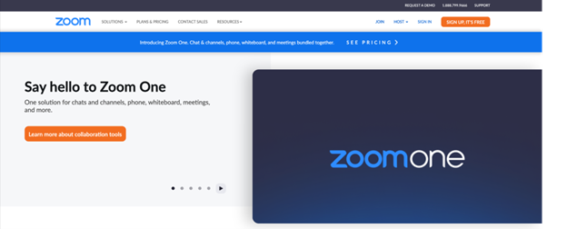
Zoom welcomes its new users with a simple ‘say hello’ message
Users see welcome messages the first time they interact with the app after downloading it. The message contains words like “Welcome” or “Hello.” After this, the user is instructed on steps to take next. Almost 90% of the onboarding sequence for new users begins with a welcome message.
Hotspots
Hotspots focus users on specific product features, often appearing as small dots or pulsating circles on the app’s interface. The goal is to enable the user to access the products’ biggest value ASAP and to introduce new features.
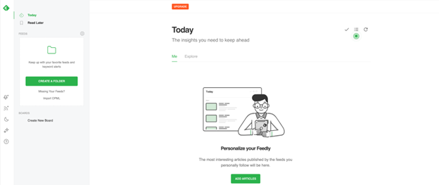
Feedly uses hotspots to highlight important features in their app.
Product Tours
Product tours are guides that help users familiarize themselves with the user interface. They often come as tooltips with pointers that contextualize and point out certain elements of the products.
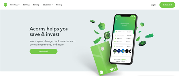
Acorn uses a simple message “Get Started” to guide its users through the app.
Checklists
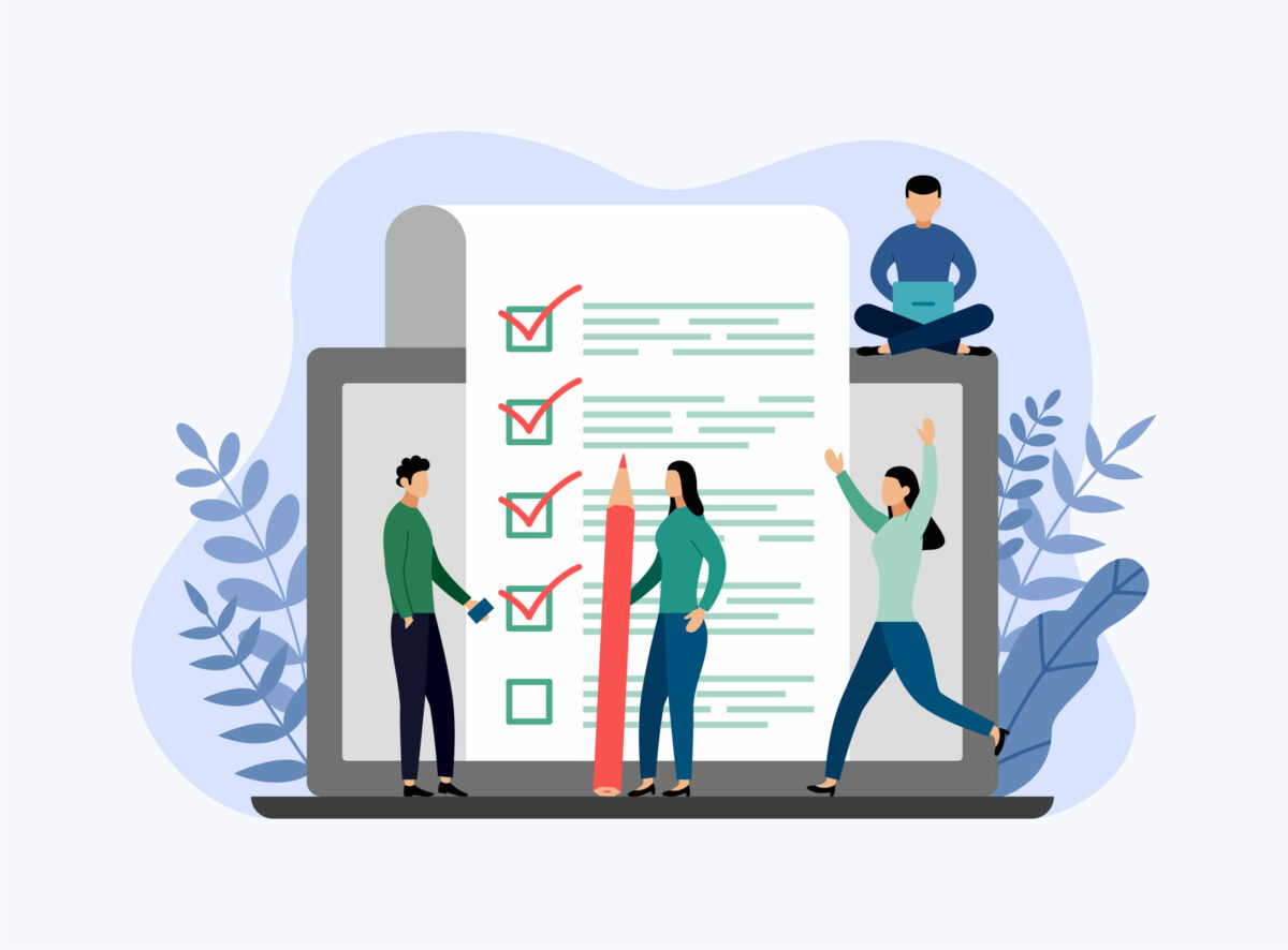
Checklists are visual representations of tasks that have been completed and those that are yet to be completed. They play the psychological role of motivating users to finish setting up or interacting with the product.
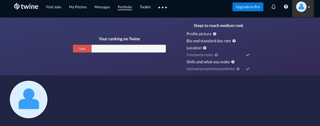
Twine uses a checklist to guide its users on steps to reaching their goals
Progress Bars
Progress bars are a visual representation of the user’s progress towards completing a task in the app. They motivate the user to complete the onboarding task.
Use indicators like dots, fractions, and dashes to indicate the progress of the process and how long to complete to encourage the user to complete the task.
Tooltips
Tooltips are messages within the app that pop up when one clicks, hovers, or stops at certain elements. The pop-up messages will disappear when the user leaves the specific element.
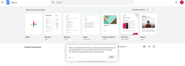
Google Docs uses tooltips to guide users on how to write a new document on the app.
Tooltips are used during onboarding UX to guide new users through setting up their accounts. Use tooltips sparingly because many independent-minded users will be put off by too many.
Deferred Account Creation
Most apps will require you to sign up before interacting with the product. However, deferred account creation allows the user to experience the app’s value before signing in. deferring the account creation allows signups from users who are a good match for the product.
Some apps only allow account creation after interacting with the landing pages. In contrast, others allow the users to sign up after a certain trial period or when the users decide to.
Persona-Based User Onboarding
Persona-based user onboarding allows new users to have different onboarding experiences based on their roles or outcomes. The onboarding UX prompts the user to self-segment by having various options which will lead them to different experiences. Segmenting can also occur automatically based on the data collected during sign-up.
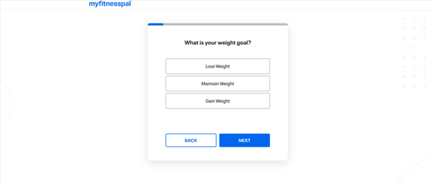
Myfitnesspal uses persona-based user onboarding to guide its users through different approaches in the app.
FAQs
What is user onboarding?
User onboarding on a website or an app is the interaction with the product that allows new users to understand the product, its purpose, and how to use it. The user onboarding UX contains a guided introduction to the product, a guide on how they can set up some initial preferences, and information on critical user interface elements in the product.
What makes a good onboarding experience UX?
A good onboarding UX has the necessary tools that will allow new users to succeed when using the app or website. So, it should purposefully be designed to have key actions to guide the user and be personalized for different users using segmentation. It should also have an attractive interface created using the best graphic design software.
How do you improve your onboarding experience UX?
Here are some tips to improve the onboarding experience with UX
- Reduce the learning curve by making the app easy to understand. Utilize user-friendly tools with the necessary information to guide the user.
- Use tools such as progress bars, checklists, and hotspots to guide the user to accomplish necessary tasks.
- Use copy to connect with your users. Create a user-friendly dashboard or landing pages using page builders, then add copy to connect with your users. A clear and concise copy will empower users to use your product successfully.
- Run experiments to figure out how you can improve user experience.
Wrap Up
Onboarding UX is one strategy to help your business grow; it is a vital key to user retention and growth in revenue. Whether you are a developer, blogger, or graphic designer, a well-crafted onboarding UX will result in a happy end user.
An excellent onboarding UX design ensures a seamless transition from users being clueless about the app to loving and utilizing it to meet their various needs.
- Onboarding UX: Ultimate Guide to Designing for User Experience - October 4, 2022
- UX Design Trends: How to Design for a Data-Heavy UX in 2022 - July 4, 2022
![]() Give feedback about this article
Give feedback about this article
Were sorry to hear about that, give us a chance to improve.
