 In late 2015 a major bank used a combination of Loop11 and Axure to create and test some new prototypes aimed at improving the user experience for their internet customers.
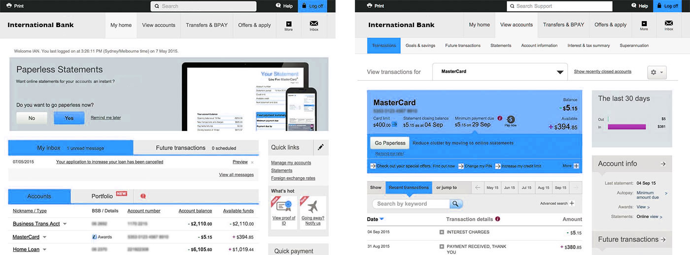
A prototype is a mid to high fidelity representation of the final user interface. In this instance the prototypes, while looking like a polished website, only contained two or three elements per page which the user could click on. By limiting the potential paths and interaction points a user could engage with the bank opened the doors to a rapid testing cycle where they weren’t bogged down by code and irrelevant functionality.
Two pages from the Axure made prototypes.
Some may argue that this almost guarantees the participant will always succeed in the given task because they are shepherded through the process. But what is really happening here is that a very specific piece of wording or design is being tested. If you start testing a prototype which has all or most of the functionality of your website it can become a lot harder to get definitive answers to specific design questions.
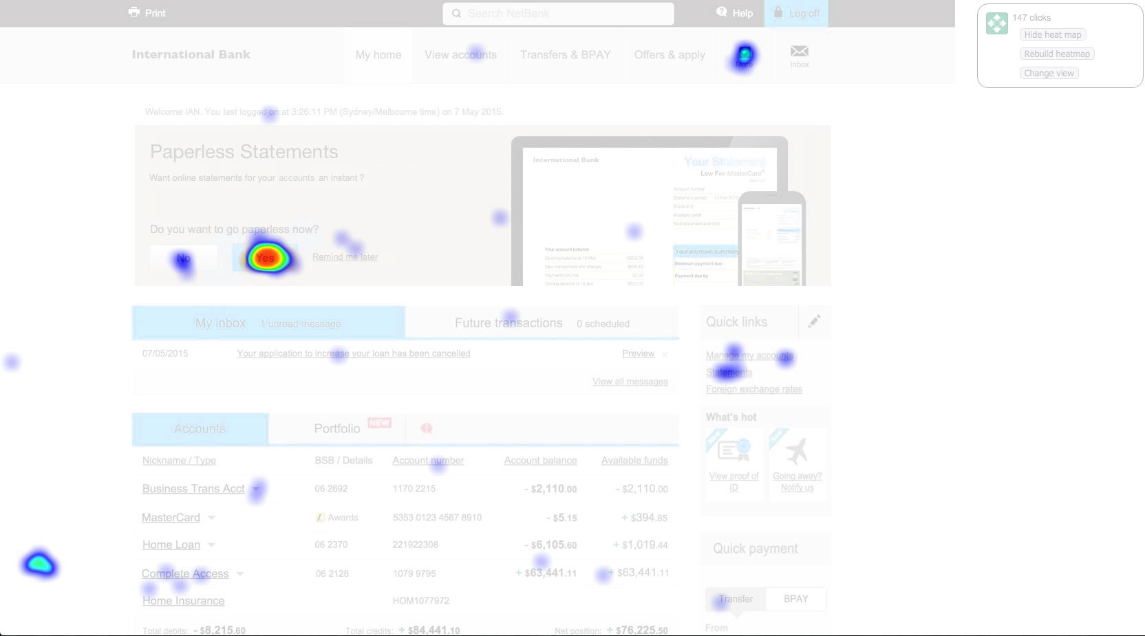
The bank could see if users were attempting to click on other elements of the page via Loop11’s heatmap analysis.
For this particular test the bank set three tasks for their participants to carry out with each test requiring the participant to navigate through a minimum of 3 pages to reach the success URL.
Loop11‘s Clickstream Analysis showed the path users were navigating when attempting to complete the task.
Each task was followed by a series of questions aimed at gauging the level of satisfaction and ease in which the user completed the task. Every time the user was given a rating scale to answer a question they were then offered an open ended question to explain their thinking.
To compliment this line of questioning further questions were then added towards the end of the test looking to gauge how representative a user’s behaviour in the prototype would be in a live setting. These series of questions utilised a 7 point scale with 7 being ‘very likely’ and 1 representing ‘very unlikely’.
Utilising the lean UX methodology the bank was able to create and launch their prototype test in under 2 hours. Within an hour of launch their first participants had completed the test and within a week hundreds had participated in the study.
With the results ready in Loop11’s reporting dashboard the bank was able to note the success, failure and abandon rate of each task and then analyse the qualitative data to better understand why users had succeeded or failed.
Without the combination of Axure’s simple yet powerful prototyping tools and Loop11’s rapid testing framework the bank would not have been able to quickly test their hypothesis, iterate their designs and continue to develop the best solution for their customers.
- Introducing Loop11’s Tester Panel - March 24, 2020
- Our Response to the Coronavirus - March 17, 2020
- Release Notes: 5 Second & First Click Tests, Image Testing& More… - October 17, 2018
![]() Give feedback about this article
Give feedback about this article
Were sorry to hear about that, give us a chance to improve.
Error: Contact form not found.


