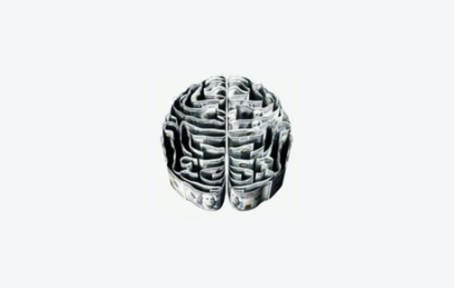
SEO and UX go hand in hand which means one will affect the other in many ways. But as a UX designer, it is important to understand which psychology principles can be used in UX design to improve its effectiveness and get through to the audience. Hence, here’s everything you need to know about psychology in design and what principles every UX designer needs to know.
#1 Hick’s Law
Hick’s Law states that the time it takes to make a decision increases based on the number and complexity of choices the person has. This means that the more options the customer or site visitor gets, the longer it will take them to decide between them. This, in turn, can lead to them not choosing anything at all as it will require too much effort from their side.
In some sense, it’s better to have as few options as possible. But what can you do with a catalog full of products? Filters can help the customer browse these products easier and sort them narrowing down the number of items to choose from. At the same time, the website’s design should be simplified too. The menu bar, for example, can be expandable with multiple categories to choose from one step at a time.
#2 Fitt’s Law
Fitt’s Law states that the time it takes to move to a target area is a function of the size of the target and distance to the target. To put it simply, the smaller the target and the further it is from the mouse of the customer, the more time it will take for them to reach the target and perform an action on it.
For example, making the action buttons bigger and placing them closer to where the mouse of the user is when they reach a particular page will be more effective than not doing so. When the user clicks on a certain link on your website, you can expect their mouse to be around the area of where the link was. Consequently, placing an action button in that area on the page they see after clicking the link will let them perform the action faster.
#3 Von Restorff Effect
Sometimes known as the Isolation Effect, Von Restorff Effect states that when multiple similar objects are present, the one that is different is more likely to be remembered. Though we are conditioned to see patterns everywhere we look, when something stands out, we are more likely to remember that particular element.
So, for instance, if you want a particular action button or element stand out on the page, make it have a different pattern, form, or color. The entire page could be done in different cold colors like blue and purple while the element you want to bring attention to could be done in one of the warm colors like yellow or orange.
#4 Serial Position Effect
Serial Position Effect is divided into the Primary Effect and the Recency Effect. The former states that items at the beginning of the list are better remembered than those in the middle while the latter states that the same thing is true for the items at the end and in the middle. Like the Von Restorff Effect, the Serial Position Effect can help you bring attention to the most important elements in your design and make the audience remember them.
For example, if you need to create lists, make sure to always start them with the most important points. Likewise, conclude them with one or several other important points. That being said, it’s worth remembering that not everyone reads lists till the end, so it’s better to keep your focus on the beginning rather than the end.
#5 Cognitive Load
Cognitive Load is the amount of thought needed to complete a task. As showcased by the different psychological principles and laws in this article, the more time and effort takes to make a decision, the fewer chances there are that this decision will be made at all.
What this means is that you need to create situations where the Cognitive Load will be minimal. Don’t stress the users with too many options or an overly complicated process. Make it easy and simple instead.
#6 Pareto Principle
Also known as the 80/20 Rule, the Pareto Principle states that 20% of your work or effort is responsible for 80% of the results you get. Consequently, if you work the right way, you can expect to get extremely good results from your efforts.
At the same time, you shouldn’t be doing all this work yourself as you can simply burn out. Instead, consider working with a freelancer from a writing services review site like Online Writers Rating who will help you with texts for the design you are making. This way, you will be able to divide your work while still putting in a lot of effort.
#7 Dual Coding Theory
Dual Coding Theory states that memory and learning depend on both verbal and non-verbal information. This means that delivering information in dual bits (e.g. an image with text) is more effective than simply trying to communicate it via a single method.
For instance, when you are designing the home page, you will likely want to explain all the basic aspects of the business that the website belongs to. Instead of simply placing chunks of text here and there, spice it up with illustrations, photographs, infographics, and videos. You can even add background music, but make sure to make the “sound off” button visible.
#8 Memory Limitations
Our working memory capacity is limited to around 10-15 seconds with only 3-4 items remembered at a time. What this means is that we forget the majority of information after less than twenty minutes of learning about it. Moreover, we can’t remember most of it in the first place. That’s why shortening links, simplifying lists, etc. can work wonders for you as the audience will remember more of the information you gave them through the design.
#9 Visceral Reactions
Users make a split-second decision about their opinion of something they see on the site, so such small elements as fonts, shapes, and colors can play a big role in the way they form their opinion about the website. Make the most of these reactions by working on even the smallest and most insignificant aspects of your design.
#10 Psychology of Persuasion
The five key elements of the Psychology of Persuasion are reciprocity, authority, scarcity, liking, and social proof. If you manage to use all of these five factors in your design, you will be able to persuade the users to do virtually anything that is required of them. From increasing sales to improving conversion rates, this can be a great tool in many ways.
#11 Gestalt Principles of Visual Perception
There is a total of six Gestalt Principles of Visual Perception which include similarity, continuation, closure, proximity, figure/ground, and symmetry and order. But perhaps the most important one of them all is the Law of Proximity which states that objects that are near tend to be grouped together. By placing important elements together in your design, the users will start subconsciously grouping and remembering them better.
Final Thoughts
To sum up, using psychology principles in design can be incredibly effective and can help maximize the results of a certain design. Use the psychological principles, laws, and rules in this article to improve your own UX design.
- Psychology In Design: What Principles Every UX Designer Needs To Know - November 5, 2020
![]() Give feedback about this article
Give feedback about this article
Were sorry to hear about that, give us a chance to improve.


