Around the world, the restaurant industry is booming, driven by continuously expanding markets and rapid urbanization, but also by the ever-growing food delivery platforms. These delivery platforms have expanded the reach of a typical local eatery, allowing restaurants, virtual food brands, and cloud kitchens to expand into entire urban markets with just one location.
Not only are popular restaurants pulling customers towards the venue itself, but they are also bringing their amazing food to the customers. These amazing opportunities have created a lucrative restaurant market, but they’ve also created the most competitive restaurant market in history.
All of this means that restaurants need to focus on their marketing more than ever — and it all starts with their online presentation.
Your website will be the defining factor in online and offline success, so let’s take a look at the website UX design trends you need to pay attention to get ahead.
It begins with website branding
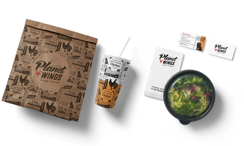
In a hyper-competitive industry like this, we can’t overstate the importance of building a recognizable, likable, and relatable brand experience. Branding a restaurant website is about conveying the brand’s unique identity, visuals, messaging, and values to the audience to create a positive experience, and improve brand stickiness and trust.

Website design matters so much for restaurants, because customers today have plenty to choose from — and they need more than quality food or great in-house service to truly fall in love with a restaurant. With that in mind, what are some key branding considerations for your website?
Make sure to weave the following into your pages:
- Brand personality
- Unique brand visuals
- Unique photography
- Your unique tone of voice
- Your messaging and values
- Your brand typography
You can use your brand style guide to direct the design of the website and make sure that the experience is as true-to-brand as possible.
Bringing photography and graphics together
Restaurants need to showcase the food they make on their websites to spark interest and inspire the visitor to keep exploring the site. And don’t limit foot photography to the Menu page.
Instead, you should leverage beautiful, professional food photography across the site — especially on your home page and landing pages. This is how you’ll improve website engagement and build brand authenticity, but most importantly, it’s how you’ll open call-to-action (CTA) opportunities and create clickable elements that will allow visitors to reserve a table, order food, and complete other actions.
But you can take things a step further. You can marry engaging photography with unique brand graphics. Graphics, like unique icons and pictograms, will create a memorable brand experience and will allow different sections of each page to come to life and stand out.
CTAs and above-the-fold content
Speaking of photos and graphic elements, it’s important to consider the flow and the arrangement of all visuals on a page. For a restaurant website, a purely minimal design might not be the best option, because you want the page to convey a rich and enthralling experience. To do that, you need captivating imagery and clear CTAs.

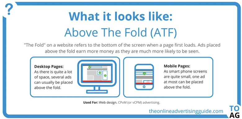
There’s nothing wrong with working with templates to build a great website, but make sure to choose restaurant-specific forms and design structures. If you’re working on your online presence in a restaurant website builder and you want to inspire people to take action immediately, then remember to pay special attention to your above-the-fold (ATF) design and content.
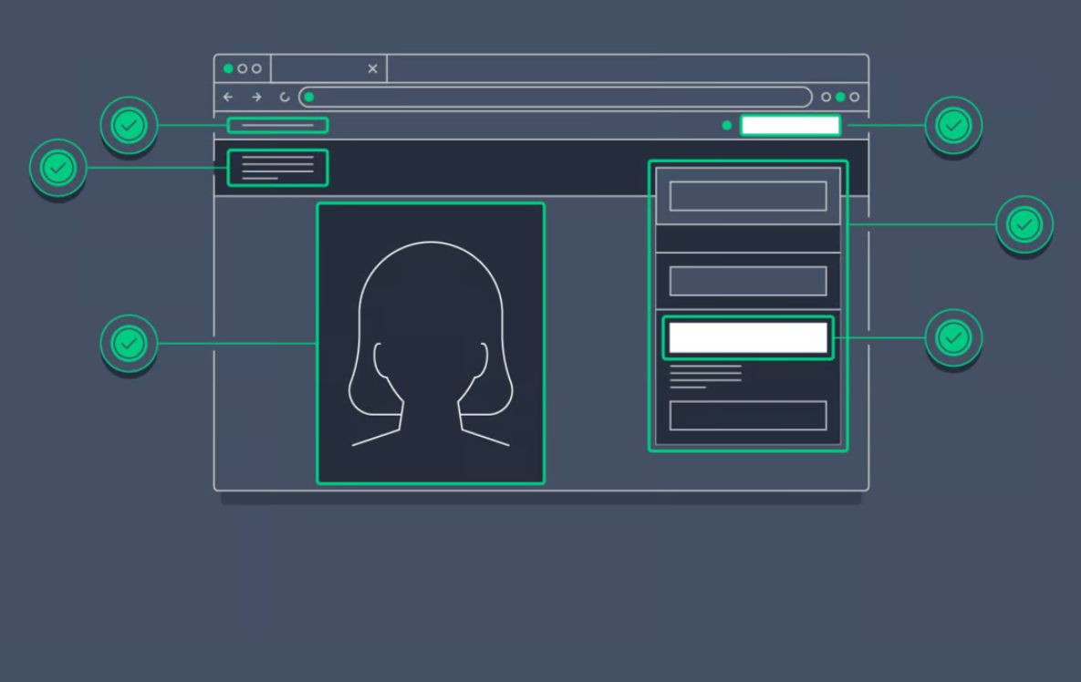
As the first thing people see when they land on a page, ATF content needs these three components: a powerful image, a clear explanation, and a call to action.
Make sure that the visitor knows exactly what’s on the page and what the next step entails. This can be to book a table or order food online, or it can simply be to jump straight to the menu or even get in touch if they have any questions.
Improving loading speed and optimizing for mobile
No matter the industry or niche you’re in, you understand that website performance is key to online and even offline success. It should go without saying that every page on your website should load quickly and properly if your goal is to retain visitors and inspire them to take action.
Choose a website theme that is optimized and scaled for the needs of the restaurant industry. You should optimize your visuals so that they load quickly but without jeopardizing the quality of the imagery.
While speed optimization (and all the many website performance tips and tricks) is a whole other topic, we should also mention the importance of mobile optimization. Without a doubt, your website must load quickly and properly on all handheld devices.
Make sure to:
- Use a mobile-first design approach
- Test with Google’s mobile-friendly tool
- Choose mobile-friendly themes and plugins
- Test your core web vitals
- Design popups for mobile devices
Using cinemagraphs to pull the audience in
The last tip is a nifty little trick that not many restaurants are using yet, so this is your opportunity to capitalize on it before everyone in the industry starts putting it in their web designs. We’re talking about cinemagraphs, which are still photos with slow-moving elements that form a short, repeating video.

In a practical sense, you can put this design feature front and center to pull the audience in upon landing on your site. A cinemagraph could be a moving picture of a glaze topping a delicious chocolate cake, or wine being poured into a glass — the creative possibilities are endless.
Add this simple element into your design and you’ll instantly separate your website from the rest in your market.
To sum up
The restaurant industry is more competitive than ever, and that means that both up-and-coming and established restaurants need to focus on website design and optimization to maintain their competitive edge. Use these design tips to your advantage and start implementing them right away to appeal to the modern customer base, and bring more patrons to your restaurant while building your online presence and popularity in the process.
- 5 Steps for Great Ecommerce UX Throughout the Funnel - January 16, 2024
- Designing Intuitive Payment Flows for Enhanced User Experience - October 31, 2023
- Gamification in UX Design: Enhancing User Experience and Engagement - September 26, 2023
![]() Give feedback about this article
Give feedback about this article
Were sorry to hear about that, give us a chance to improve.


