Online shopping is incredibly popular, yet consumers always seem to expect a website to look a certain way. Business may suffer if a company’s website isn’t up to specific standards. As a result, companies work hard to accommodate customers while creating sites that are not easy to use. But how do you do that while still creating something customers want to look at?
Let’s break down the essentials of ecommerce UX design, including the fundamentals, essential elements, and the common mistakes to avoid. Soon, you’ll have a professional website for your business that’s both eye-catching and user-friendly.
What is Ecommerce UX Design?
The essential ecommerce User Experience Design depends on the website’s viewer’s perception, and the overall goal is to provide the best shopping experience.
Aside from aesthetics, website discovery and functionality are critical from the first click to securing a purchase. Ecommerce is projected to grow around 50 percent through 2025. Ecommerce sales are expected to grow to 4.9 trillion dollars globally. To take full advantage of this trend, it will be essential to have a well-designed website.
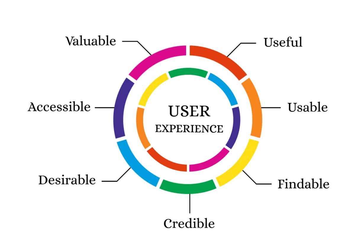
The fundamental UX design factors to consider for success include:
- Utility
- Usability
- Accessibility
- Desirability
Utility refers to how quickly users reach their desired location and if they can get to it on their own (without assistance) when using the ecommerce site.
Usability measures the ease and convenience of the user interaction with the website.
Accessibility allows the website and product to upload on all browsers, including mobile devices.
Lastly, desirability determines the customer’s use of the site in general. Visual components can make a huge difference with this feature.
The website’s layout and design can all elevate the user’s experience. Updated designs, speed, product information, and returns are all critical factors to consider while ensuring customer satisfaction and safety.
Design
Maintaining an updated website that’s accurate and trustworthy is the first step to a great UX design. Make sure the design and code is up-to-date, then add the necessary pages to make the site functional for the user.
Speed
Website speed affects not only the user but search engine ranking for the entire site. According to Google, two seconds is the maximum acceptable loading time but half a second is best. Customers may move to a new website if your site freezes or pictures can’t load.
Products
Many customers look for shipping information right away, as the estimated length of time listed for shipping can influence the decision to buy a product. Remember to update content and products regularly, and note on the page and listing if inventory runs low. A customer may not return if they are ready to check out and a product looks available but is actually out of stock.
Returns
Be sure to prominently list your company’s return policy on your website. When a customer makes a purchase, an easy return process is critical to retaining their loyalty in the future. For instance, offering the ability to provide returns through both your physical and online stores is helpful to customers short on time.
Requesting customer feedback after purchases or returns also shows that you value their opinions while and want to gain their trust. Knowing how to provide excellent service on your ecommerce website is essential for growth, longevity, and success.
Security
Security is significant for your customers, as credit card information is at risk during a cyberattack. Due to the rising number of data breaches, all ecommerce UX design sites are expected to include security features. Security measures include the following:
- SSL certification (green padlock on URL)
- Secure payment gateway, such as PayPal or Apple Pay
- Privacy policy on footer pages
There are many necessary components to running your ecommerce website. From aesthetics and design to speed, all are crucial steps toward successful page users can enjoy and trust. But online security is a must for ensuring the trust of your future customers.
Basic Elements for Ecommerce UX Design
All ecommerce websites strive to include convenient design elements. These are the essential tools to make your page functional for the majority of your customers:
- Landing page
- Easy navigation
- Search bar
- Call to action
- Checkout page
Landing Page
The landing page is the first thing a user sees when clicking on your website, so grabbing their attention is a must. Navigation can be tricky, but there are ways to make things easier for the consumer.Make all elements and actions easy to identify, and use simple words for actions like “buy” and “search.”
Navigation
A compatible mobile design is necessary for today’s consumer, who is more likely to shop from their phone thana desktop computer. Therefore, the website across devices in terms of functionality and appearance.
Search Bar
The search bar is at the top of a website, and is typically colored white so it’s easy to locate. You can add customization under the search to narrow results to serve your customers looking to find a product that serves a particular function.
Call to Action
A call-to-action (CTA) button or link instructs the user to take action on your site at a certain point, whether it’s to buy a product or to take action after a written prompt. A CTA tends to work well when it’s concise and visible. But first, ensure the website pages you’re linking to are just a few clicks from the main page so your loading speed isn’t too hampered.
Payment
Different payment options are a great way to provide flexibility to your customers. Make the process easier with multiple payment options (such as credit card, Apple Pay, and PayPal) while keeping the logos of relevant services visible to encourage trust.
If the user isn’t ready to purchase yet, the “save to cart” option is a fantastic feature for future orders to seal the deal later and is excellent for multiple purchases. A purchase is then just one click away when the customer is ready to pursue action.
Creating Your Ecommerce Website
When creating your ecommerce website, the homepage should be considered comparable to a storefront that attracts and represents your site and business.
Key homepage elements include:
- Stating the unique value proposition (what you offer)
- Website contact information, company information, and social media links
- Proof of credibility, such as testimonials
- Brand features
- Contact information for sending questions or requesting support
Product Page
For ecommerce websites, high-quality product images determine the likelihood of a customer completing a transaction. When selecting website images, find pictures that look similar in appearance, with similarities in filters, color scheme, and clarity so your website appears unified.
Listing product information near the visual element will help explain the product in detail. The more information you list, such as colors, styles, and sizes of products, the more it’ll help your customer.
A virtual reality feature is a new element for ecommerce websites, and a very useful way to utilize technology to portray a product accurately. If providing virtual reality is out of your budget, try a media arrangement that offers a 360-degree view. The 360-degree view allows the consumer to see a particular product from all angles, as if they were seeing it in person.
Providing a positive consumer experience also means adding features like “related products,” so customers can discover similar items that they otherwise may have overlooked. The cross-sell feature also serves this purpose—after the user purchases an item, they’ll receive recommendations for similar products they may like.
FAQ Page
A section listing customers’ frequently asked questions is a great way to solve potential problems in a quick fashion. Carefully select the most common questions from customers regarding product care or instructions, as well as regarding the product shopping experience. Not only will it ease concerns, but customers may even purchase products faster than they otherwise would have.
Checkout Page
The last page where you must avoid pitfalls is the checkout page.. Many opt for checkout to take place on one page, while others may break up the process into multiple pages to track customer activity at each stage of the process.
With a single checkout page, everything loads faster but it may be harder to include all useful information a customer needs to know. Plus, the user may skim crucial details. While two to three checkout pages are a bit harder to navigate, and some customers may not like multiple screens, it’s a better option overall.
Checkout pages usually include payment input options, shipping information, a review page, and a final confirmation. Features on the checkout page should include the following:
- Easy-to-access signup forms and options for payment
- User registration options and the ability to check out without a website account
- Disclosures of shipping costs for consumer awareness
How to Avoid Common Mistakes
It’s easy to make mistakes regarding ecommerce UX design. Users tend to back away from a business trying too hard to stand out against competitors (and maybe creating a website that’s difficult to use in the meantime).
Putting the customer’s experience first is the goal. Keep the first-time user in mind when creating your site. Focus on the basics while providing information about the product.
Ecommerce sites rely heavily on carriers, yet some businesses have only one (which can create issues). It’s better to have multiple carrier options for shipping reasons if one backs up and runs behind on shipments.
There are additional ways to keep the user in mind when creating an ecommerce UX design site. When it comes to extra buttons, tools, and pop-ups, having too many distractions overshadow its purpose.
Final Takeaways
A fantastic ecommerce experience is essential to your company’s website and overall reputation. While creating a visually appealing design is a must, so are elements such as easy navigation, speed, and sound website security.
In addition, users should be able to navigate your website easily with a search bar, call-to-action features, and multiple payment options.
Overall, having separate pages optimized to serve different purposes (and clear paths between them) is beneficial. Your users will gain momentum to go from your homepage to frequently asked questions, products, and finally to checkout. A website designed with ecommerce UX design in mind pays dividends.
- The Fundamentals of Ecommerce UX Design - January 30, 2024
![]() Give feedback about this article
Give feedback about this article
Were sorry to hear about that, give us a chance to improve.


