We thought we would have a look at how user friendly 10 of the world’s leading airline websites are. On a recent overseas trip, I was astonished to see how many people continue to take dangerous or banned items, such as scissors and cigarette lighters through the check-in gates at airports. Since security has become radically tougher in recent years we thought we’d explore how easy (or difficult!) it is to find information about the items you’re not supposed to have in your luggage… So we tested the usability of the ten following airline websites:

The following task was asked of 1,000 participants (100 per website):
“You are taking an overseas holiday next month. Before you go you want to check whether certain items are considered by the airline to be dangerous or banned. Using the website how can you do this?”
Our participants were sourced from a number of resources, including our Twitter and Facebook accounts, but the vast majority came from Mechanical Turk where we paid the nominal sum of $30 for the bulk of the participants. Thanks to all those who got involved.
Task Completion Rates:
In general, each website had one page dedicated to banned or restricted items, such as these pages from American Airlines and British Airways.
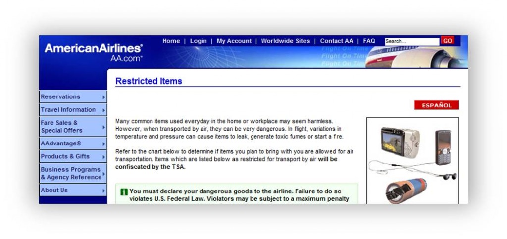
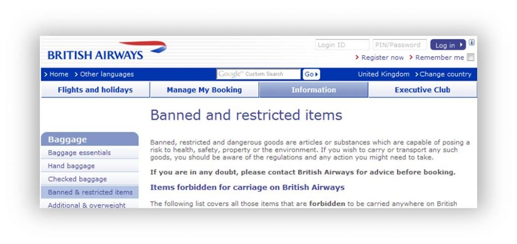

If the participants found the appropriate page they were deemed to have completed the task successfully, otherwise they were considered to have failed it, or they abandoned the task if it all became too hard.
The results indicate that finding information on dangerous and banned items is rather difficult. This perhaps provides some clues as to why so many people on my recent trip were still packing them in their luggage.
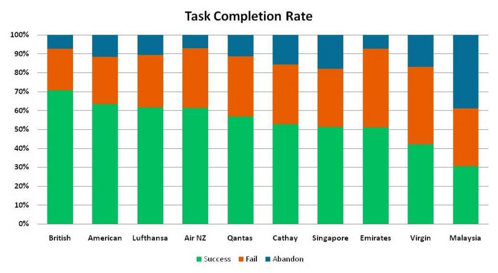
The British Airways website was the standout performer with 71% of participants completing the task successfully. Of most concern were Virgin Atlantic and Malaysia Airlines where less than half of participants were able to locate the information. In the case of Malaysia Airlines, just 31% of participants were able to complete the task.
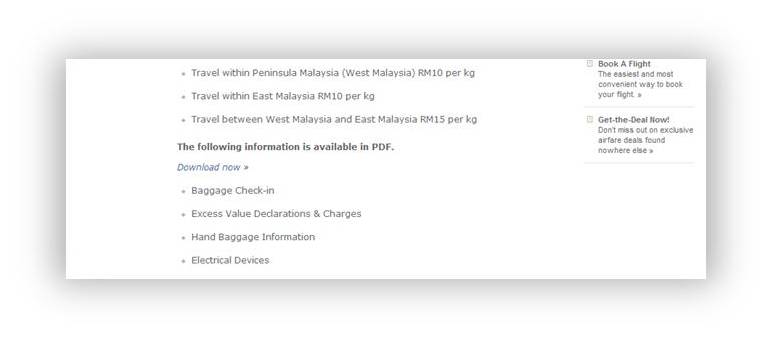
Additionally, a total of 39% of participants abandoned the task on the Malaysia Airlines website even though more than half went directly from the home page to the Baggage Information landing page where they should have easily found the information. It would seem the call to action to “Download now” is not sufficient to indicate the PDF document on the Baggage Information landing page is the place to go for this information.
Average Time to Complete Task:
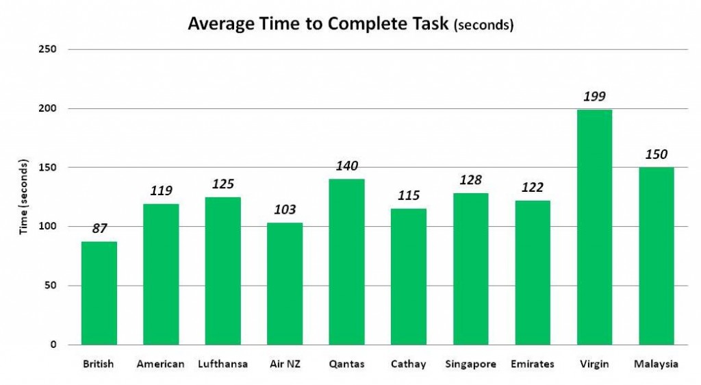
The average time taken to complete the task on each of the ten websites again shows that the British Airways website was the standout performer, with participants completing the task in an average time of 87 seconds. Malaysia Airlines and Virgin Atlantic once again performed poorly, with the average time for Virgin Atlantic (199 seconds) being more than twice the time taken for those using the British Airways website.
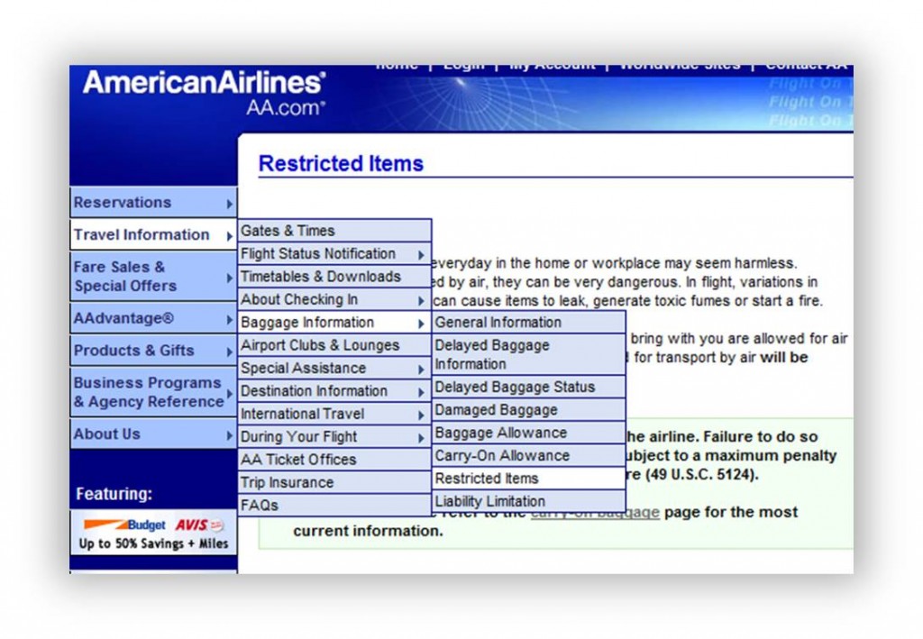
The study also revealed that only Virgin Atlantic and Lufthansa did not have fly-out menus in their main navigation. Fly-out menus, such as those shown on the American Airlines website below; often result in faster navigation since users are able to see at least the second level navigation links without having to make a click.
A deeper look at the path analysis for Virgin Atlantic shows that a quarter (24%) of participants went to the correct section of the website, the Passenger Information landing page in the first instance. This is a substantially lower result than British Airways and even Malaysia Airlines where more than half navigated to the correct section first.
Ease of Use Rating:
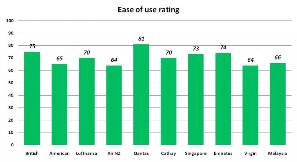
One of the follow-up questions for participants after completing the task was to rate on a 5-point scale how easy it was to use the website. There was much less variation in these results, which we don’t find surprising. In face-to-face, lab-based user testing we frequently encounter participants who have a terrible time navigating a website but still comment on how easy the website was to use! We always felt this was the moderator effect, but perhaps this extends to unmoderated user testing too!
Overall Usability Score:
To directly compare the usability of one website to another we decided to follow the ISO definition of usability. ISO 9241-11 defines usability as the “Extent to which a product can be used by specified users to achieve specified goals with effectiveness, efficiency and satisfaction in a specified context of use.” This gives us three areas to focus on: effectiveness, efficiency and satisfaction.
Combining the scores for the task completion rate (effectiveness), the average time taken to complete the task (efficiency) and the ease of use rating (satisfaction) we can establish an overall score for each of the ten airline websites, which are shown below.
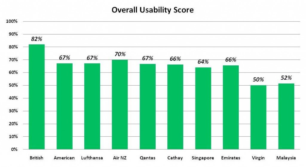
Not surprisingly, British Airways was heads and shoulders above the rest while Malaysia Airlines and Virgin Atlantic were well behind. There was little difference between the remaining seven websites. But clearly there’s a lot more work to be done by airline websites to help people avoid packing those banned and dangerous items.
Tested with Loop11
![]() Give feedback about this article
Give feedback about this article
Were sorry to hear about that, give us a chance to improve.
Error: Contact form not found.

