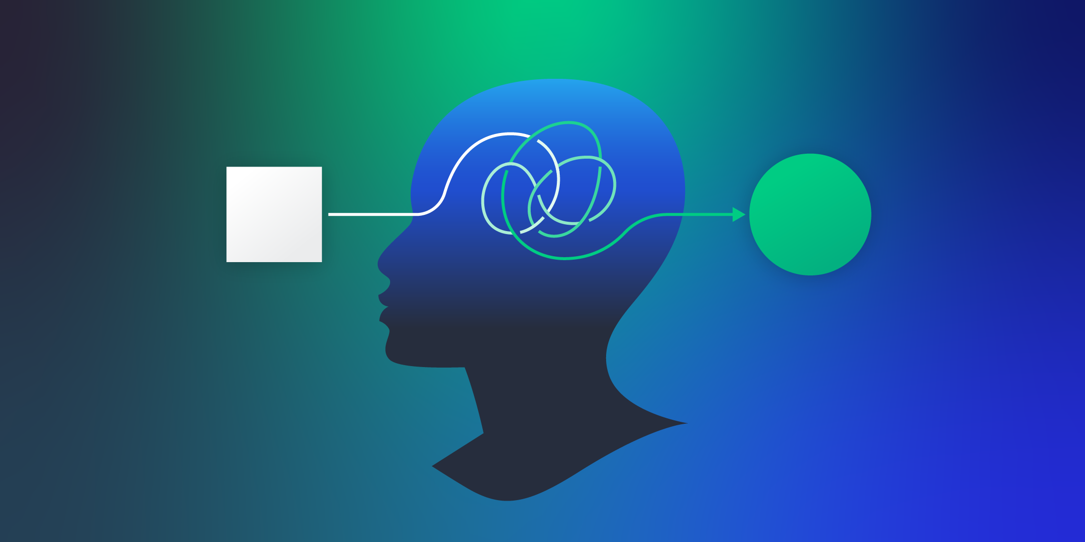
We’d all like to believe we’re perfectly logical beings, making decisions based purely on facts and rational thought. The reality? Not quite.
As fantastic as they are, our minds come with a few quirks known as cognitive biases. These subtle mental shortcuts often tip our decision-making scales, sometimes without us even realizing it.
In the world of User Experience (UX), understanding these cognitive biases isn’t just useful — it’s essential. It can be the key to designing more intuitive, user-friendly experiences that resonate with how people naturally think.
So, ready to dive into the human mind? Let’s get started.
What is Cognitive Bias?
First up, let’s demystify the term cognitive bias. Imagine you’re in charge of managing a call center. You’re juggling call durations, customer complaints, peak times — the works. You believe you’re making choices purely based on facts. But are you?
Cognitive biases are sneaky. They’re like your mind’s little shortcuts, guiding your choices based on your perceptions and past experiences, not just the raw data. They were discovered and coined in the 1970s. Back then, two acclaimed scientists, Daniel Kahneman and Amos Tversky, noticed something odd while researching people’s understanding of numbers. They found that we’re often less than rational when it comes to big numbers, making far from logical decisions.
So, if you’re ever leaning more toward strategies that worked before (that’s your status quo bias talking), or if last week’s customer complaints seem to play a huge part in your performance review (recency bias, anyone?), you’re experiencing these mental shortcuts first hand.
If you’re crafting user experiences, it’s important to be aware of these biases and how they play out in the real world of human decision-making.
Understanding Cognitive Biases: A Game-Changer for UX
It’s a safe bet that whether you’re a designer or a product developer, cognitive biases are a part of your decision-making toolbox, whether you realize it or not.
Remember, we’re all susceptible to these mental shortcuts and ingrained perspectives. Acknowledging this is like turning on a spotlight, helping us see our own decision-making processes more clearly and logically.
When we talk about framing, we’re all fair game. The context we’re in, and the experiences we’ve had, can all subtly sway our design choices. It’s like wearing rose-tinted glasses — you might focus on some parts of a problem and totally miss others, all thanks to these external factors.
Let’s dive into a neat study from Kathryn Whitenton of the Nielsen Norman Group to illustrate this for UX designers. In this study, a usability test was run with 20 users. The results were framed in two ways:
- 4 out of 20 users could not find the search function on the website.
- 16 out of 20 users found the search function on the website.
Spot the difference? It’s all in how the results are framed. In this experiment by the NNG, here’s what happened:
- About 39% of UX designers who heard about the success thought a redesign was needed.
- Over half (51%) of the designers who heard about the failure rate believed the feature required a redesign.
This shows how framing can twist our perceptions, leading to different design choices. But let’s not forget — cognitive biases can also impact our test users. This is often clear when it comes to perceptions of pricing — what’s seen as expensive and what’s seen as a bargain.
Let’s take a closer look at some common cognitive biases that play a part in the decision-making of both users and UX designers.
Unmasking the Usual Suspects: Common Cognitive Biases in UX
In the realm of UX, cognitive biases act like those subtle nuances in a film script that impact the story’s outcome. Let’s bring these hidden players into the limelight:
- Anchoring bias
This is the tendency for people to rely too heavily on the first piece of information they encounter (the “anchor”) when making decisions.
Let’s imagine you’re spearheading a design revamp for an ecommerce site with a domain .hk. The first price a customer sees on your site sets an expectation. If they see a high price initially, they’re more likely to think subsequent prices are bargains, even if they’re not. Sneaky, huh?
But wait, it’s not just about pricing. Anchoring bias can apply to other aspects, too, like product ratings, review scores, or delivery times. So, it’s definitely a bias worth understanding and keeping in mind when crafting the perfect user experience!
- Social desirability bias:
Users, they’re just like us! They want to be liked and accepted.
This bias can make users say what they think you want to hear during testing.
Say, you’re running a test on a new eco-friendly app feature. Because “being green” is popular, users may provide positive feedback, even if they find the feature challenging to use. It’s a tricky one to navigate, but being aware of it is the first step.
- Confirmation bias
We humans love to be right.
This bias describes our tendency to seek out and favor information that confirms our existing beliefs while ignoring contradictory data.
Suppose you’re a designer who’s got a pet theory about a certain color scheme. You might unintentionally favor user feedback that confirms your belief in your UX design while overlooking comments suggesting otherwise.
- Bandwagon effect
Ever jumped on the bandwagon?
In UX, this bias means users are more likely to use a product if they see others using it.
Let’s see this in action. Suppose you work at a VoIP software company like Vonage, and you’re launching a new communication platform. You’ve gathered testimonials from satisfied customers, highlighting their positive experiences. Now, it’s time to showcase these testimonials on your website.
As potential customers visit your site, they see these testimonials from others who have already hopped on board your platform. This creates a powerful social influence known as the Bandwagon Effect. People tend to follow the crowd and feel more compelled to try a product or service if they see others already using and enjoying it.
- Availability heuristic
We tend to rely on the first examples that come to our minds when evaluating a specific concept, topic, method, or decision.
If a user had a great experience with a similar feature in another app, they might expect your app’s feature to work the same way.
Recognizing these biases can provide insights into user behavior and help us create a more intuitive and engaging user experience. But remember, it’s not just about understanding these biases. It’s also about knowing how to use this knowledge to our advantage. So, let’s dive deeper.
Steps to Keep Bias in Check for Unbiased UX Research and Design
Creating a user experience that’s fair, inclusive, and unbiased is key to building great products. Let’s explore some essential steps you can take to prevent bias in your UX research and design:
- Mix It Up with Diverse Participants: When gathering research participants, aim for a diverse group that reflects different backgrounds, ages, genders, and abilities. By including a range of perspectives, you avoid biases that can arise from studying a narrow slice of the population.
- Get Your Research Objectives Straight: Clearly define your research goals before diving into any studies. This helps you stay objective and prevents you from unconsciously shaping findings to match your preconceived ideas.
- Watch Your Language: Be mindful of the words you use in surveys, questionnaires, and interview scripts. Strive for neutral and inclusive language that doesn’t lead participants toward certain responses. Avoid accidentally biased phrasing that could influence their opinions or behaviors.
- Shuffle the Deck: When conducting usability tests or user interviews, mix things up! Randomize the order of tasks or questions to reduce the impact of primacy or recency biases. This way, you get a fair assessment of the overall user experience.
- Keep Everyone in the Dark: Whenever possible, embrace double-blind testing. This means neither participants nor researchers know the experimental conditions or designs being tested. By staying in the dark, you eliminate biases arising from participants’ expectations or researchers’ interpretations.
- Team Up for Diverse Insights: Encourage collaboration among designers, researchers, and stakeholders from various backgrounds. Bringing different perspectives to the table helps challenge biases and ensures a well-rounded approach to UX design.
By following these steps, you can cultivate an environment of inclusivity and objectivity in your UX research and design work. Striving for unbiased experiences helps create products that resonate with a wider audience, delivering satisfaction and engagement for all users.
Embracing Bias-Free UX
In the world of UX design, understanding and managing biases is key to creating inclusive and impactful user experiences. By recognizing and tackling cognitive biases like anchoring and social desirability, we can design with diverse users in mind, avoiding favoritism toward specific groups.
While we can’t eliminate biases completely (we’re only human, after all), we can actively work to minimize their impact through intentional design choices and research methods. Embracing bias-free UX empowers us to develop products that resonate with a broader audience, making a positive digital impact.
So let’s embark on this journey together, shaping the future of UX with empathy, inclusivity, and unbiased design practices. Together, we can create a more inclusive digital world.
- Understanding Cognitive Bias in the User Experience - August 29, 2023
![]() Give feedback about this article
Give feedback about this article
Were sorry to hear about that, give us a chance to improve.


