Wondering how your website performs for users on their latest gadget? Try split-testing your site on participants who use different web-worthy platforms to find out. Testing can help you uncover how user-experience on a desktop or laptop might differ from user-experience on a smartphone or iPad.
To demonstrate this, here’s a little test we ran on 100 participants.
Some participants completed our test using a PC and others with an iPad. Our results help us see how their online experience was being facilitated by the site and just how doable are these tasks on different platforms.
We didn’t have any pre-conceived ideas as to how browsing and completing tasks might differ on the two platforms. We did, however, think it’d be really interesting to see the results, so that in turn we could demonstrate a great way to test, analyse and understand user behaviour. All this, so that you can tune, tweak, and better the online experience you offer.
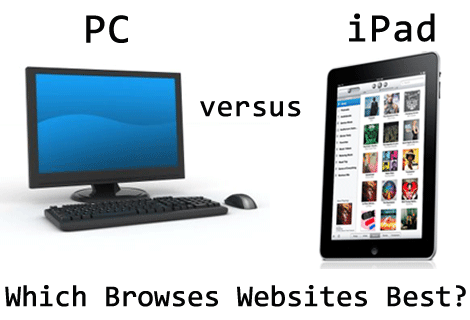
Our Study
We ran identical unmoderated online studies on the Apple website for participants using either an iPad or a PC. In each study there were three tasks and few follow-up questions.
Loop11 also allows us to validate whether iPad participants were actually using iPads or not. You ask if there were any of these? Well, you might be surprised to hear that there was a handful of PC participants who signed up for the iPad test! Yes, you know who you are.
Don’t worry – you won’t be finding tarnished results in this case study. We threw out the invalid tests.
You can run through the test yourself, here, before reviewing the results. But, of course, our study has since been closed, so your results won’t be counted.
In total, 100 participants completed the test, 50 in each group. Here are the results.
Task 1: Free Surf
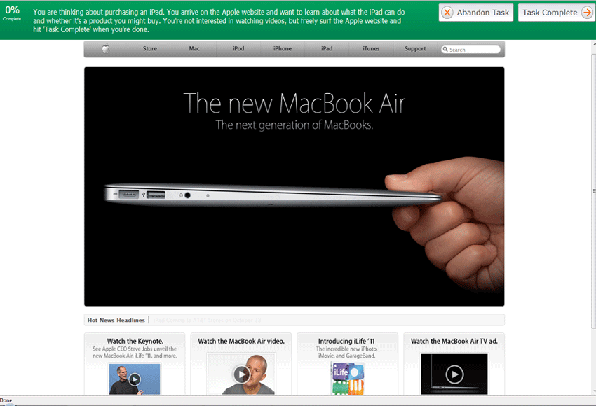
“You are thinking about purchasing an iPad. You arrive on the Apple website and want to learn about what the iPad can do and whether it’s a product you might buy. You’re not interested in watching videos, but freely surf the Apple website.”
The first task simply required participants to freely surf the Apple website. Participants were allowed to check out what they could about the iPad. When they felt they’d found sufficient information, they simply had to let us know by marking the task as complete.
This kind of task helps us understand how a browsing experience might differ on these two devices.
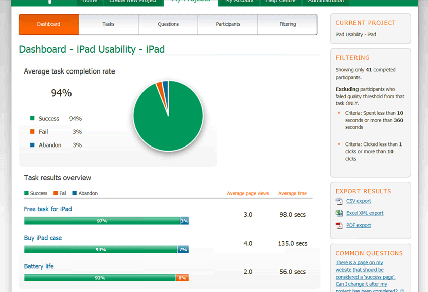
The results are rather interesting: iPad users spent longer than PC users during the task of free surfing of the Apple website. On average iPad participants clocked in at 98 seconds, with PC participants coming ahead with 86 seconds.
Remember, iPad participants already own the iPad. The longer time spent on browsing for iPad users does hint at fairly significant browsing differences on the two devices.
Task 2: Shop!
“Fast forward 4 weeks and you’ve gone and bought an iPad! But you now realise you’re going to need a case to protect it. Find a case and put it in your shopping cart. You’re not going to buy it right now, though. Hit ‘Task Complete’ when it’s in your shopping cart.”
The second task required participants to achieve a defined goal: Find a protective case for an iPad and add it to the shopping cart. This task helps us understand the usability and presentation of functions on a website as it’s translated onto the different devices.
Task completion results for iPad and PC users were identical with both groups boasting a 100% completion rate. A success! iPad participants, however, in completing the task took 53% longer than PC participants. At an average of 135 seconds, iPad users were surpassed by the speed of PC participants who hit the mark at 89 seconds.
What’s more, PC users even had to visit one extra page on average – 5 pages on the PC versus 4 on the iPad – to complete the task.
Task 3: iPad battery life
“For future reference, you want to know how long the battery will last before you need to re-charge it. Where would you find this information?”
The final task also presented a clearly defined goal: Find details on the iPad’s battery life. We knew on which page the information was available – there were at least two pages, and we wanted to see how users would go about finding it and how long it would take them.
Given that this task was a little more involved than previous tasks, completion rates are subsequently lower. But we admit, the task completion rates are still impressive by any standards.
iPad users had greater success with 92% completing the task correctly, while PC participants dropped down to a 90% completion rate. Once again iPad users took significantly longer averaging a time of 56 seconds as PC users averaged 38 seconds. That’s 47% longer for the iPad users despite the same number of average page views.
Overview
Adapting websites to fit the needs of users who come from different machines can be a head-walloping task.
Our software aims to help you realise small steps towards great improvements.
To improve it, though, you must first document it. And Loop11 documents user-experience so that it can be improved.
Simplified designs, variations in page layout, consistencies of functionality across all elements, or adaptations on page flow and size—there are tons of ways web professionals work to iron out user-experience on all devices.
But don’t just guess how user-experience might differ. When transitioning your website for a gadget-friendly version, find out where and how users are stumbling so that you can understand why. In this process, usability testing is often the missing lynchpin.
![]() Give feedback about this article
Give feedback about this article
Were sorry to hear about that, give us a chance to improve.
Error: Contact form not found.

