


I realize the title of this article sounds unbelievably meta but stick with me.
This was exactly what we had to do when reimagining the Loop11 participant interface used during usability studies run by our customers.
The context you need for this article is that Loop11 is a remote usability testing platform used by UX professionals around the world to test websites and prototypes within their browsers on desktop, mobile and tablet. The results are reports which feature both quantitative (heatmaps, click steams, success rates, etc) and qualitative data (video, audio, survey questions).
When Loop11’s participant interface was created a number of years ago it was cutting edge, worked beautifully and generally fitted the aesthetic of most modern websites. Flash forward to 2017 and you could pretty much reverse all of the statements in the prior sentence. This didn’t happen overnight, but it grew in importance as technology evolved surrounding security and testing on mobile devices became more and more popular.
In this article I’m going to talk about some of the problems we identified with our old UI and how we looked to solve them. I won’t dive into any of the technical challenges and changes, rather, I will focus more on the UX considerations.
At Loop11 we use Intercom as our support tool which makes it really easy to have initial conversations with our customers. These conversations formed the initial discovery phase of our research.
A sometimes confronting aspect of being a tool of UX professionals is that your customers are, well, UX professionals. Thus, you have to walk the walk of great UX. There is no room for error and the feedback can be brutal. But, the huge upside of being a tool of UX professionals is that your customers are, you guessed it, UX professionals. When they give you feedback, it is amazingly insightful, plus, they really want us to succeed!
As customers create their free accounts and start to create tests we’d be able to initiate conversations that would allow us to not only explore where they were having problems but also learn what they were trying to achieve and how we could better serve their needs.
Discovery Phase
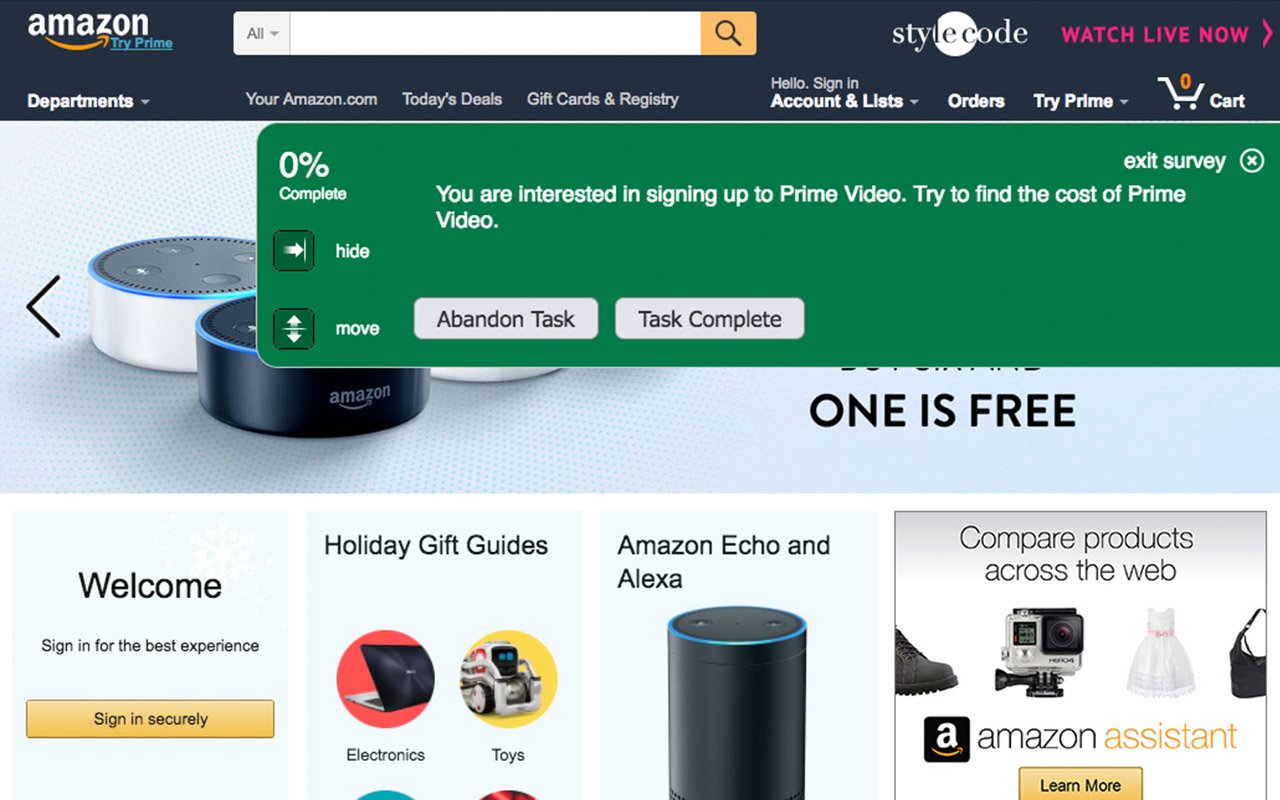
One of the main things we learnt is that while Loop11’s participant interface featured clear buttons to move or hide the UI, many study participants found them either difficult to use or missed them entirely. This resulted in an interface which often blocked key elements of the underlying website such as the header and menu. This was of course a deal breaker for many would-be customers.
Despite having buttons that we felt were clear and simple to use, we’d need to find a better way of ensuring the UI was visible when it needed to be, and then out of the way at all other times.
Another relatively common issue we found was due to the way our UI was built. The underlying CSS rules of the website being tested could potentially overrule the styles in our interface. In the worst-case scenario this could mean that form fields or radio buttons would be hidden and thus render one of our questions unanswerable. This worst-case scenario wasn’t common but was something we couldn’t accept, not even in the most niche of cases.
The final issue I’ll discuss revolved around the UI design on mobile versus desktop. Loop11’s participant interface featured subtle yet different designs and controls when comparing our mobile UI to our desktop UI. This, amongst other things, made it difficult for our customers to write consistent introductory copy to direct their study participants.
After around 6 months’ worth of conversations with customers via Intercomwe felt we’d built up a great understanding of what our customers wanted to do, the problems they currently have and how we might be able to solve them. However, we didn’t jump straight into devising the solution. Instead we scheduled a series of 1 on 1 interviews with local and internationally based clients to test some of our assumptions and dive a little deeper into their workflow.
These interviews provided a great resource not only for the UI redevelopment but to also understand bigger picture problems and opportunities that existed. This allowed us to make forward looking decisions and allow our product teams to leave room for future functionality to tie in without any major reworks required.
Once we rounded off 1 on 1 research we were left with some key goals for the new UI.
- Ensure the new UI loaded faster
Previously our UI waited for all other elements on the page to load which, on a slow loading website, gave the appearance that our UI was also loading slowly. - Better UI Controls
Ensure participants would find it simple to hide or move the interface and never leave the potential for obfuscation of the website being tested. - Maintain high levels of accessibility
- Ensure CSS was robust
The new UI couldn’t be susceptible to the code or rules of the underlying website and would thus display and perform consistently.
Prototyping
Some of the key thinking when building prototypes for the new UI was based around the following questions:
- When do we want the UI to be visible?
- What else should be visible when the UI is being shown?
- When and how should the new UI be hidden, and where should it reside once hidden?
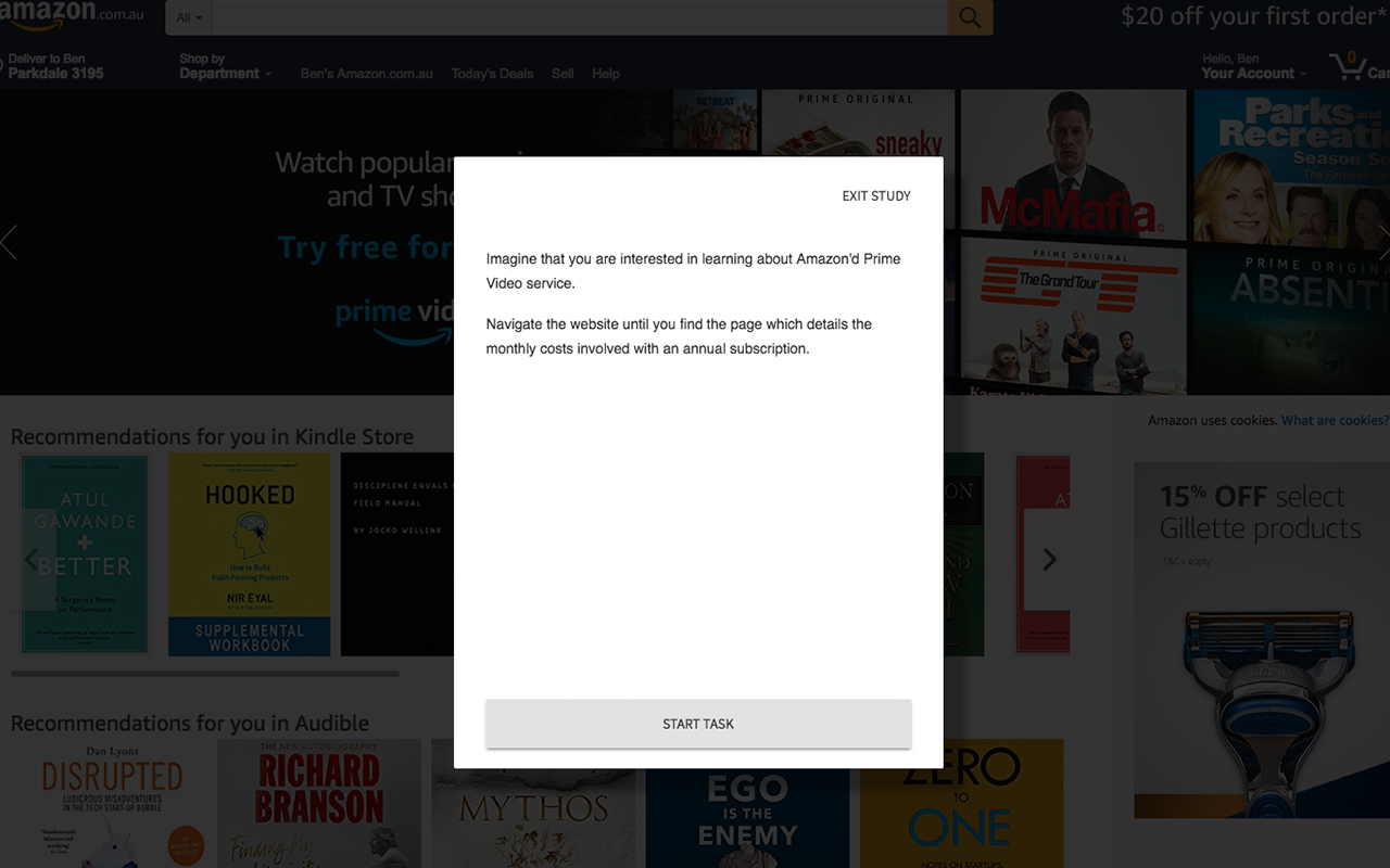
We ended up determining that when the UI was visible, and the participants were being shown task instructions or questions, then we wanted the underlying website to be almost totally obstructed. Ideally, this would leave no chance that the participant would attempt to ‘peak around’ the interface to the underlying website.
When the UI was hidden it would essentially minimize itself to the bottom left hand corner of the screen, with the open and minimized states joined by a clear animation. This would ensure the participant could follow what was happening and where the UI had relocated. We chose the bottom left hand corner as this is the position least likely to disrupt other elements of the underlying website. We also made the minimized element draggable so it could be repositioned by the participant in real time.
Before we progressed too far into the design process of the new UI we created a low fidelity prototype, using Sketch and InVision, and then ran some moderated user tests with power users of Loop11 to get their feedback. This process delivered great insights on all elements of the UX thanks again to our participants being research experts!
User Testing
We took their feedback and worked it in to a higher fidelity prototype which we then ran unmoderated user testing on with hundreds of participants. This is where things got a bit tricky. For the unmoderated testing we used our old user testing interface, to sit over the top of our new user testing interface.
If you ever wanted an exercise in having to clearly and concisely script a user test then try to use user testing software to test user testing software!
We ran a few pilot studies on smaller numbers of participants first to see where they were getting confused between the two UIs and how we could improve our messaging. Once we were confident we launched our main study.
Because our participant interface is so sparse with only three or four interactive elements, much of our insights revolved around subtle aspects such as button ordering, text labels and, in general, how intuitive our new design was.
For example, when labelling the button used to prematurely leave a test, if we used the word ‘Exit’ many participants would mistakenly confuse it for the button that hid the interface. The simple solution for this was to add the word ‘Study’ so the label would be ‘Exit Study’. This resulted in almost no confusion between exiting a test and hiding the interface.
In order to gauge how intuitive the new design was we looked at metrics such as task success, time on task and page view counts. The higher these were (with the exception of the task success metric), generally speaking, the more confused a participant tended to be. We also cross referenced these metrics with the actual participant videos, so we could see and hear if they were confused or just distracted.
The results we got from our moderated and unmoderated user tests gave us confidence that we were heading in the right direction.
The Build and the Beta
We then hunkered down for a few months and set about redeveloping our participant interface from the ground up. For those interested we used the relatively new functional programming language Elm.
After a few weeks of exhaustive internal testing we invited key customers to participant in a private BETA where they could launch tests using the new interface, providing feedback and feature requests as they went. The reason companies do private BETA’s is no secret, but I’m always pleasantly surprised by how valuable this process is and how willing customers are to kick the tyres and provide valuable, in context feedback.
We kept the private BETA running for just over 3 weeks at which point we were confident that it was ready for the big stage.
The new participant interface was released about a week ago and so far, so good. I know it’s only early days, however, our support tickets related to problems with the participant UI have shrunk to virtually non-existent, which, anecdotally is a good sign.
If you’d like to see the new interface in action, head on over to loop11.com and create your free account. No credit card required and you get full access to Loop11 for 14 days.
- Introducing Loop11’s Tester Panel - March 24, 2020
- Our Response to the Coronavirus - March 17, 2020
- Release Notes: 5 Second & First Click Tests, Image Testing& More… - October 17, 2018
![]()
![]() Give feedback about this article
Give feedback about this article
Were sorry to hear about that, give us a chance to improve.