How many millions of people in the 80s and 90s had trouble figuring out how to program their VCRs? My older sister was the only one in our house who knew how to do it, and that’s because she was a little nerdy and read the manual.
This is one of the most classic examples of a usability problem. No one wants to read a manual or call a support line – or even spend more than five minutes trying to figure things out on their own; people want and expect to be able to use products out of the box. This is the essence of effective usability design, and the same principle applies to website usability.
What is website usability?
Website usability has two aspects:
1. The primary aspect is about meeting your users’ goals and delivering a satisfying user experience. Is your site clear, concise, and intuitive to them? Can they quickly and easily find what they’re looking for? Are the consequences of pressing buttons and clicking links unambiguous to them?
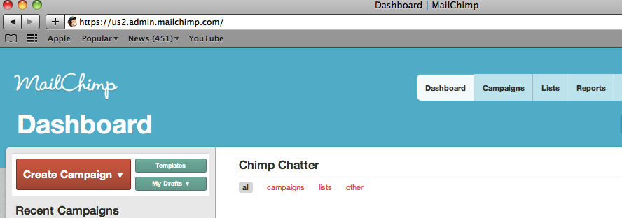
The email management tool Mailchimp.com is one of my favorite examples, because usability is one of its main selling points. And indeed all of the most common things that you’d want to do with it are laid out clearly on the front page: Create a Campaign, Manage a List, View a Report. The button for the most common action – creating a campaign – is distinguished by its orange color and large label. It’s hard to miss.
Ideally your site is so intuitively laid out that the question of usability never enters your users’ minds; it simply works the way they expect it to. (In fact, users generally only think about usability when they’re frustrated by something that is not usable to them.)
2. The secondary aspect of website usability is more subtle; it’s about fulfilling the goals your company has for the site. Does your site’s design nudge visitors in the direction you want them to go? Are the features that are most important to you front and center?
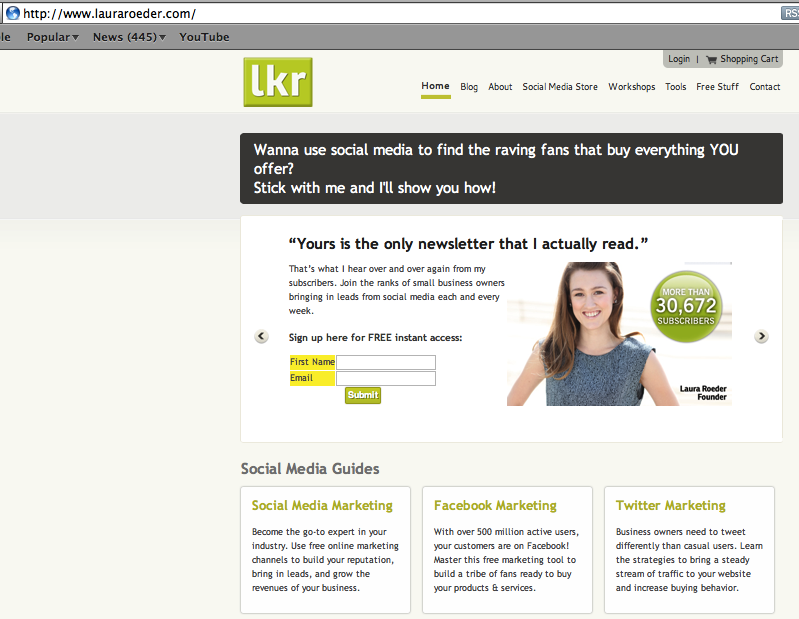
Here’s a quick example: Laura Roeder Studios (lauraroeder.com) offers social media training and tips to small business owners. Building its list of weekly newsletter subscribers is important to them – as shown by the fact that the email newsletter sign-up is given prime real estate on their site:
The value of user testing
Of course we designed our site to be usable, you might be thinking. Why wouldn’t we? Here’s the thing: you will never know how usable your site truly is until you test it with people outside of your organization.
Is usability subjective? Could something be intuitive to one person and not another? Absolutely, and therein lies one of the two main values of user testing: testing across groups reveals quantifiable trends. If 7 out of 10 people can’t figure out how to navigate to checkout on your website, that tells you something very valuable which you will want to address.
The other main value of user testing is that it’s unambiguous. Ask a user an open-ended question – Is our website usable to you? – and you will likely get a general reply. But give someone a set of specific tasks to execute on your website, and look at the results, and you will see unambiguously where the stumbling blocks are, if any. And that means you can fix them.
User testing enables you to get inside your users’ heads and create a site that will truly be easy and pleasant for them to use. And that, of course, is win-win for both them and you.
Go ahead and create your first user test to get a quantifiable, unambiguous handle on your site’s usability (it’s both easy and free).
![]() Give feedback about this article
Give feedback about this article
Were sorry to hear about that, give us a chance to improve.


