UX/UI or User Experience and User Interface are two buzzwords of modern-day digital infrastructure.
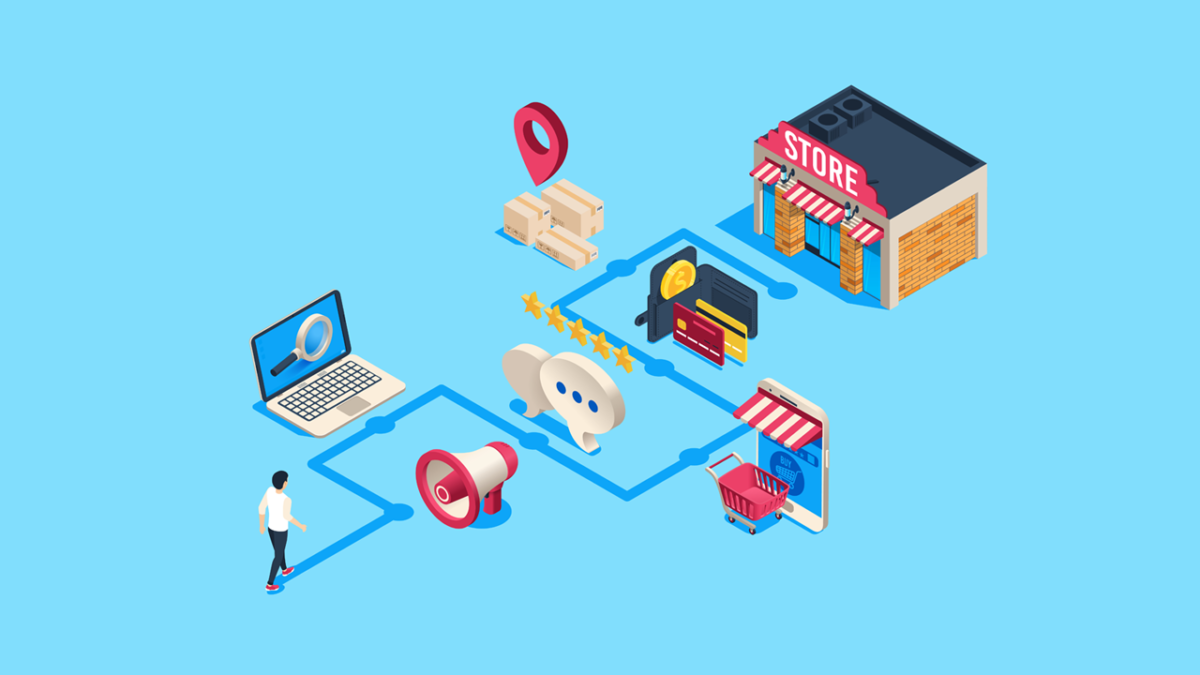
A website with a good UX/UI is like a perfectly built brick-and-mortar store where customers can easily choose the products or services they want to buy.
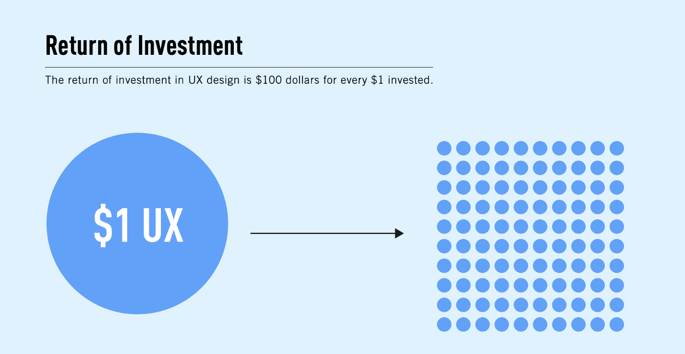
According to UXCam, every $1 invested in a website’s UX/UI reaps up to $100 for the business. In other words, you get a 9,900% ROI.
Thus, investing in an excellent UX/UI design can help you reap extensive profits. Before we delve into UX best practices for websites, let us look at some of its benefits.
Benefits of a perfect UX/UI Design
- A high rate of return
UX/UI investing may seem unnecessary to you but ask your customers, and you will hear an entirely different story.
Customers like simple UX/UI that allow them to settle when they visit a website. Even the best brands like Apple and Amazon have a simple UI.
The reason is that simple UIs help reaps a high rate of returns. Customers find it comfortable and easy to navigate; hence, they do not hesitate to buy repeatedly from such websites.
2. A decline in bounce rates
If your website is experiencing too much bounce rate, then the chances are that your customers cannot work your UI design well.
Remember, UI designs are not meant to please your eyes; they make life easier for customers. Therefore, you must create a simple UI design keeping your customer in mind.
Websites with good UI designs do not experience high bounce rates because people like to stick to a reliable source instead of hopping from one website to another.
3. Helps in customer acquisition
Every business wants to acquire new prospects and continue to extract value from their old ones. With the Internet being the biggest market, businesses cannot afford to have a lousy UX design where a customer is unable to navigate and understand its services.
A smooth UX/UI design offers convenience and security to the customers. When they see that a brand’s website is aesthetically well-built, they trust them with sensitive details like bank account numbers and addresses.
When customers enjoy a website’s services, they spread word of mouth. Your website can drum up random conversations, and you will get fresh customers.
4. High productivity
Modern-day employees are tired of traditional reward and engagement systems. They are looking to have a stress-free work culture. And a great UX/UI design helps them attain just that, wondering how?
A great UX/UI will not get as many errors as a lousy interface. Fewer errors mean fewer headaches and easy management.
Also, a perfect interface would streamline employee operations by reducing maintenance time and effort.
Moreover, you can fetch employee involvement in more exciting tasks like marketing and client engagement, where they get to upskill themselves.
5. More engagement
What is the point of inviting users to come to your website when they do not engage with the content?
Therefore, a UX/UI design should entice the customer and positively impact their minds. And to do so, websites must place specific calls-to-action buttons strategically.
CTAs help users figure out what they can do next. CTAs provide a clear picture of your product or service.
A good UX design always have CTAs placed on every page so that users do not get confused about further steps.
5 Best Practices to Upgrade your Website’s UX/UI Design
Now that you know the benefits of a great UX design, let us now look at some of the UI/UX best practices which you can follow to upgrade your user interface:
- Do not fix what is not broken
Often, people try to waste a lot of time for no reason in hopes of better user engagement. The truth is that people do not like the complex app and website layouts that eat a chunk of their time in understanding.
You can always use tried and tested methods that have worked in the past and keep your layout simple.
However, minor tweaks are always welcomed for optimization, but for example, if you are shifting the navigation bar from the top of the page to the bottom, it is not a wise strategy.
2. Create a purposeful landing page
Often people try to integrate everything into their landing page so that customers know everything about them.
But the fact is that not every customer is willing to know everything about you. Most customers are there for a specific product or service, and if they see everything other than what they are looking for, they will bounce back.
Therefore, it is best not to pack your landing page with much information. Keep it organized and clutter-free. You can give a mention to your primary service and leave the rest on the customer’s conscience.
3. Know what they want
While planning for your UX/UI layout, you need to know what your customers want.
Often, business owners assume that based on their past research and market experience, they know what their customers are after, and that can be right sometimes, but trends change fairly quickly in the online world.
For example, the growing number of cybercrimes has led customers to demand safe data transmission from their browser to the website’s server. Unlike the previous times, every business must safeguard their network connection with a budget SSL cert. If a business has unlimited subdomains, a wildcard will fit your requirement. A business can choose from RapidSSL wildcard, PositiveSSL Wildcard, and GlobalSign wildcard SSL to encrypt the data transferred between their website and the customer.
Therefore, it would be best to check out the latest trends before revamping or creating your UX design.
4. Create visually distinct elements
A good UX design always displays a clearcut picture of the website. Everything from blog posts, themes, and colors to search icons, images, and navigation bars should appear differently.
Users must know what page they are at through menu navigation, and they must always have a search bar at the top and the bottom so that people can search for stuff.
Moreover, pages should have distinct colors so that every page does not look the same.
Visually distinct elements distinguish different website segments and provide a vivid experience to the users.
5. Remember the end goal.
Every website has its final objective where it wants users to go. Therefore, you must know what you want users to do after visiting your website.
You must provide a seamless experience by helping them decide what to do next. Not every user is sure about what they can do on your website, and that is where chatbots and FAQ sections come in.
AI-powered chatbots can describe the website to them and solve their queries. Moreover, you can also integrate the FAQ section, where you can answer all potential questions that a user can have upon landing on your website.
Final Thoughts
After going through all these UI/UX design guidelines, you must have understood how a perfect UX/UI design can benefit you eventually.
Today, if a website wants to rule the hearts of the masses, it must provide a seamless and smooth experience.
Websites with great UX design are never short of customers. Their customers market them. Therefore, if you wish to stand out from the growing competition, you must understand what users want and adhere to that.
So, follow these five tips to upgrade your website’s UX/UI design.
- Why Should Modern-Day Businesses Invest in UX Design? - May 23, 2022
![]() Give feedback about this article
Give feedback about this article
Were sorry to hear about that, give us a chance to improve.


