Think it’s too costly to integrate usability testing in the early stages of web development? Think it requires fully designed prototypes? Think again. Usability testing in the early stages of web development can be both efficient and cost-effective. With wireframes you can easily ensure that you’ve streamlined the user-experience before even completing your site.
The Media Department at a University in Sweden recently used Loop11 to run usability testing on wireframes. Two different prototypes of a tourism website were tested. Running this quick investigation, the researcher discovered how users would naturally navigate and interact with their site before the design phase commenced. Their testing yielded some interesting results.
The Test
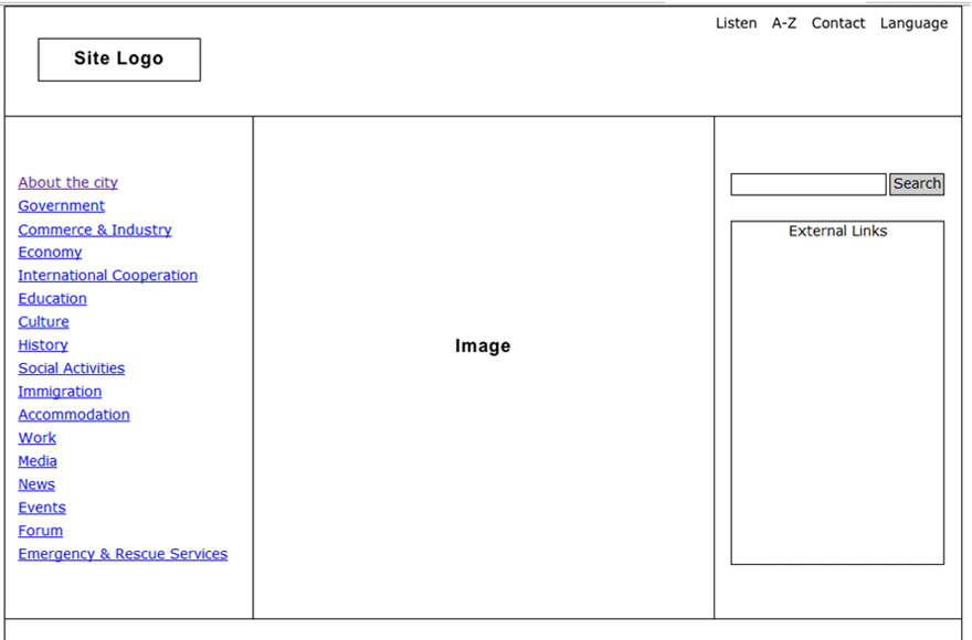
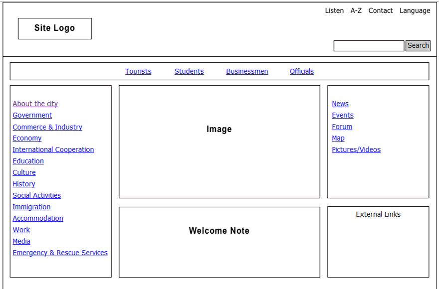
In the early stages of the project—just after drafting the outline and organisation of a tourist website for a major city in Sweden—the team wanted feedback from users. Using two prototypes made of very low-fidelity wireframes, the team witnessed how user-experience differed across different versions of the same site.
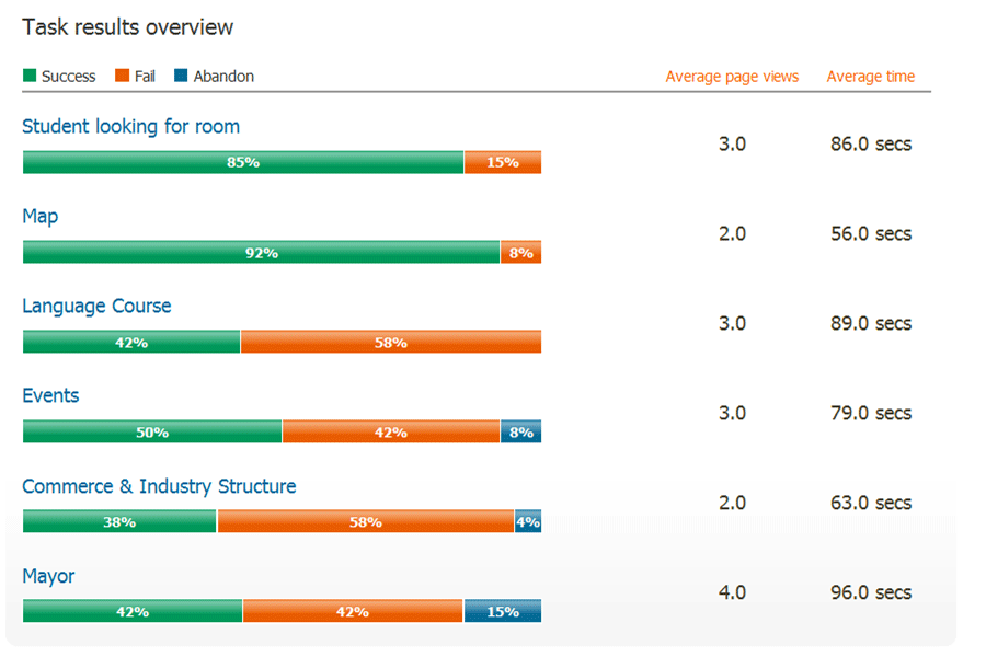
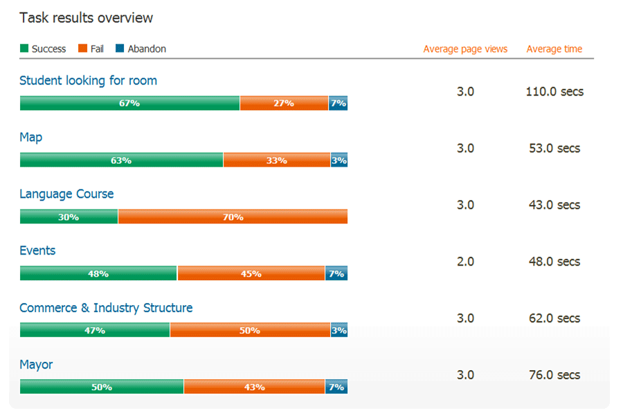
Prototype 1: Prototype 2:
These two sites were presented to 60 participants in total.
All participants completed a series of six tasks: find an events list, locate city maps, learn more about language courses, and other actions usually performed by visitors to a tourism website. The project recorded if tasks were completed successfully and how long each task took.
At first blush, with only minor tweaks on layout and information architecture, the two prototypes might not seem distinct enough to yield significant test results. But, as we know, even the smallest change can make a huge difference on overall web experience.
The Results
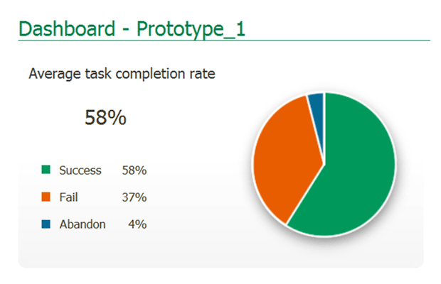
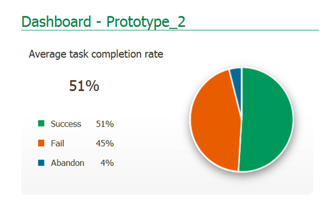
On the whole, Prototype 1 performed the best. Prototype 1 demonstrated a task completion rate of 58%, while only 51% of the tasks were completed successfully on Prototype 2. Looking closely at each prototype, however, there are some nuances across the board.
Four tasks on Prototype 1 benefited from higher rates of task completion. But most of those tasks actually took significantly longer to complete on Prototype 1. On the other hand, Prototype 2 only had two tasks with higher rates of task completion. And overall, there was only one task on Prototype 1 which was completed more quickly than on the second prototype. Looking for student accommodation took at full 24 seconds longer on Prototype 2.
The Interpretation
Generally speaking, the first prototype appears to be more usable. But it does take users longer on Prototype 1 to get to their destination. So instead of using Prototype 1 wholesale as the ultimate guiding draft for the final site, the researchers can take a closer look at their results and their website.
The researchers might question why, though many tasks were easier to complete on Prototype 1, did they take longer to complete. To do this, they might take a critical look at layout, link naming, or site organisation on Prototype 1. Or since both prototypes demonstrated better completion rates on a few tasks, the team might explore ways to combine the best of both into one site.
By using the results, this team can use the newly gained insight to revisit fundamental decisions on web design.
The Meaning of It All
The project demonstrates how you can gain significant insight on usability with only the barest of wireframes.
It allows teams to enhance page layout, navigation paths, and information architecture without investing great funds on fully designed prototypes. Easy and quick, a wireframe usability test helps flesh out foundational details before designers and developers commit to creating polished, finalised site. Wireframe usability tests—despite their simplicity—can help teams seriously question, rethink and fine-tune a site’s overall experience.
![]() Give feedback about this article
Give feedback about this article
Were sorry to hear about that, give us a chance to improve.
Error: Contact form not found.

